Company
Overview
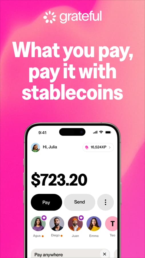
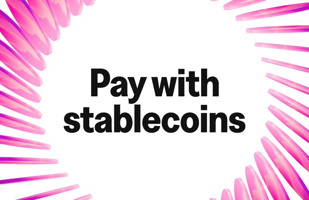
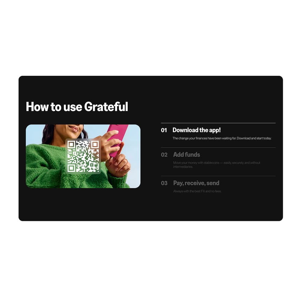
One app to make paying with stablecoins the easiest, most cost-effective, and enjoyable way to pay anywhere and to anyone around the world. Built to simplify everyday transactions, it brings more clarity, speed, and transparency to how money moves.
Brand Story
Grateful was born to create a meaningful impact at a time of deep human transformation. Beyond having a clear business goal, Grateful also seeks to contribute to this era of profound change in humanity.
Grateful not only facilitates payments, it invites a shift in perspective: to pay with gratitude, recognizing the value of what we receive and the connection to our own personal journey.

Mission: Finance Independence for All
We believe that financial empowerment is a path to freedom. Our mission is to enable people and businesses to move, receive, and grow their own money, instantly, globally, and without dependence on intermediaries. True financial independence is not just about money — it's about access, awareness, and sovereignty.
We have different value propositions that highlight different uses or benefits.

Our values define how we build, connect, and move, guiding every interaction with transparency, empathy, and intention.

Grateful Manifesto
For too long, finance has been a game built for a few. Small print. High fees. Hidden commissions. You were taught to ask permission to use your own money. But real change comes from opening your eyes, taking control, and choosing every move you make.
Grateful exists for those who do exactly that. For those who see financial freedom not as a privilege, but as a responsibility — where every payment is an act of recognition of value, and of yourself.
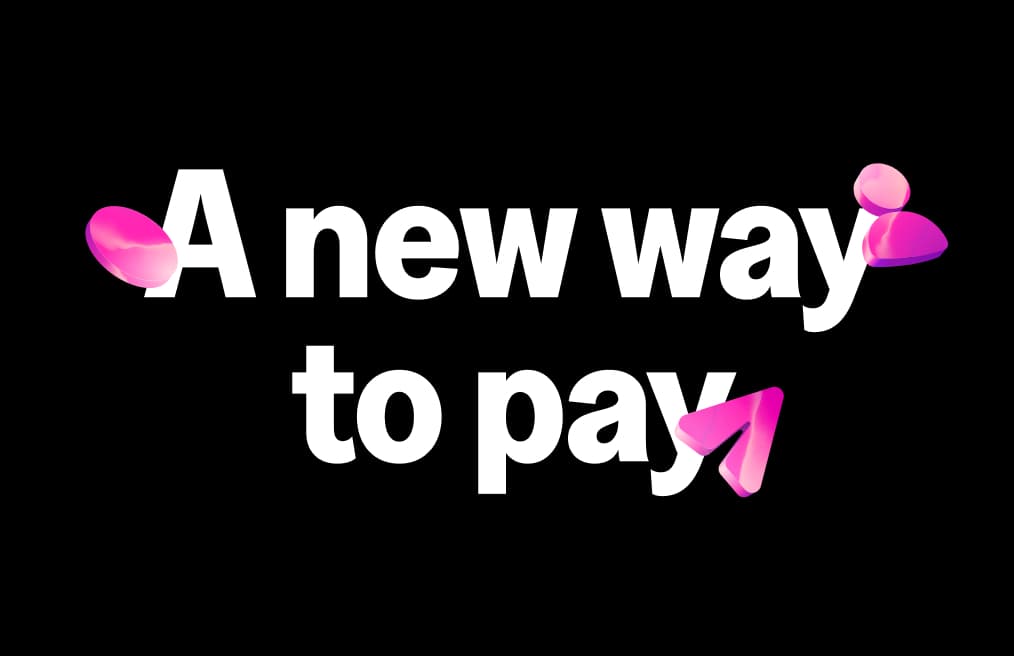
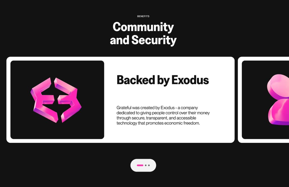
That's why we built Grateful: the simplest, most direct way to pay with stablecoins. No detours. No hidden fees. No surprises. Pay anywhere, send money globally, or split a dinner in seconds. All backed by the experience and trust of Exodus, with over a decade bringing crypto closer to people.
Grateful is about moving your money consciously. Because money is energy — and when you move it with intention, every transaction becomes an act of value.
Grateful. Value in every movement.
Logo
Grateful's logo is soft, fluid, and in constant motion, expressing money as a living flow.
Inspired by circular systems, it evokes coins in movement: value that goes, returns, and keeps circulating. It reflects a world where money is continuous, human, and connected.
As the first point of contact, it represents effortless financial flow, intuitive and global.
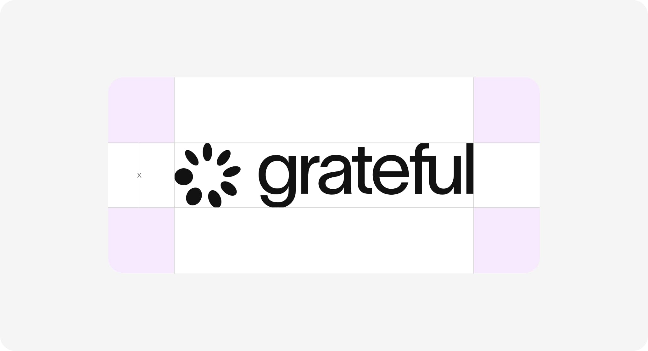
Primary Logo
Our primary logo combines a rounded wordmark with a circular symbol. The wordmark's soft shapes convey clarity and approachability, while the symbol represents value in motion: expanding, returning, and looping.
Together, they create a balanced and dynamic system, easy to recognize across contexts.
Use the primary logo in most cases, adapting color for optimal contrast and legibility.
 Open in Figma
 Open in Drive
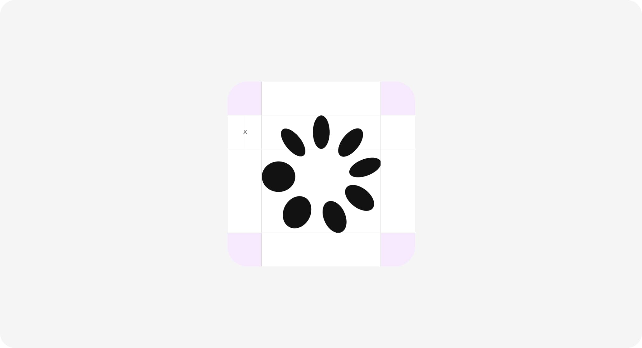
Symbol
The symbol is the purest expression of Grateful.
Built as a circular constellation, it represents the flow of money as a cycle: going out, coming back, and moving through people and systems. It can be used when the brand is already recognizable or when a lighter, more minimal presence is needed.
Clearspace
Clearspace is the area around the logo that must remain free of any visual elements.
It ensures clarity, legibility, and presence across all applications.
This space is defined by a unit based on the logo and should always be respected.
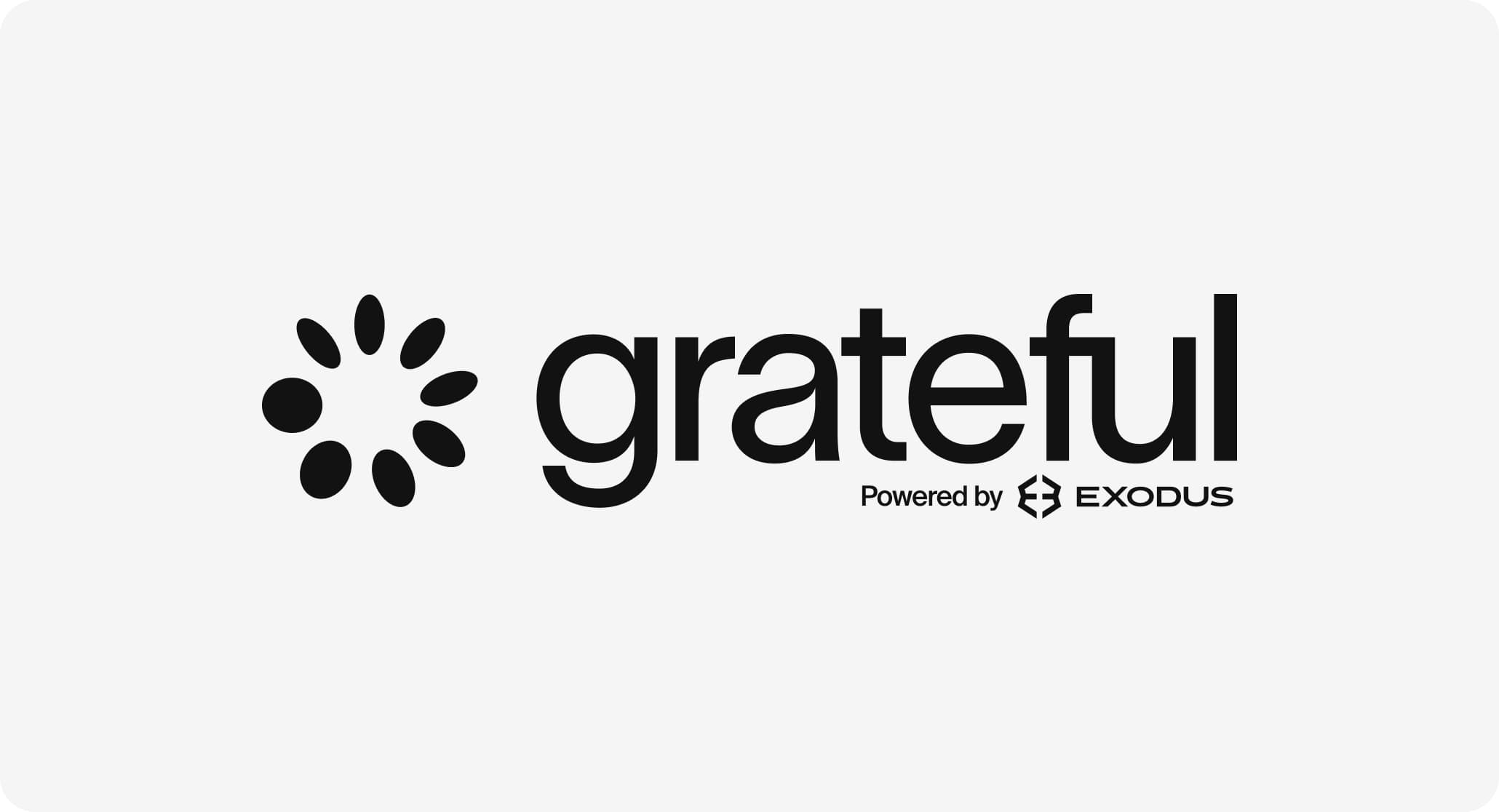
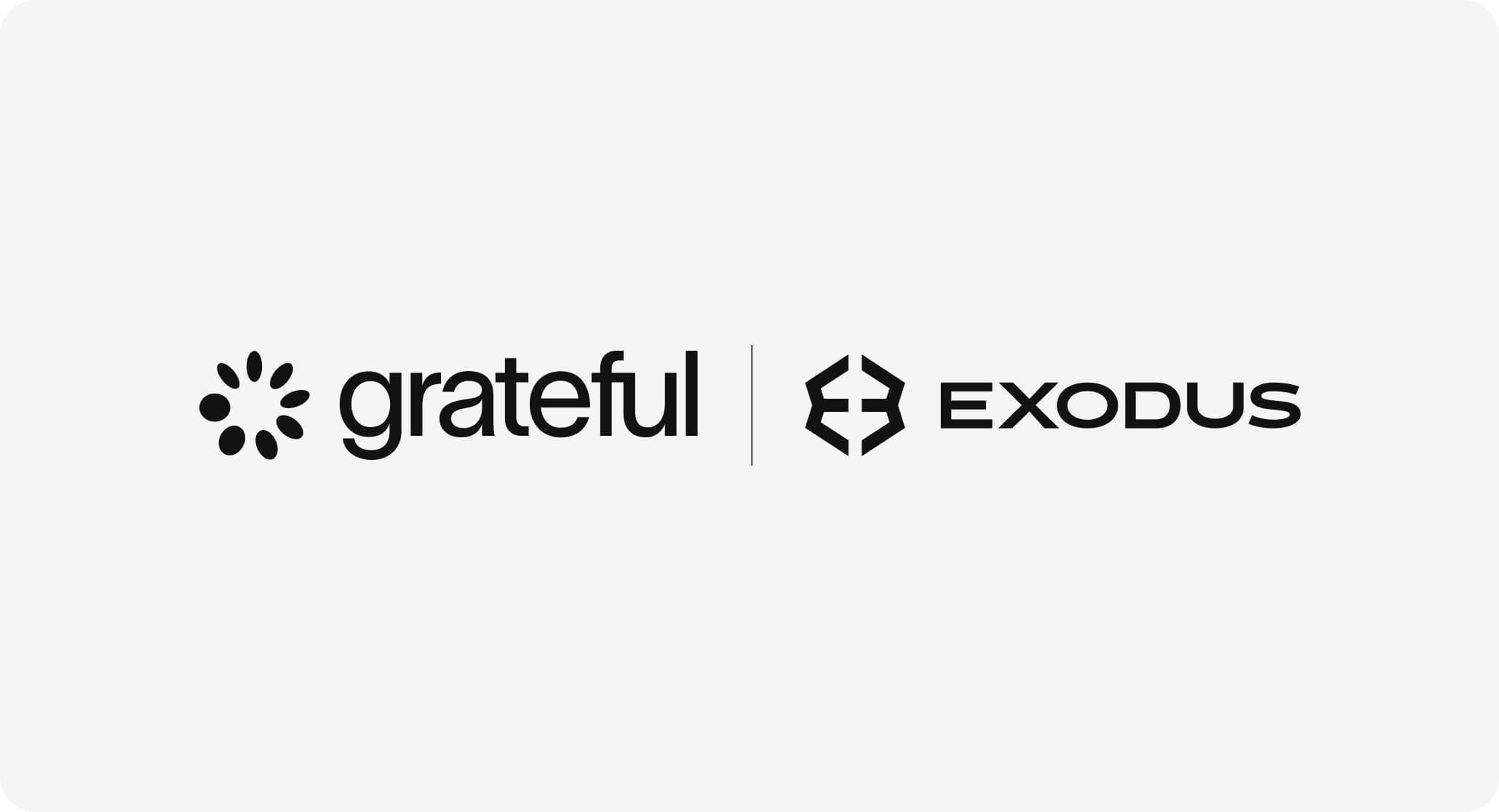
Endorsement
When used with other brands, the Grateful logo should appear in a monochrome version.
Partner logos should follow the same approach whenever possible.
Maintain clear separation and avoid visual competition.
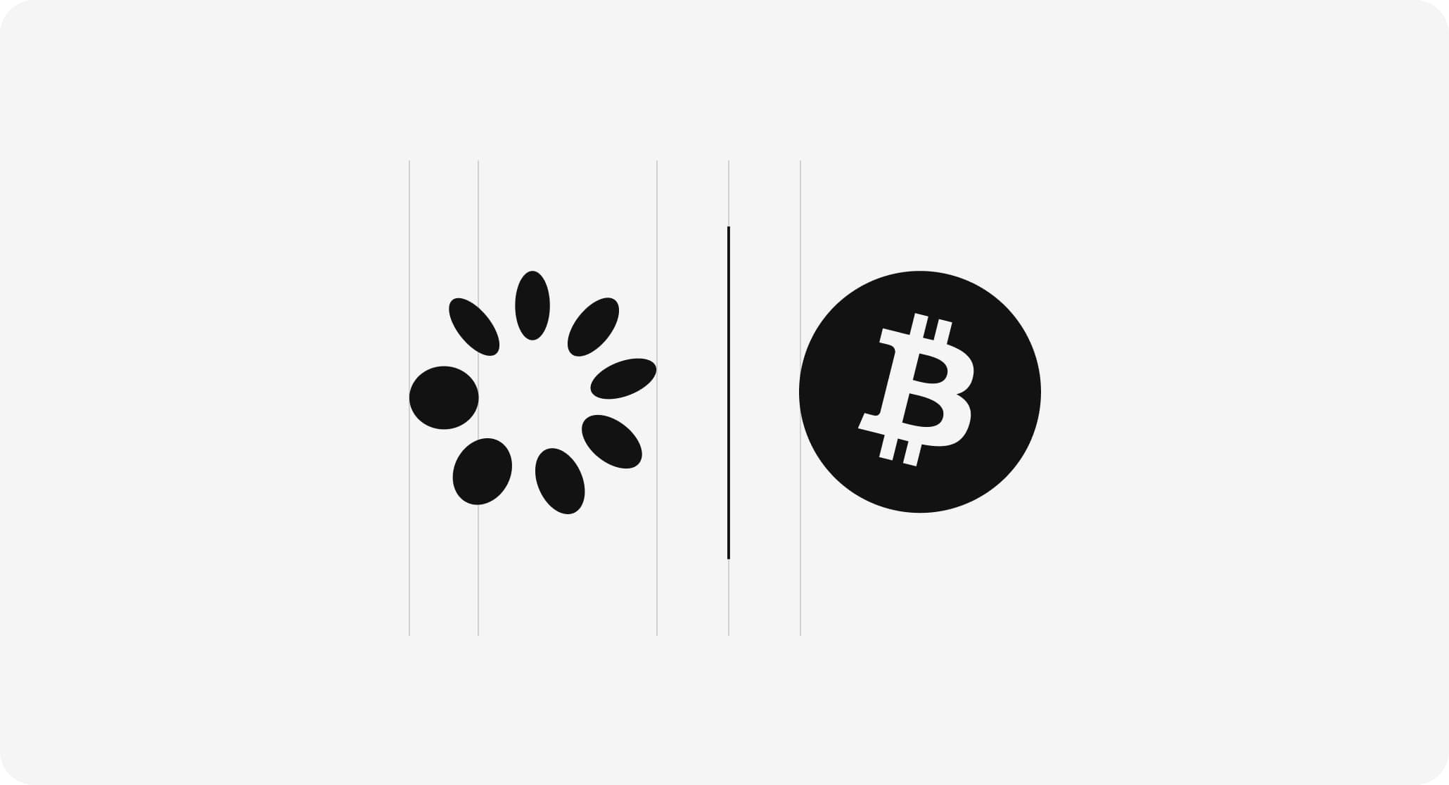
Partnerships
In partnerships, logos should feel balanced and aligned.
Use consistent spacing or a subtle divider to separate them.
The relationship should feel clear, without one brand overpowering the other.
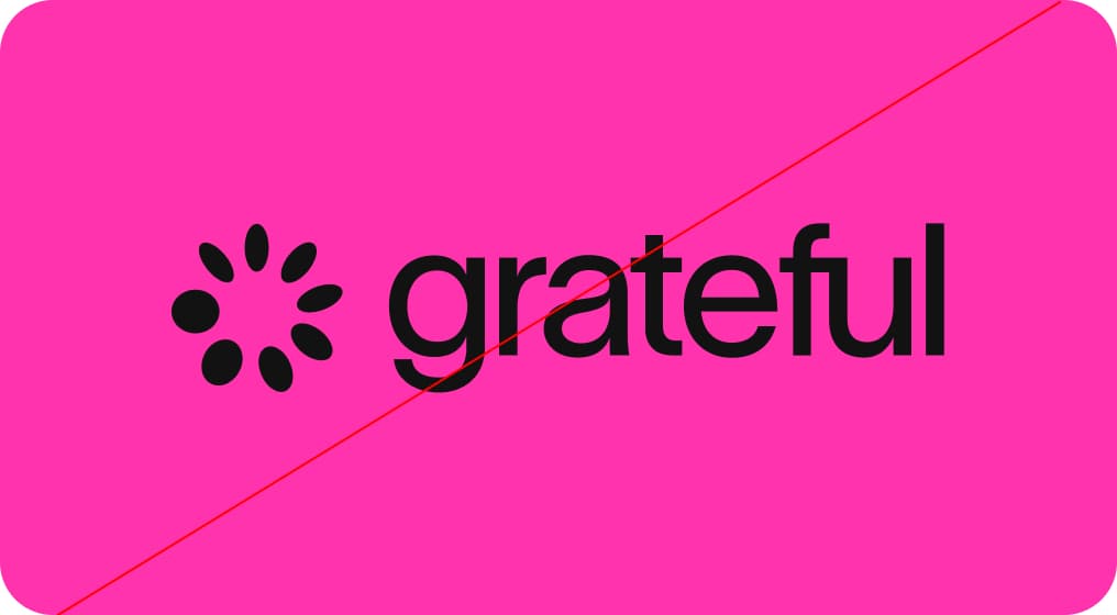
Incorrect Usage
Do not alter the logo.
Avoid distortion, color changes, effects, or low-contrast backgrounds. Do not modify or separate its elements.
Consistency is key to recognition.
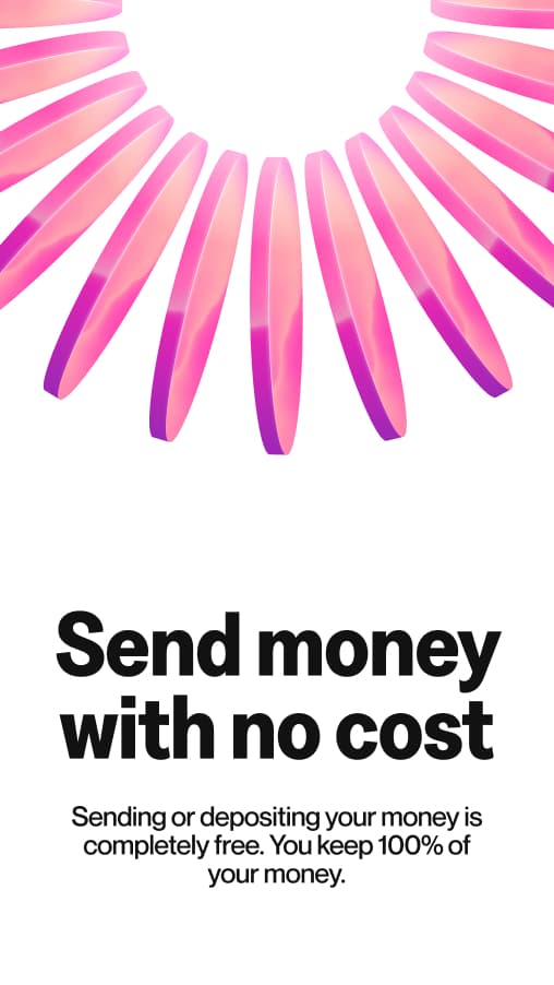
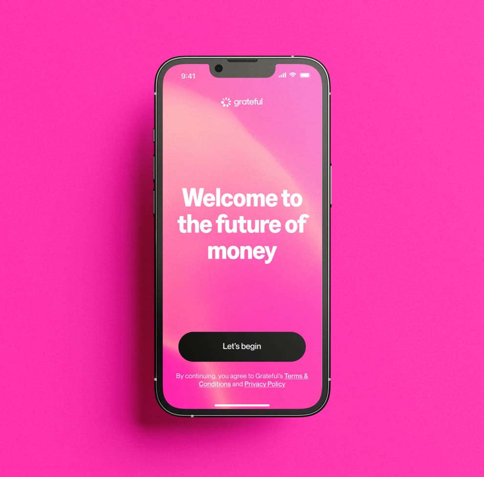
Pink in Motion
This direction introduces the pink texture as the brand's living signature. More than a background, it becomes a dynamic layer that moves, adapts, and creates instant recognition.
It differentiates Grateful from traditional finance, adding energy, emotion, and a sense of trust across every touchpoint: digital, physical, and experiential. A brand that feels alive.
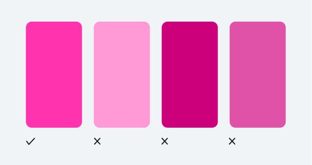
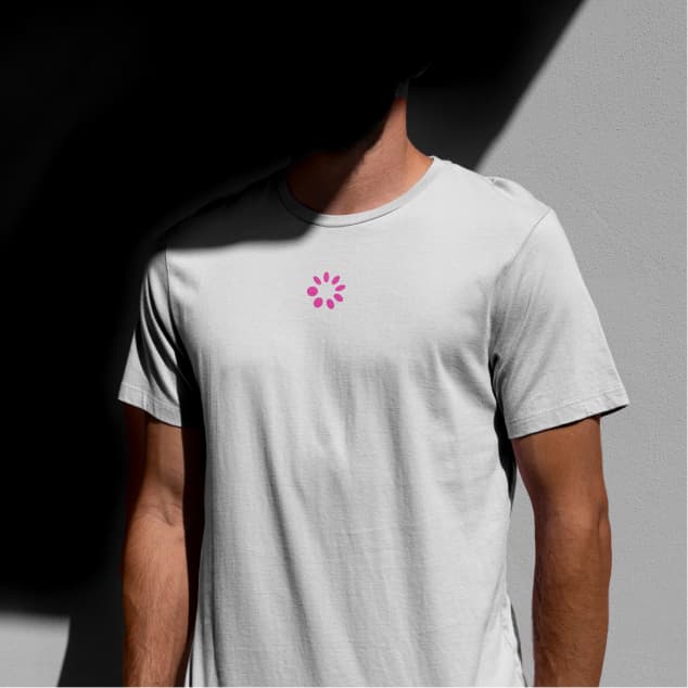
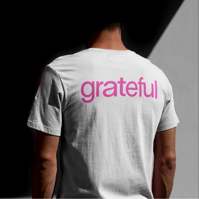
Grateful Pink
Grateful Pink is omnipresent across all brand touchpoints and used strategically so that it stands out as the hero color. Floods of pink can be powerful, but that should not be the only way pink shows up.
Its inclusion should be done thoughtfully and intentionally. Challenge yourself to meet this criteria in unexpected ways. Consider materiality, lighting, texture, and motion as avenues to explore.
Approach Grateful Pink with nuance and energy: it is not just a color, it is a living signature.


Supporting colors
Black and white provide balance to Grateful Pink, helping maintain visual clarity and avoid overuse of our signature color. They bring structure and contrast to compositions, allowing pink to stand out where it matters most.
Soft Pink and Purple can be used sparingly as high-impact accents to introduce depth and warmth, but should never be used as full background fills competing with Grateful Pink.
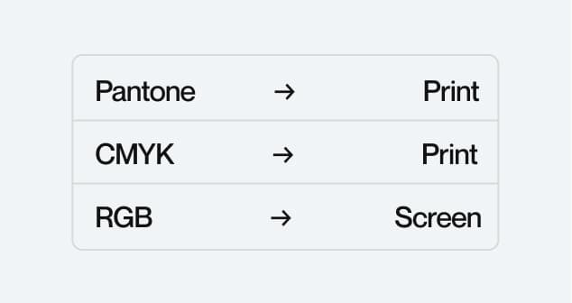
Color Modes
No color system can perfectly represent the full extent of what we see with our eyes in the wider world. Different color modes serve different purposes depending on medium.
RGB and Pantone offer the most vibrant on-screen color, while CMYK is used for print, with some limitations in vibrancy and range.
Accessibility
Good accessibility starts with legible text. In digital design, this means ensuring strong contrast between text and background colors. Grateful follows WCAG guidelines, aiming for AAA compliance, the highest standard.
This means a contrast ratio of at least 7:1 for normal text to ensure maximum readability. Grateful Pink is specifically created to work with white or black text. Avoid using Grateful Pink as a critical design element where contrast requirements are not met.
Printing preferences
Our color system allows for a wide range of flexibility across print and digital applications. The following guidelines ensure color accuracy and consistency across every medium.
Colour System
Techniques
Materials
Incorrect usage
Our color system allows for wide creative flexibility, but some rules must be followed to ensure consistency and brand integrity. Avoid the following.


Typography
Our typography system is built on two complementary typefaces that express Grateful's character across every context: bold and direct for impact, precise and warm for clarity.
Each typeface has a defined role. Together, they create a visual language that is confident, human, and instantly recognisable.
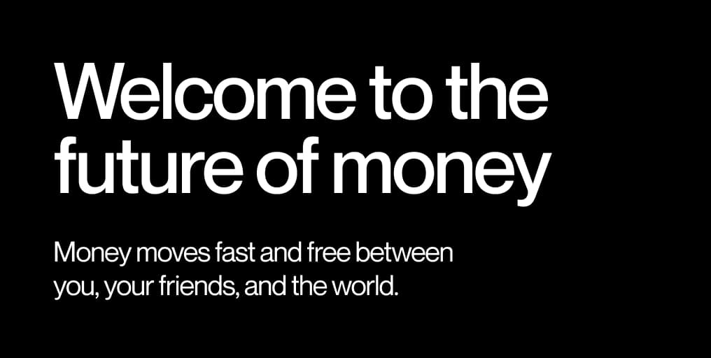
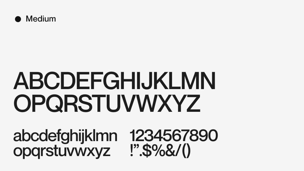
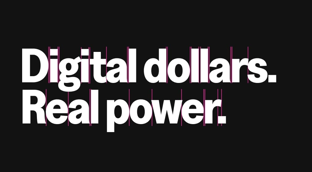
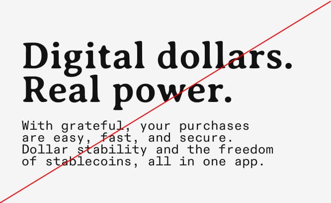
Titular Typography
Greed Narrow Bold is our display typeface. Its condensed proportions and bold weight give Grateful its expressive, playful identity. Used at large sizes for titles and hero moments, it commands attention and builds brand recognition. Greed Narrow Bold is what people see first and remember longest.
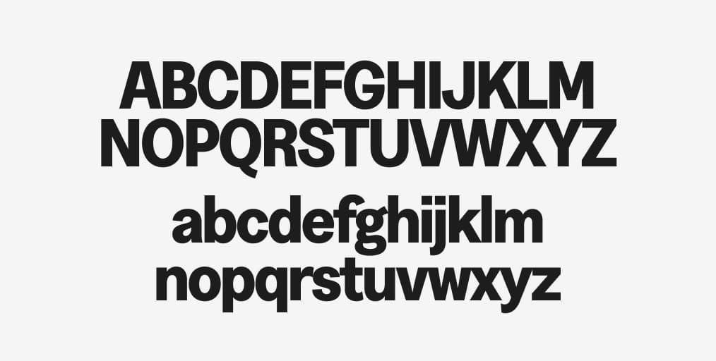
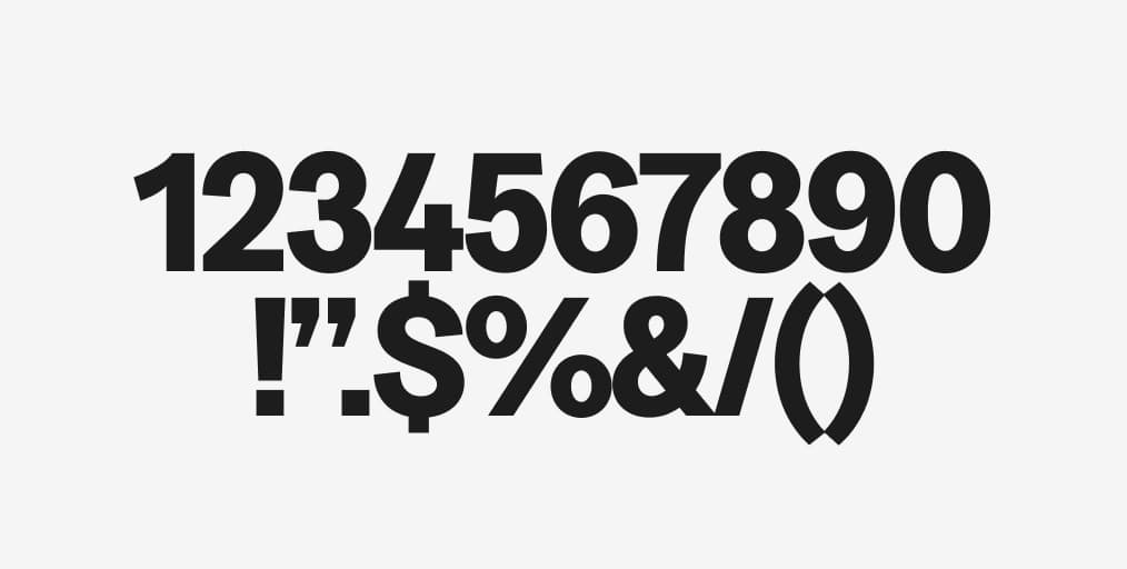
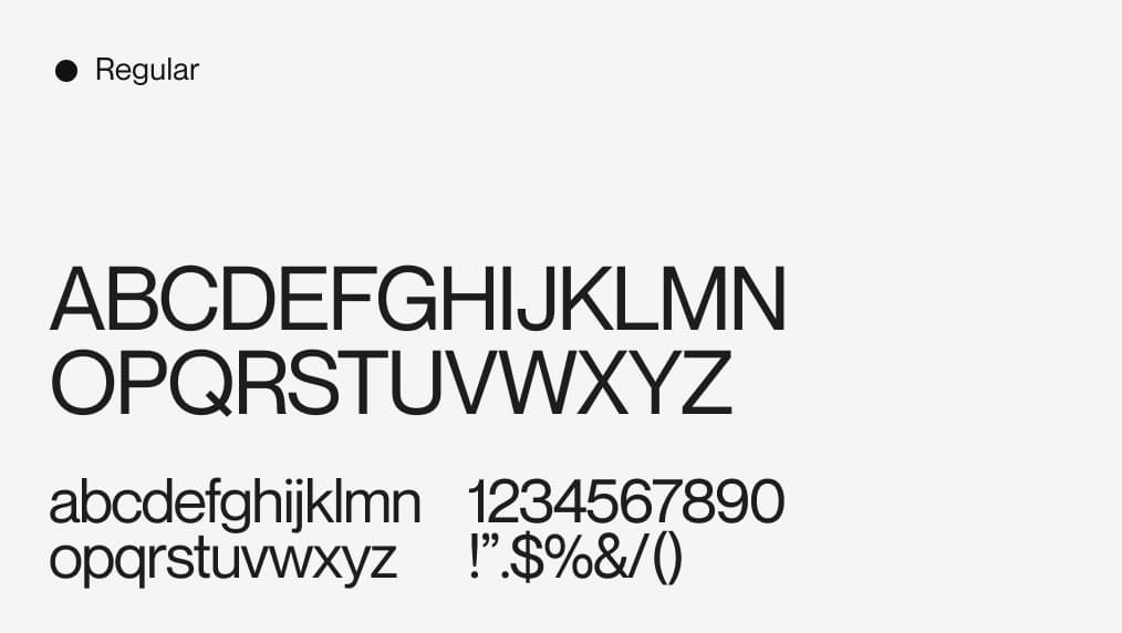
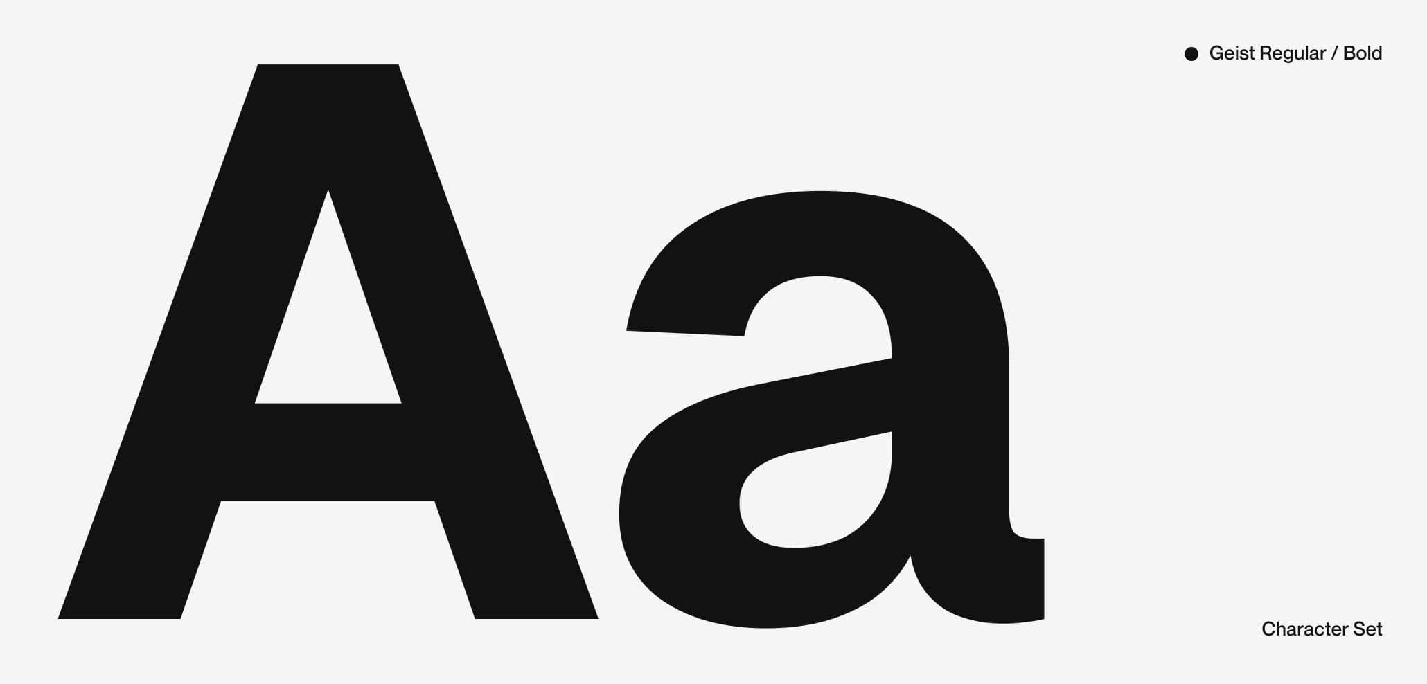
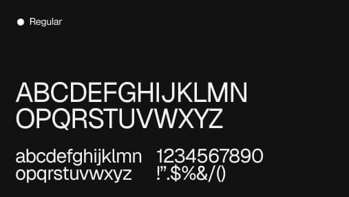
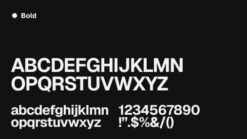
Functional Typography
Neue Montreal is our functional typeface. Available in Medium and Regular weights, it handles everything from subtitles and UI labels to long-form body copy. Its clean geometry and excellent legibility at small sizes make it the perfect companion for the product and app. Medium for emphasis and hierarchy. Regular for reading.

Everyday usage
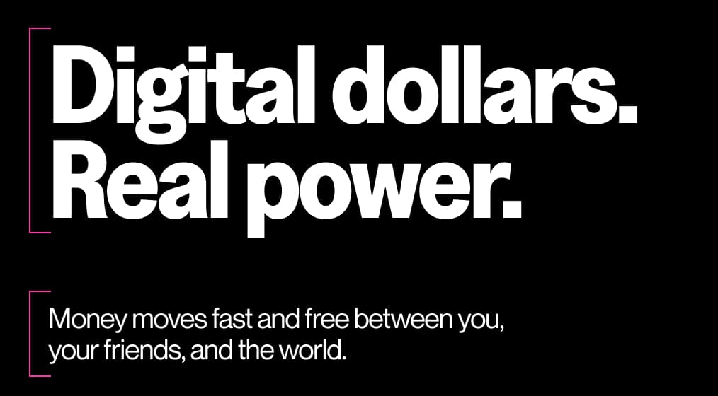
In everyday contexts, PP Neue Montreal Medium carries all informational, navigational, and supportive text. Greed Narrow Bold appears for section titles and key moments of emphasis.
Keep type clean, structured, and purposeful. Let hierarchy do the work — avoid overloading a composition with too many type sizes or weights.
Expressive usage
Greed Narrow Bold is built for expressive moments. In motion, campaigns, and large-format contexts, typography becomes its own distinct graphic object. Conventions can be defied. Experimentation is encouraged. Always consider the relationship of type to the rest of the composition.
Typesetting
Good typesetting requires a discerning eye. These are universal principles to follow when setting type, ensuring consistency and high legibility across all Grateful touchpoints. The combination of Greed Narrow Bold and Neue Montreal (body) creates a natural contrast that reinforces the brand personality: bold expression at the top, clarity and ease at the reading level.
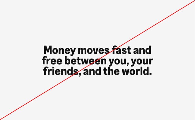
Incorrect usage
Our typefaces work best when used as intended. Avoid these common mistakes to maintain the integrity and legibility of the Grateful typographic system.
Free Dimension / Backup font
When Greed Narrow Bold is unavailable — in systems that do not support custom fonts, email templates, or third-party platforms — PP Neue Montreal Medium serves as the primary fallback.
In contexts where neither typeface is available, use Arial or Helvetica as the final system fallback. Maintain the same typographic hierarchy with size, weight, and spacing.
Brand Elements
Brand elements are the building blocks of Grateful's visual identity. Each one has a defined role, a specific logic, and a clear set of applications. Together, they create a system that is cohesive, recognizable, and built to scale across every touchpoint where the brand shows up.
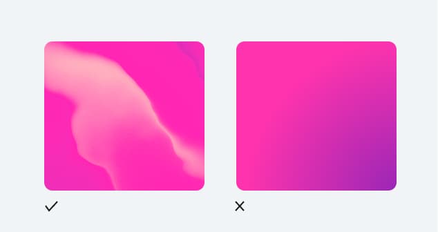
Mesh
The mesh is one of Grateful's most distinctive and recognizable visual elements. It runs through the entire brand, both static and in motion, giving it depth, warmth, and a sense of life. Far from decorative, the mesh is a core part of what makes Grateful feel like Grateful.
Static meshes


Uses
Its uses span across the brand system: as backgrounds in communications and campaigns, as the texture that fills illustrations, and as the defining surface of the Grateful card. When animated, it brings fluidity and energy. When static, it adds richness and personality.

Gradient
The gradient adds another layer to the brand's visual depth. Soft, luminous, and always rooted in Grateful's pink palette, it brings a sense of glow and elevation to the system. Unlike the mesh, which has texture and movement, the gradient is smooth and atmospheric.

Uses
Its application is intentionally contained: the gradient is used exclusively as a background element. This restraint is what keeps it powerful. When it appears, it signals space, breathing room, and a premium feel without competing with the content on top.
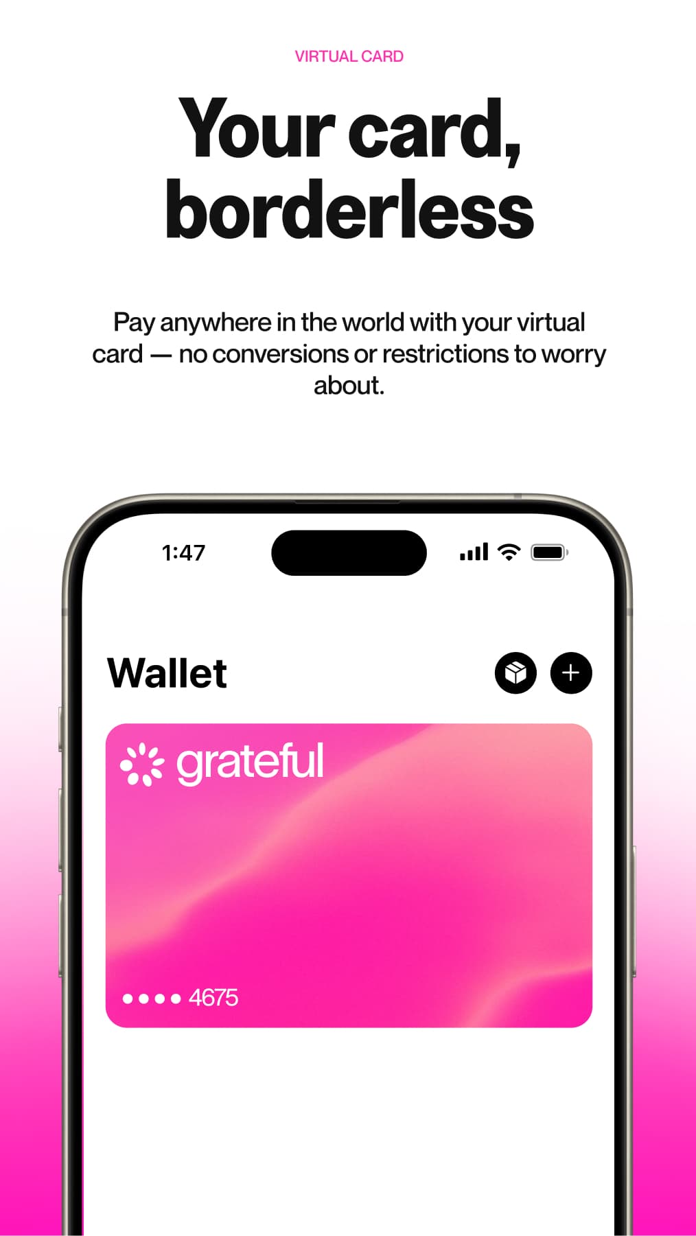
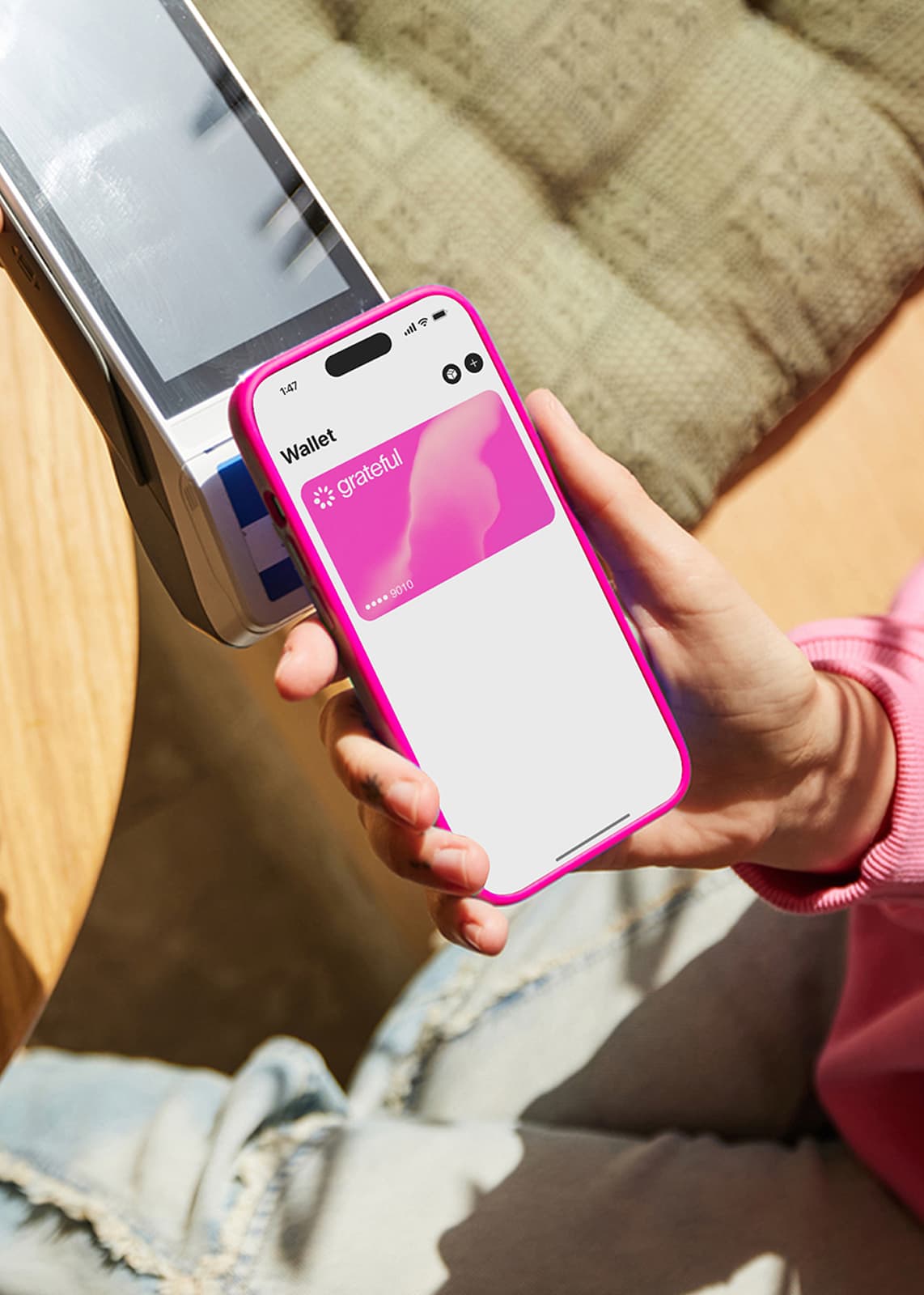
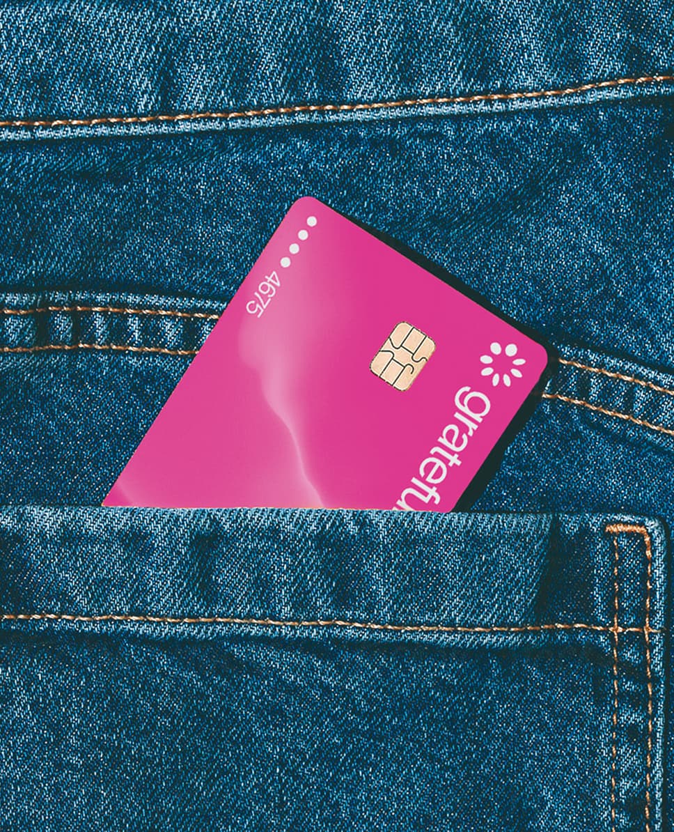
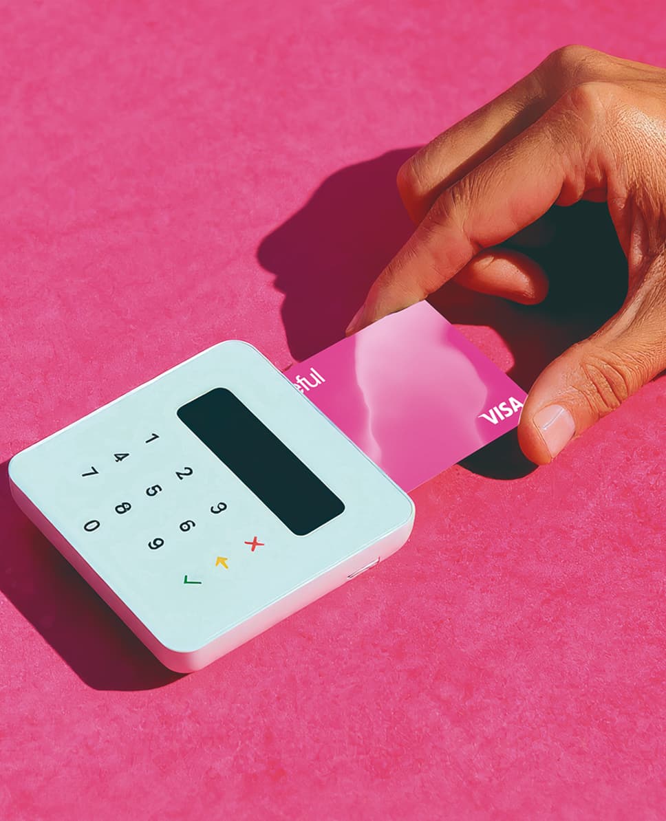
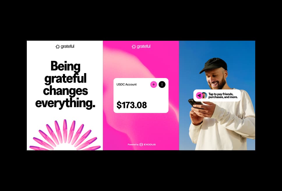
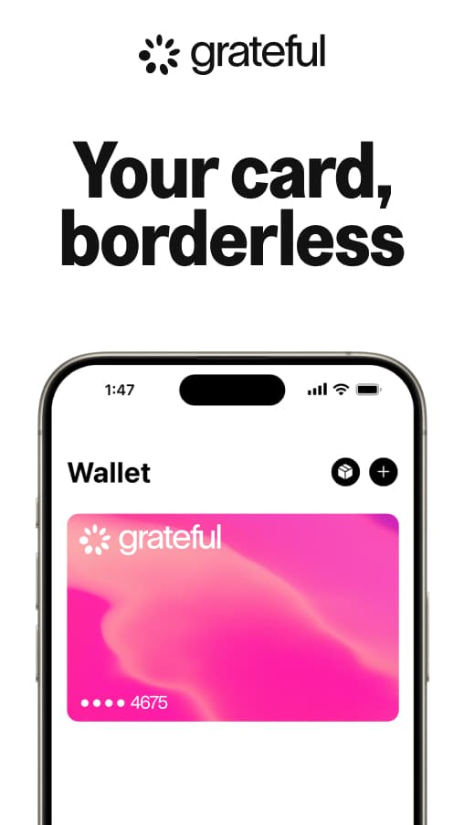
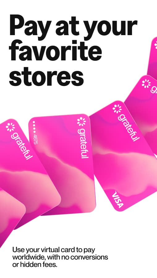
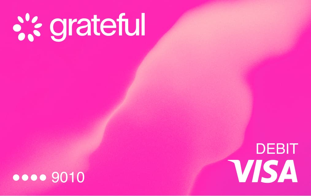
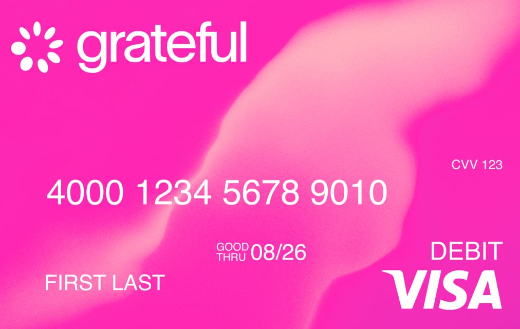
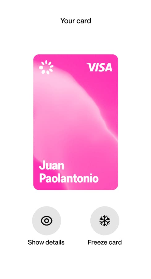
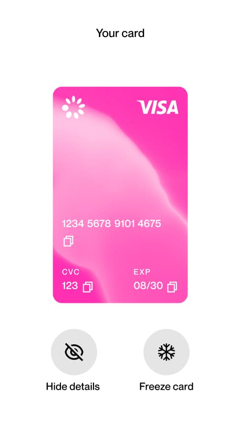
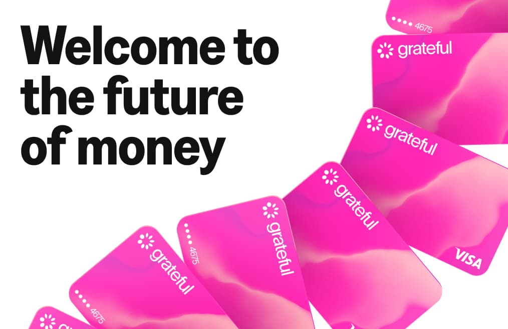
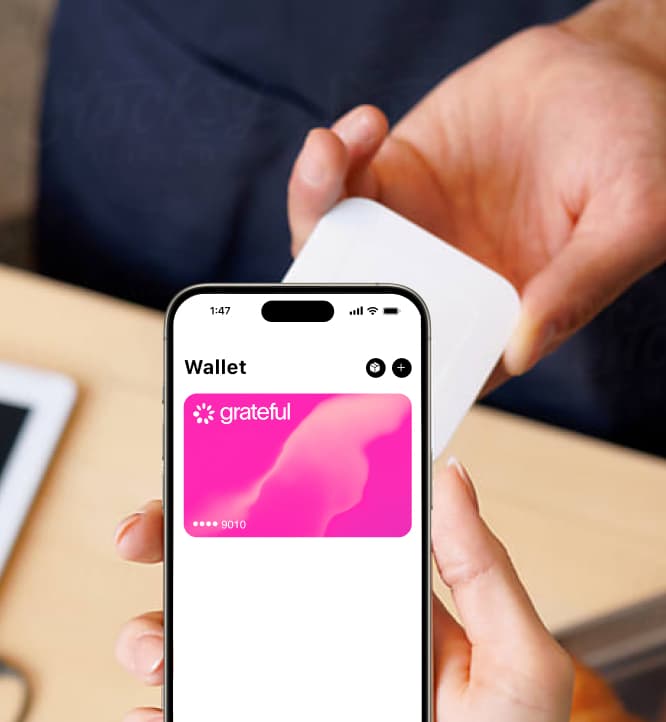
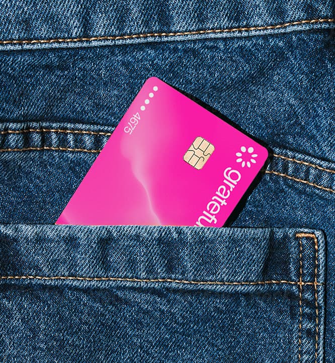
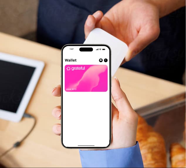
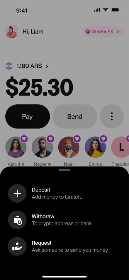
Card
The Grateful card is where the brand becomes tangible. It's the physical and digital object that users carry with them, and it had to feel as distinct and intentional as the rest of the system.
The mesh, our most signature texture, lives on the card surface, making it immediately recognizable as Grateful.
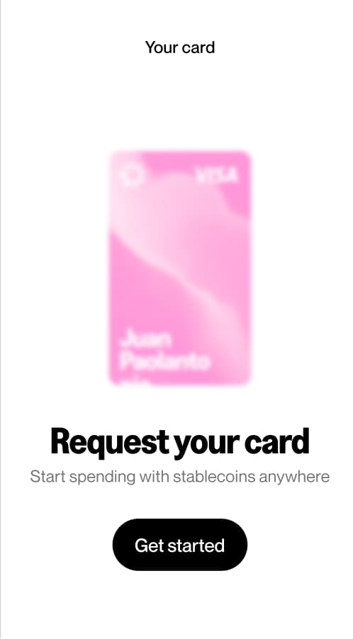
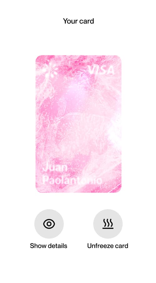
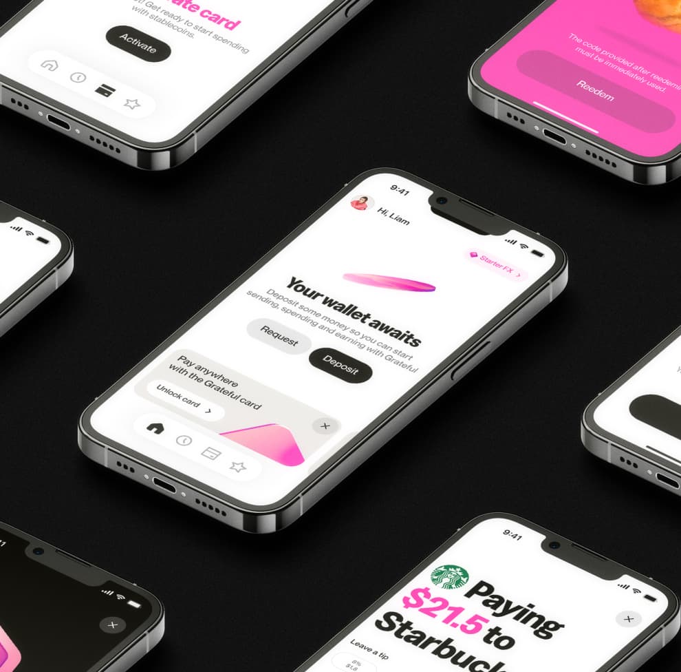
Card App
The card appears across different states within the app: from the initial request screen, where users are prompted to get their card, to the active state with full details visible, frozen, or hidden. Each state is clearly communicated through the card's appearance and the actions available below it.
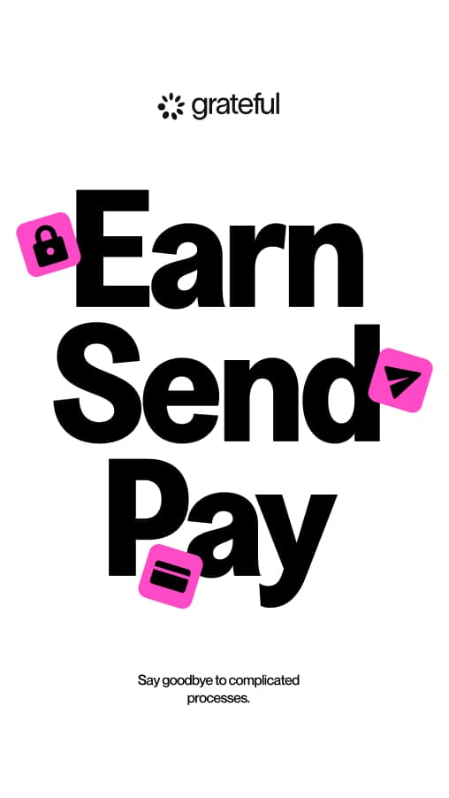
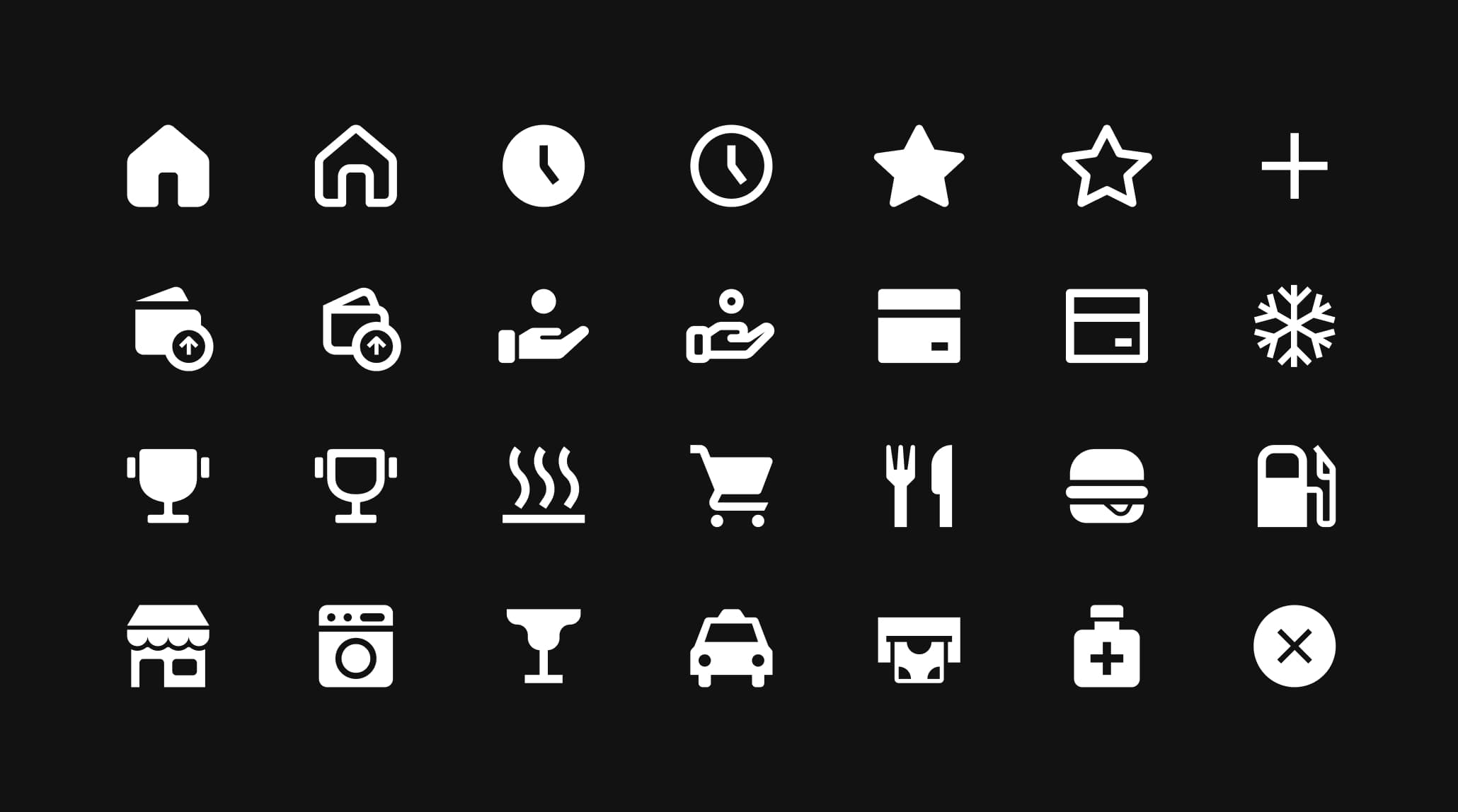
Iconography
The icon set was designed specifically for the Grateful app. It draws from the spirit of our primary typeface, Greed Narrow, borrowing its weight and structure while staying minimal and functional. In a payments app, clarity is non-negotiable, and every icon earns its place by being instantly readable.
Icons come in two styles: filled and outlined. Both versions coexist in the system to support different contexts; filled for primary actions and selected states, outlined for secondary or inactive ones. A strong metaphor is the starting point: intuitive, then refined.

Graphisms
Graphisms are a step beyond standard icons. They're bolder, more playful, and much more closely tied to the Greed typeface personality. Where the icon set stays minimal, graphisms lean into expression. They feel like type turned into shape.
These elements are not used as UI components. Instead, they function as flat illustrations; graphic devices that add personality and visual punch to layouts, campaigns, and communications. They appear on pink backgrounds and in contexts where the brand needs a bolder, more editorial presence.


Illustrations
Grateful's 3D illustrations are built on the mesh texture, carrying the brand's signature material feel even in icon form. Each illustration is rendered with depth, light, and a soft pink fill that ties them directly to the visual system. They add movement and personality wherever they appear.
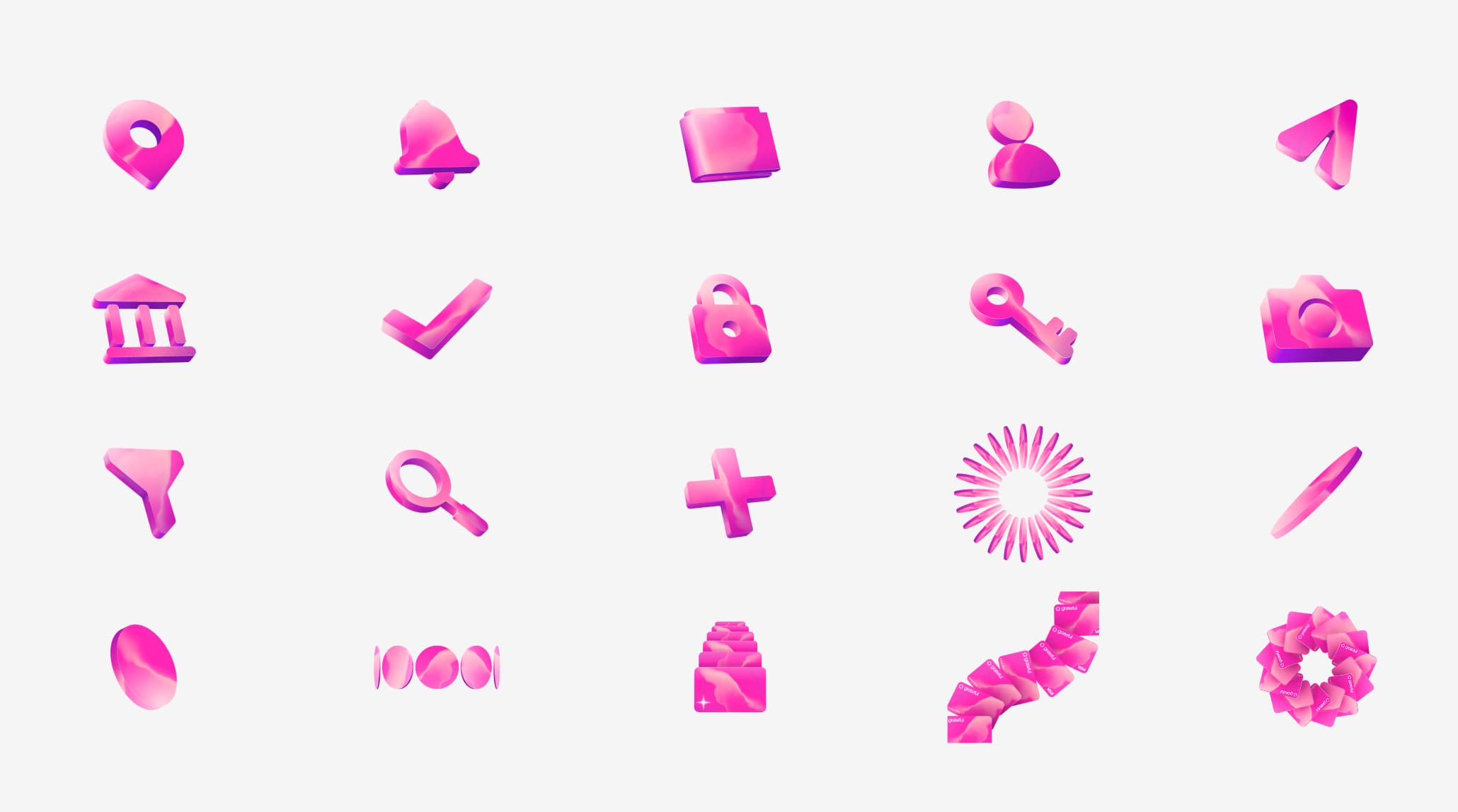

Uses
In the app, 3D illustrations do a lot of heavy lifting: they make features feel approachable, signal rewards and moments of delight, and give the UI a sense of dimension that flat design alone can't achieve. They work alongside typography, with images, and as standalone hero moments.


Objects Mapping
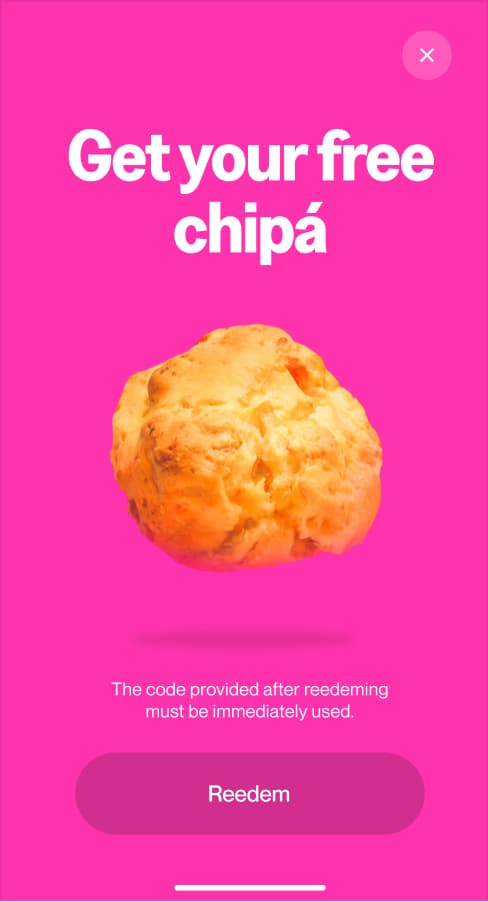
Objects mapping was developed for a specific acquisition campaign within the app. The concept was simple: when users arrived at a participating restaurant or merchant, the app would surface a visual using the exact product from that offer: a sandwich, a drink, a chipa, isolated on a pink background.
Use
This approach made promotions feel immediate and real. Instead of generic coupon UI, users saw the actual thing they were getting. The result was a more visceral, engaging moment that blurred the line between the physical world and the Grateful experience.
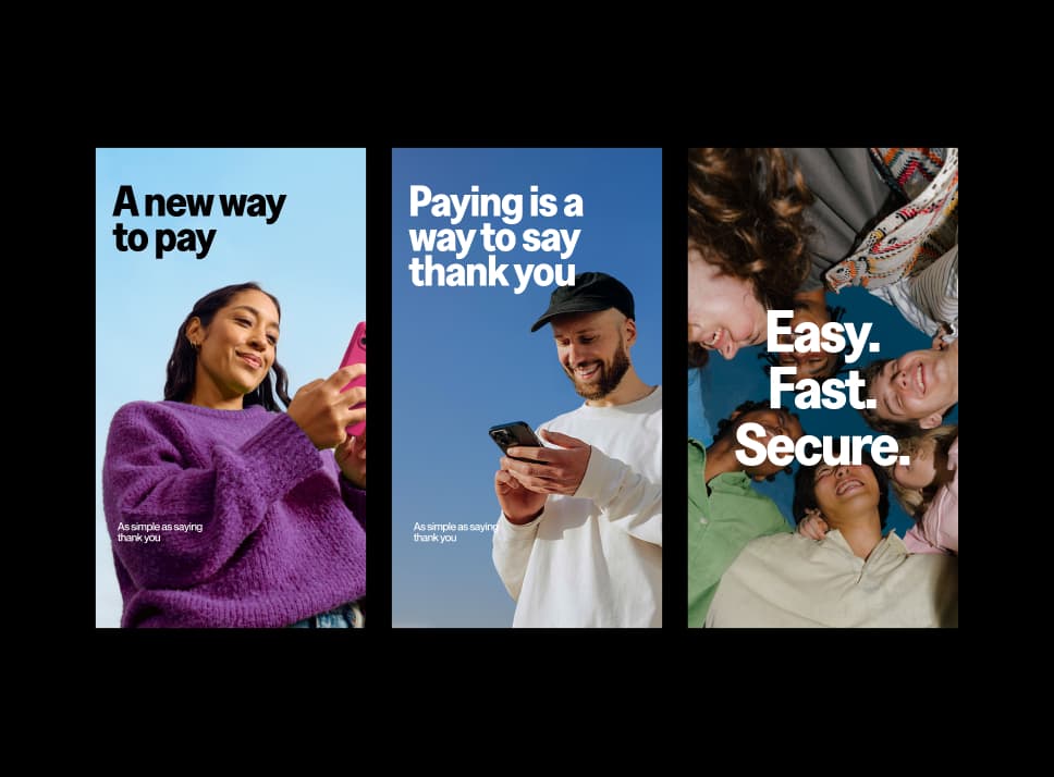
Photography
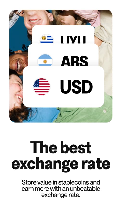
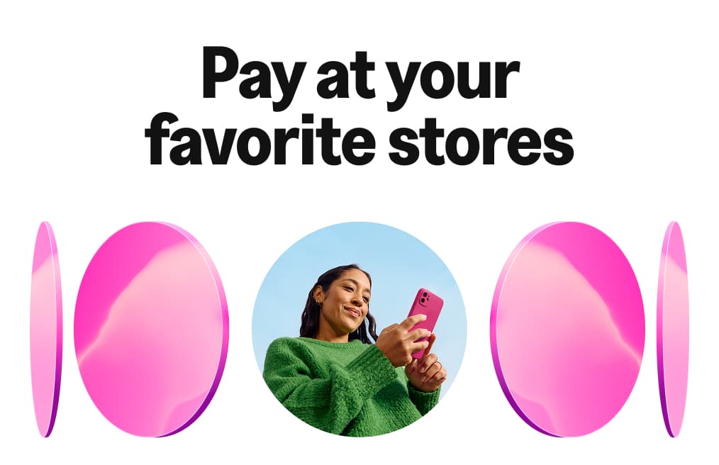
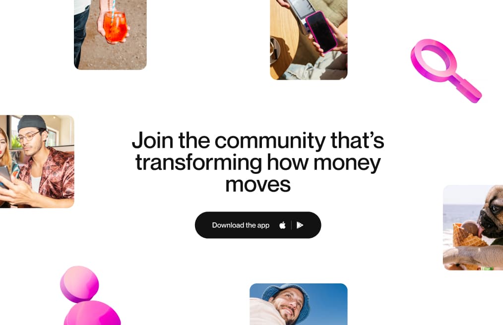
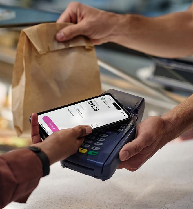
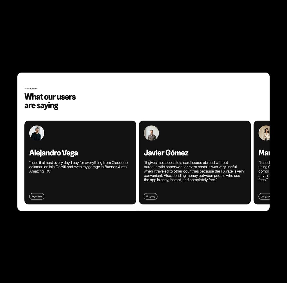
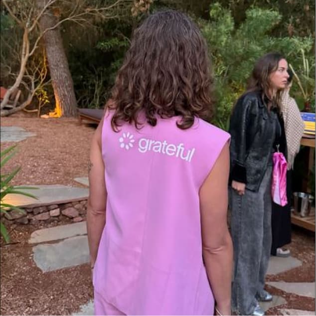
Photography is one of the most human parts of the Grateful brand. Real people, real moments, real energy. No staged setups, no stock perfection. We shoot with strong color, flash, and bold detail to tell stories that feel immediate and alive.
Lifestyle photography captures the spontaneity and energy of life with Grateful. Candid, expressive, and grounded in real connections. Natural expressions over posed setups, authentic gestures over perfect compositions. And when there's an opportunity to be funny, we take it. A dog licking an ice cream cone communicates more joy than any tagline, and that kind of levity is part of who we are.


This style is a full commitment to the brand color. Pink stops being a UI detail and becomes the entire mood. Vibrant, playful, and expressive, these images break away from convention. Pink slides, pink tones on skin, pink environments — it's a way of seeing the world through Grateful's lens.


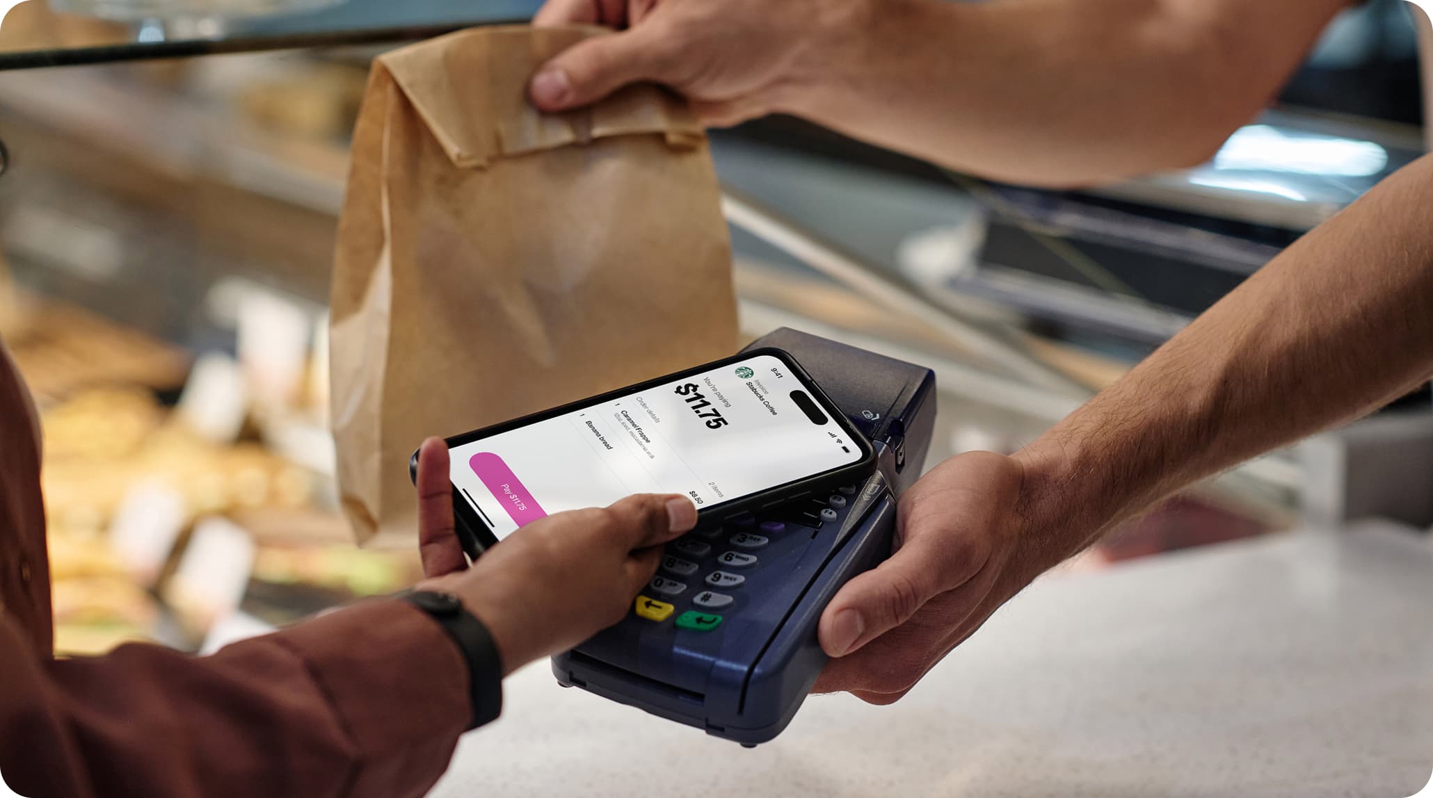
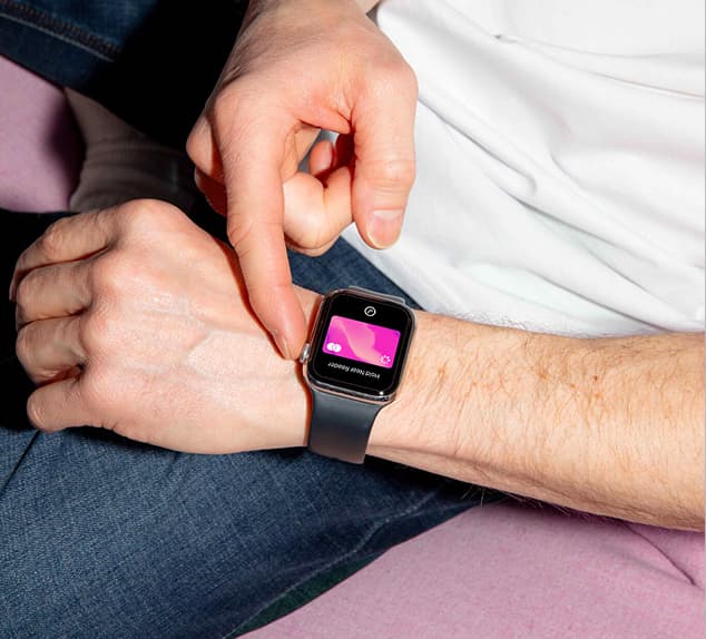
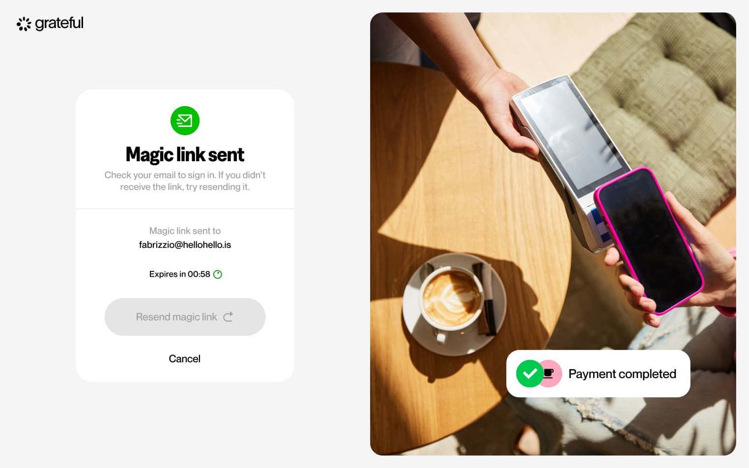
Product photography highlights how people interact with Grateful in real life. From checking balances to making payments, we show authentic gestures and real screens. This makes the product easy to understand, relatable, and directly connected to everyday moments.

Sound
Sound completes the experience.
It reinforces key actions with clear, intentional cues. Nothing is decorative. Every sound signals a moment: confirmation, progress, or reward.
Simple, immediate, and unmistakably Grateful.
Motion
Our motion language reflects how value moves through Grateful. Fluid, intentional, and human.
Dynamic shifts in pace and energy bring emphasis to key moments, adding presence and expression while reinforcing trust, control, and awareness in every exchange.
Motion Principles
Inspired by Grateful's vision of financial empowerment and human connection and rooted in both digital gestures and real-world interactions, these principles create a flexible framework for motion that feels intuitive, fluid, and meaningful across products, platforms, and brand experiences.
Expressive
Motion brings emphasis and presence to key moments. Through dynamic acceleration, deceleration and match cuts, it highlights actions, transitions, and outcomes that matter.
Movement is not neutral — it carries energy, making value exchanges feel tangible and significant.
Natural
Motion follows real world physics. Interactions unfold with continuity and ease, inspired by familiar gestures and behaviours.
Responsive
Motion reacts in real time. Every action is acknowledged instantly, creating a tight feedback loop between the user and the system.
This immediacy reinforces trust, control, and a sense of ownership.
Typography
From functional UI text to more expressive moments, type animations helps make the flow of value clear, immediate, and human.
Text animation follows our motion principles, primarily through expressive and natural behaviors. Strong acceleration brings emphasis to key moments, while smoother ease-out transitions ensure clarity and readability.
This balance creates a system where type feels clear, fluid, and intentionally alive.
Representing the UI
Interactive animations
Interactive animations respond directly to user actions. They provide feedback, guide attention, and make the product feel tactile and alive.
3D motion
Motion principles extend into the 3D visual language, creating a cohesive system across product and brand.
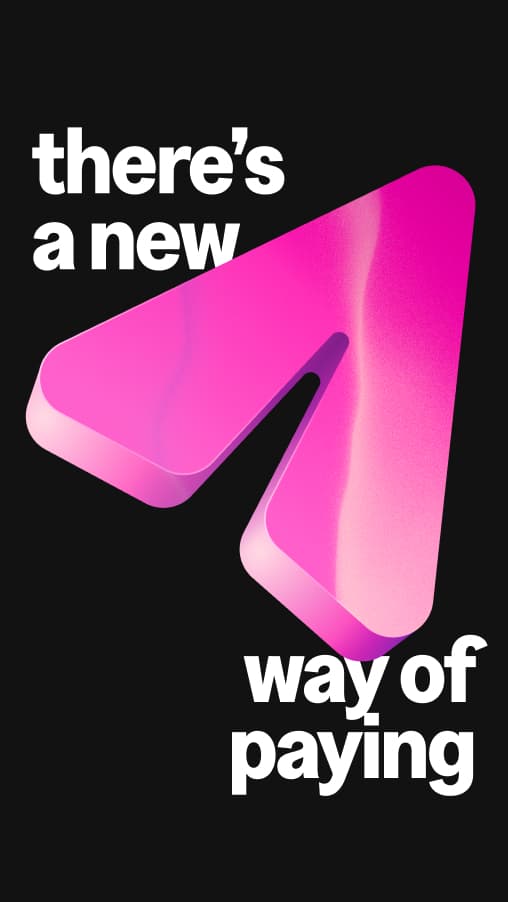
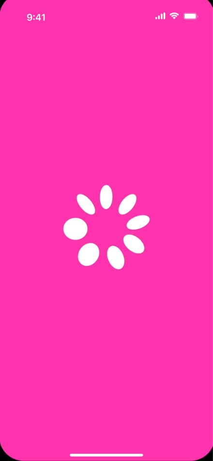
Logo mark
The way our logo moves reflects how value flows through Grateful. Clear, intentional, and alive.
Our logo animation distills our motion principles (expressive, natural, and responsive) into a simple, memorable gesture across product and brand. Through controlled acceleration and release, the logo arrives with clarity, reinforcing trust, completion, and continuity.
A seamless exchange, resolved with purpose.
Voice & Tone
Grateful's voice brings our brand to life through every word we write. The way we communicate shapes how people relate to money, payments, and each other.
Grateful was born to challenge the status quo and reframe finance from a human perspective. Our voice reflects that mission: direct, warm, and transparent, always honest about what Grateful is and what it can do for everyone.
Our voice
We have core principles that guide us so that no matter who is writing or where Grateful shows up, we sound like ourselves. These principles are rooted in our brand pillars: Game-changing vision, Rewarding value(s), Transformative power, and Delightful simplicity.
We tell it like it is. Finance has been a maze designed for the few: small print, hidden fees, arbitrary limits. Grateful exists to change that. We say what we mean, clearly and completely. We never bury important information or leave users guessing. Clarity is the first act of respect.
Transparent
Confident
Simple
Purposeful
Empowering
Jargon-heavy
Arbitrary
Complicated
Vague
Permissive
Grateful was created to connect businesses and people through reciprocity, so communities can grow and strengthen. We believe transparency, empathy, and gratitude should guide everything, making freedom an option for everyone. We write as humans, for humans. Tech with empathy, that is who we are.
Empathetic
Inclusive
Reciprocal
Joyful
Accessible
Transactional
Cold
One-sided
Indifferent
Elitist
Every payment is an act of recognition: you acknowledge the value of what you receive and recognize yourself. We believe payments are more than transactions. There is value in everything we receive. Gratitude in every transaction makes it possible to give more and receive more. This is how we connect value to human values.
Humble
Resilient
Generous
Reciprocal
Purposeful
Hollow
Indifferent
Extractive
One-directional
Performative
Our tone
Our voice is always Grateful, but our tone shifts with context. We use word choice, structure, and phrasing to adapt our voice to each moment. Adjusting tone shows users we understand them. It signals empathy, builds trust, and deepens the relationship.
When adjusting our voice or toning it down, ask yourself:
1. What should this writing accomplish?
2. What moment in the user journey are we writing for?
3. Who are we talking to, and how are they feeling right now?
We use the customer journey to guide tone. Every interaction has a purpose and is part of something bigger.
• App Store
• Campaign Landers
• Campaign landers
• App store
• Onboarding Emails
• Tooltips
• New-user states
• Transactional Email
• Notifications
• Lifecycle marketing
• Event marketing
• Chatbot
• Error Messages
• Error states
• Chatbot
• Transactional email
• Lifecycle marketing
• Logged out state
• Time out
• Footer
Brand in use
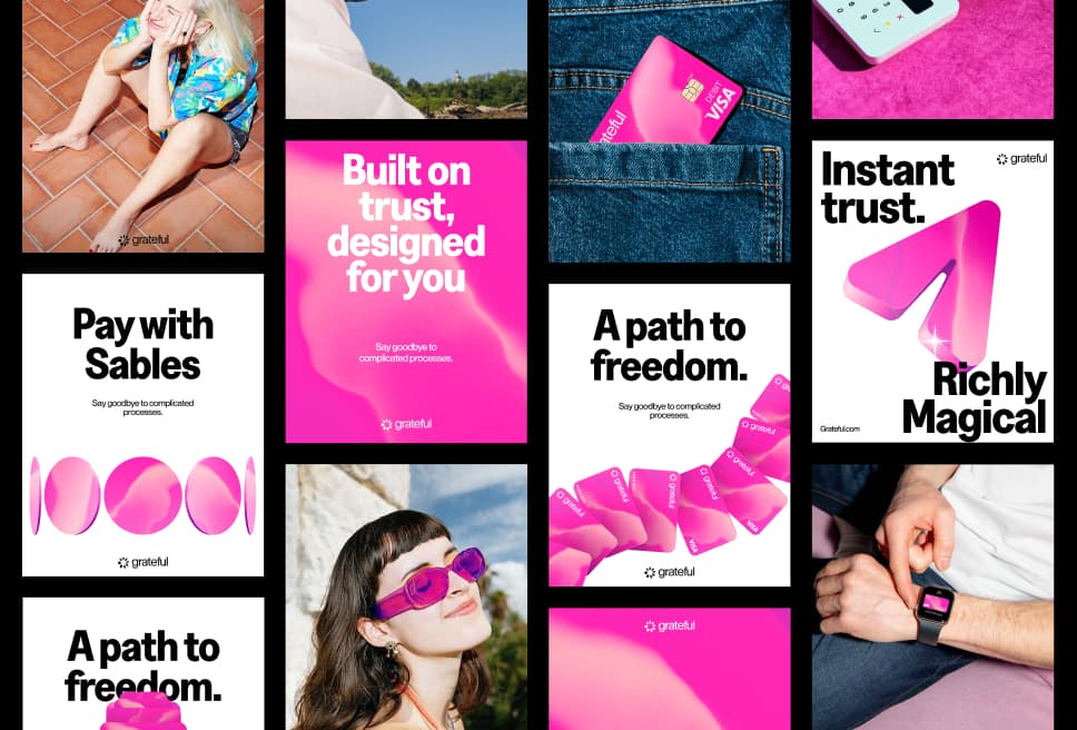
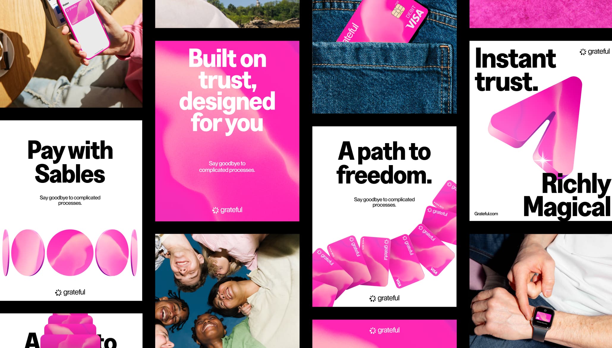
This section shows the brand working across the full range of touchpoints where Grateful shows up. Digital and physical, screen and print, campaign and product. Each application is different, but the system holds: the same color, the same energy, the same unmistakable character.
Seeing the brand in use is the best way to understand how the pieces connect. The mesh on a card, the pink on a poster, the typeface on a screen. When everything speaks the same language, even a new format feels instantly like Grateful.
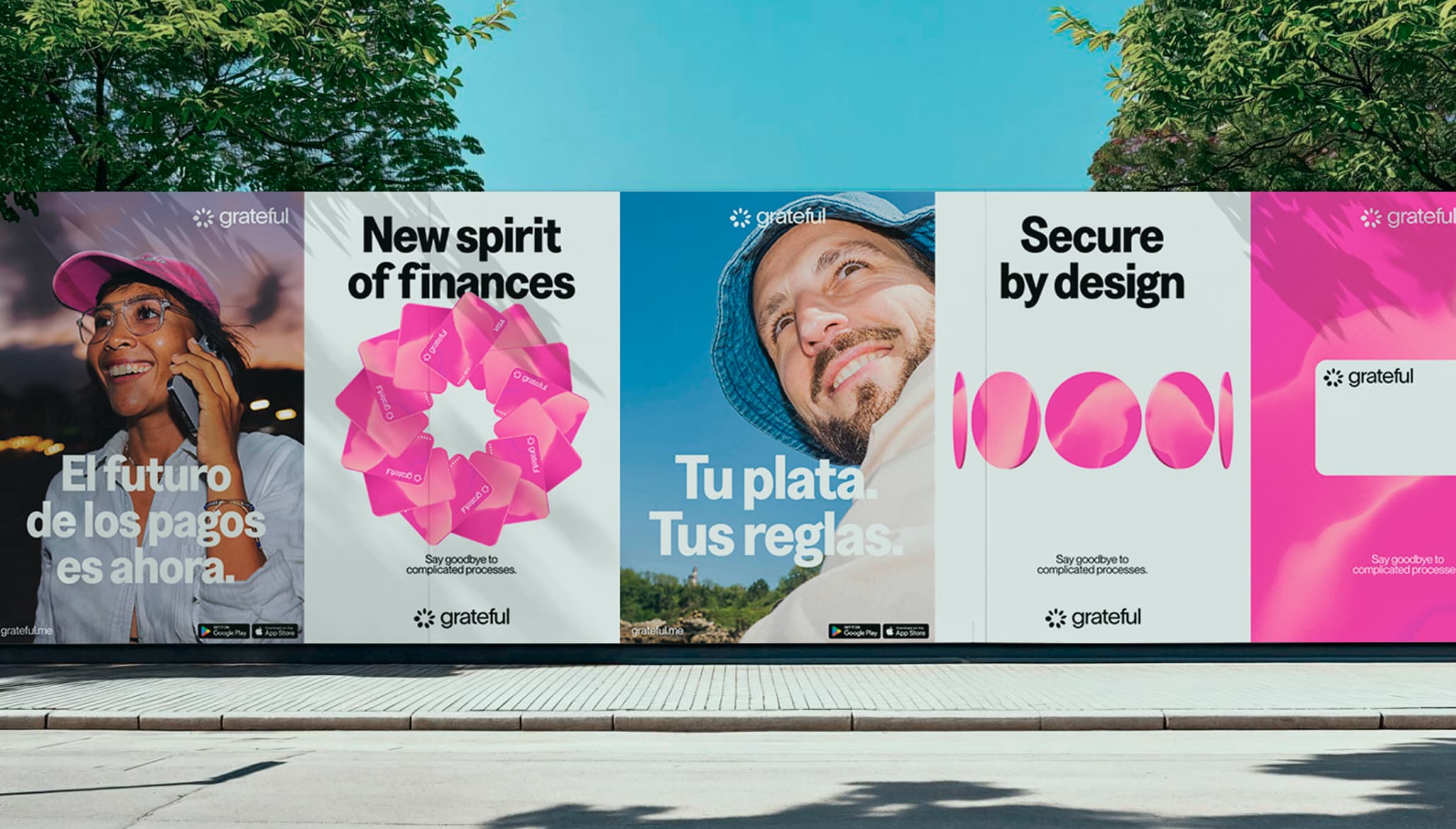
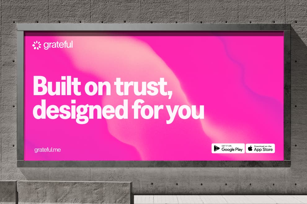
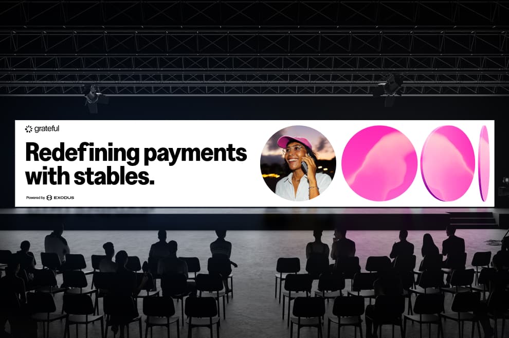
Billboards & Large Formats
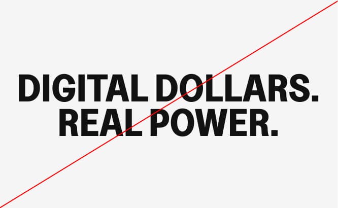
In large-scale applications, the brand becomes bold, immediate, and unmistakable. Strong typography, clear messaging, and high-contrast compositions ensure visibility at a distance.
Layouts are designed to capture attention quickly while remaining easy to read. The system balances impact and clarity, allowing the brand to stand out in dynamic, public environments.
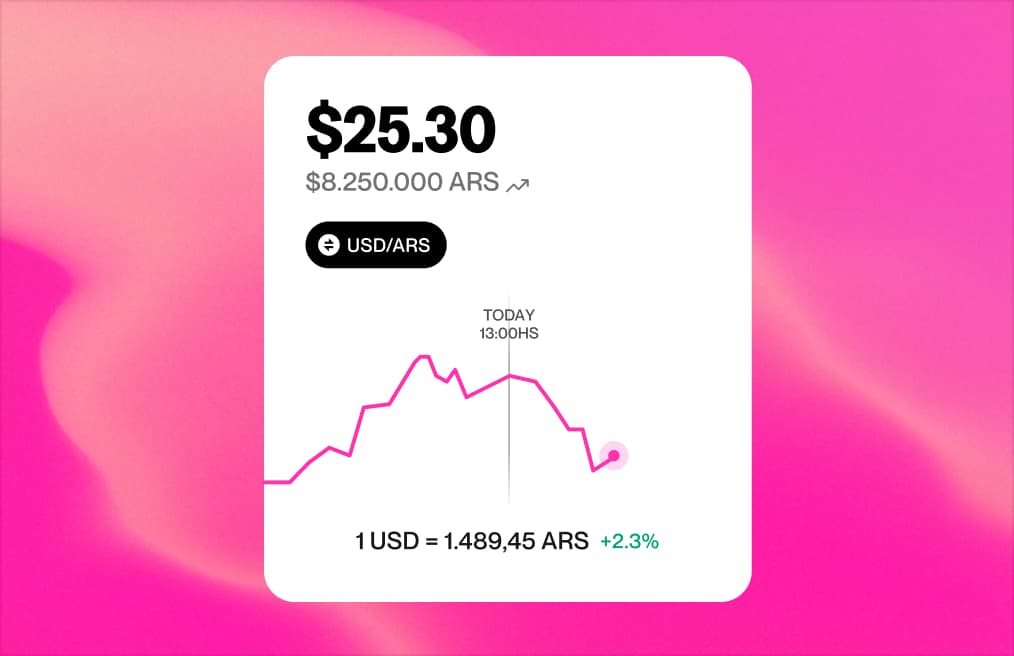
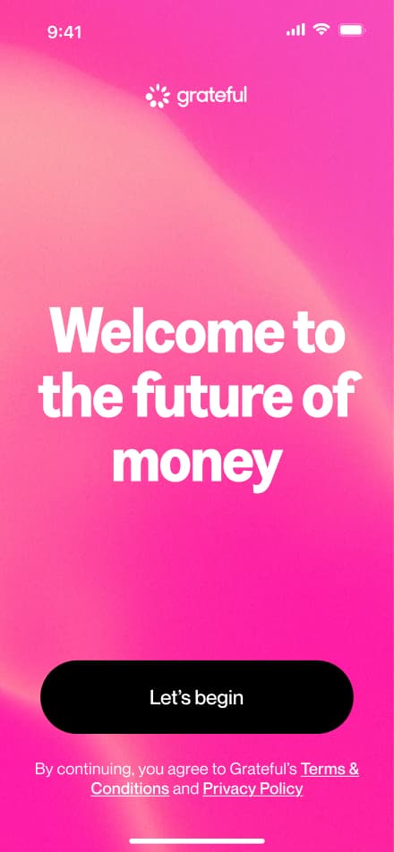
Product & App
Inside the product, the brand becomes more functional and intimate. Every interaction is designed to feel simple, clear, and natural.
Typography, color, and motion work together to guide users without friction. The experience prioritizes usability while maintaining the same visual identity, ensuring the product feels consistent with the broader brand.
Additional Attributes
Rounded corners and stencil breaks are recurring details. While not used in every icon, they should be included where they naturally make sense.
Web
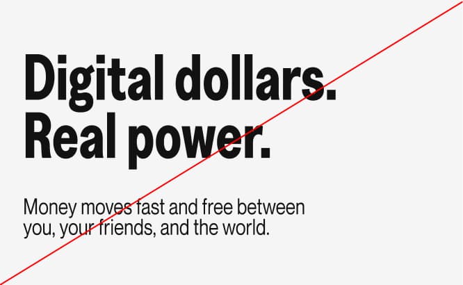
The web brings the full Grateful experience together, combining product clarity with a more expressive and human tone.
Content flows in a simple and intuitive way. Bold headlines highlight key ideas, while supporting text adds context without overwhelming. Real-life imagery and graphic elements work together to create a system that feels both functional and distinctive.
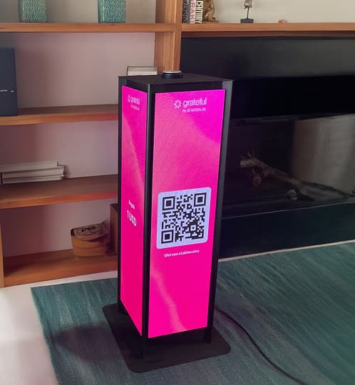
Real World & Activations
In physical spaces, the brand becomes tangible and social. From print to environments, every application translates the digital system into real-world experiences.
Materials, scale, and context introduce variation, but the identity remains consistent. The result is a brand that feels natural, present, and recognizable across everyday moments.


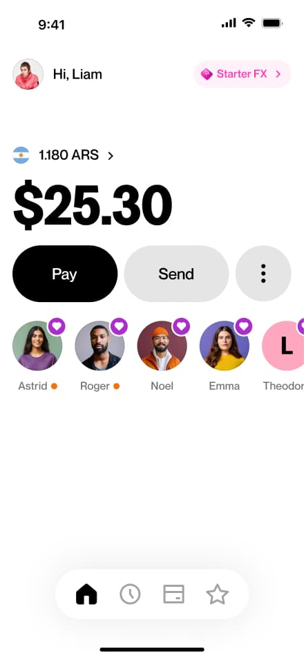
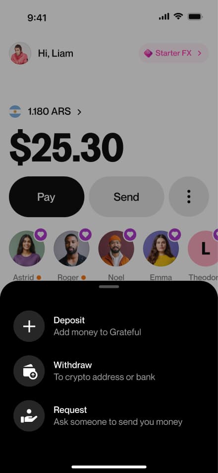
App Flows
Explore the key user journeys that bring the app experience to life. This section documents the core interaction flows across the main features, focusing on the happy path. Each flow is presented in a screen-by-screen format to provide a clear and detailed view of the interface, navigation patterns, and design decisions that shape the overall user experience.
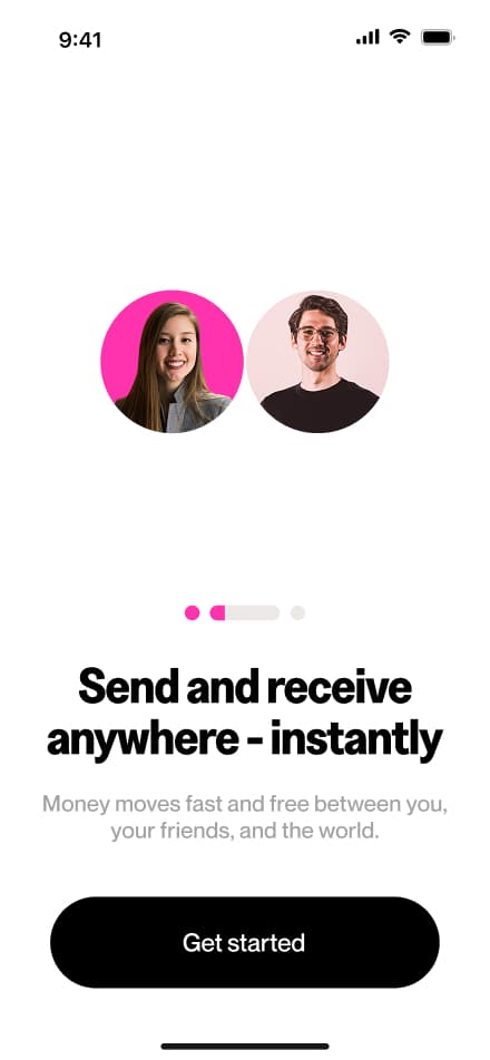
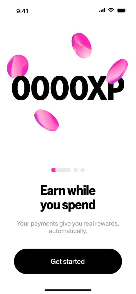
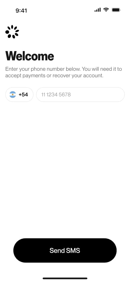
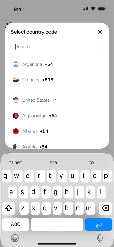
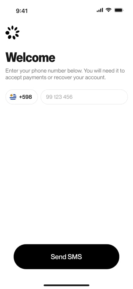
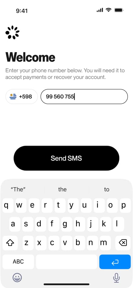
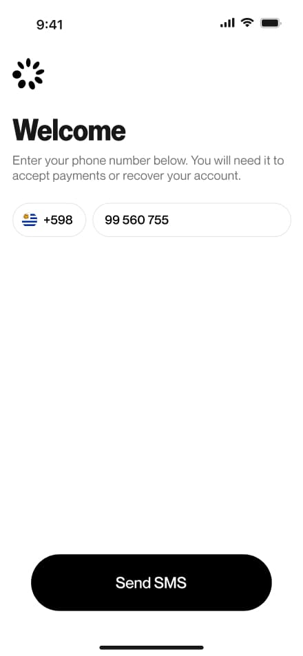
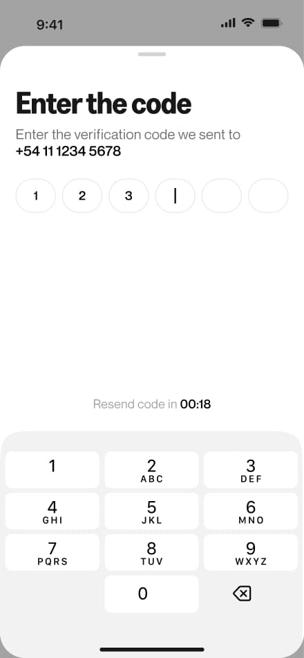
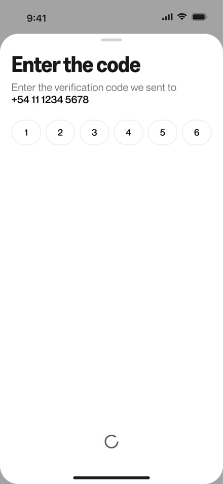
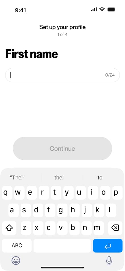
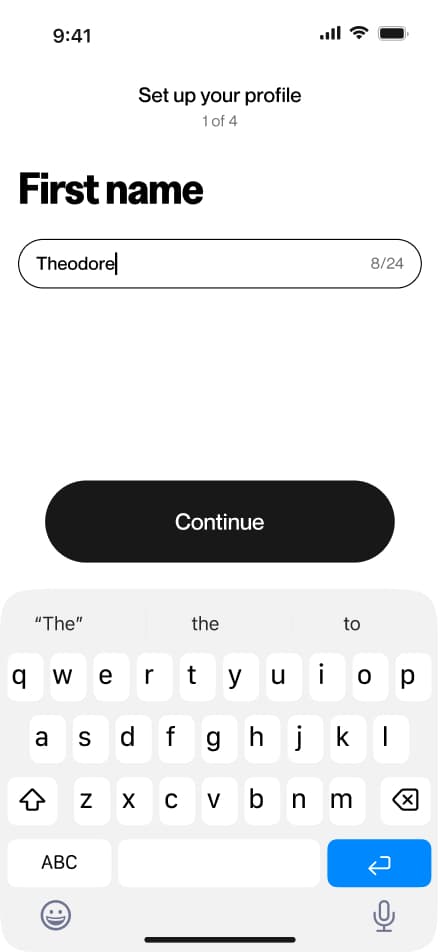
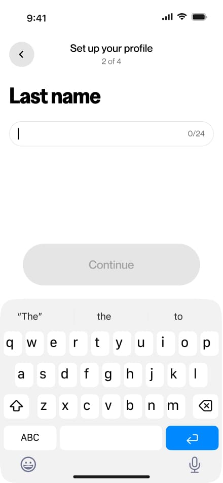
Onboarding
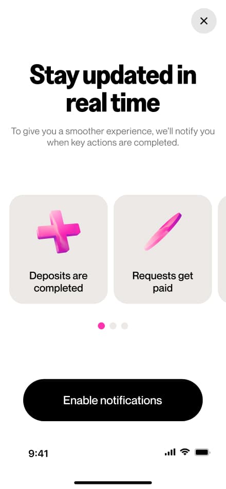
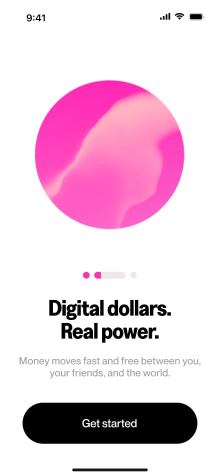
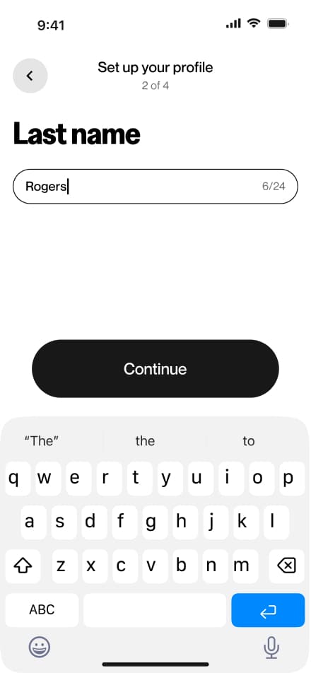
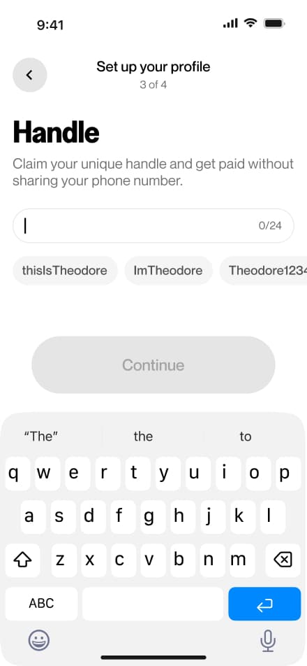
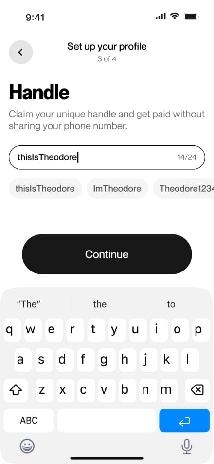
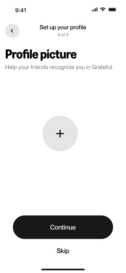
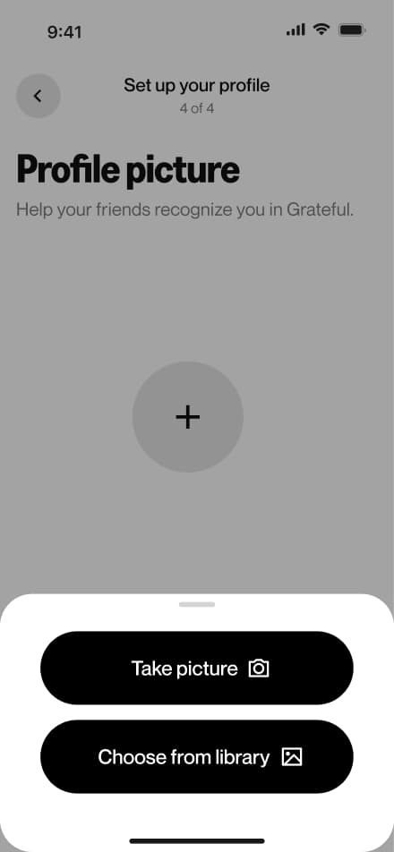
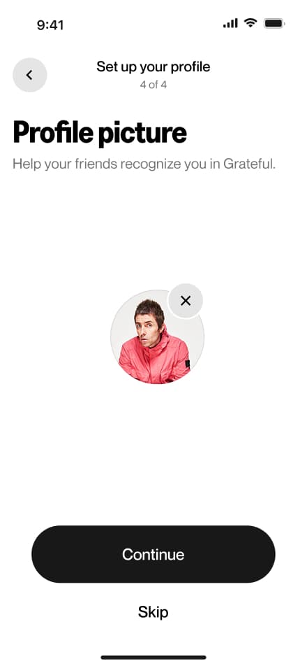
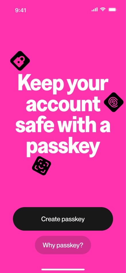
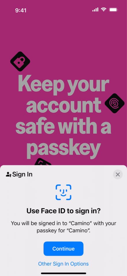
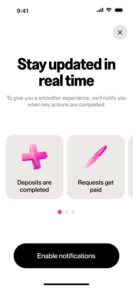
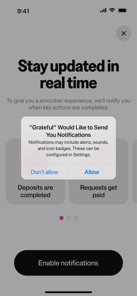
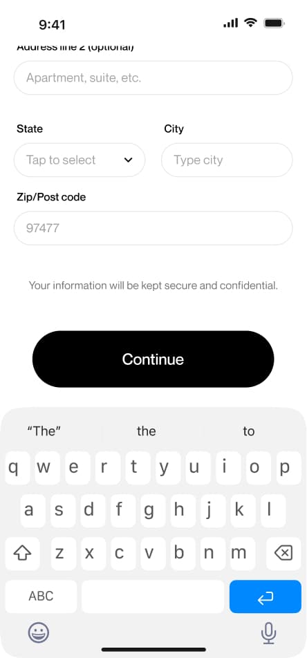
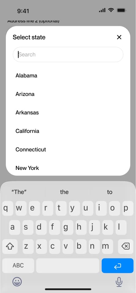
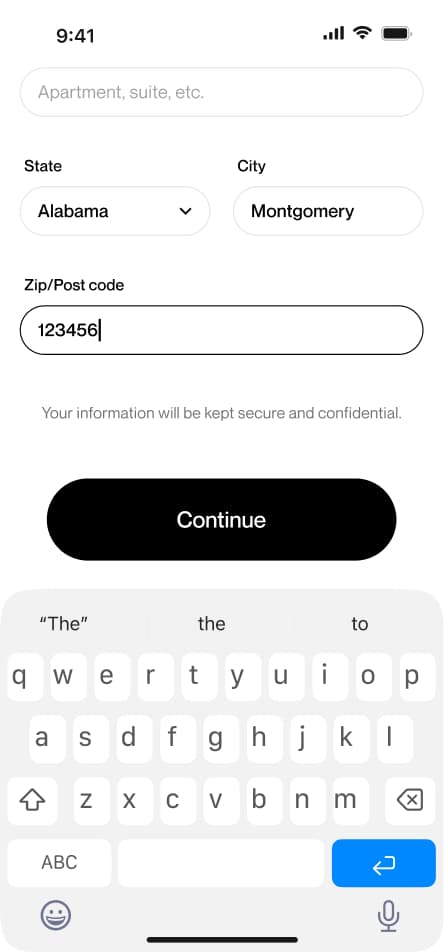
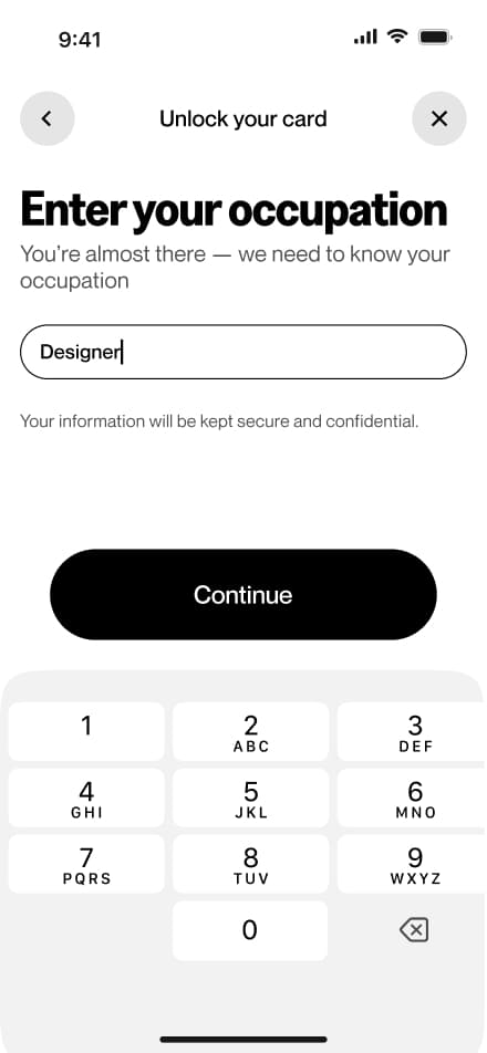
32 screensThe onboarding flow guides new users through the initial setup of their account. After signing up, users are prompted to complete their profile by providing basic personal information, uploading a profile picture, and selecting their preferred currency and region.
 Download PDF


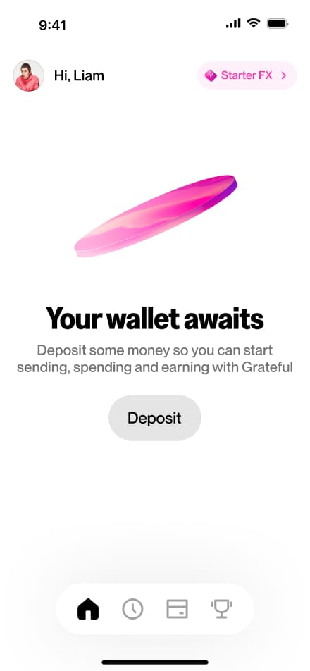
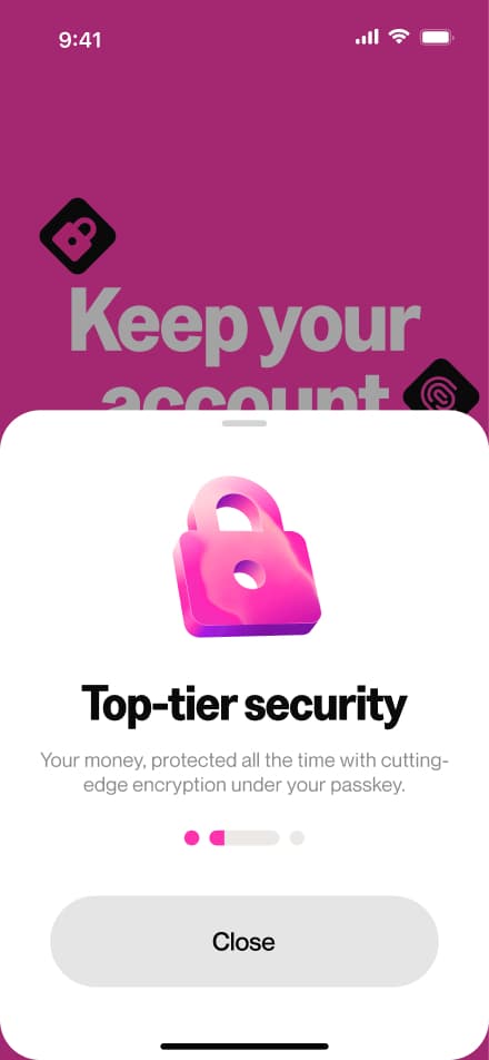
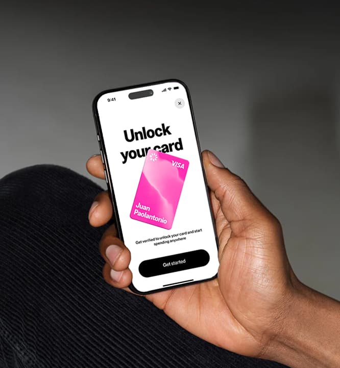
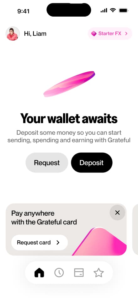
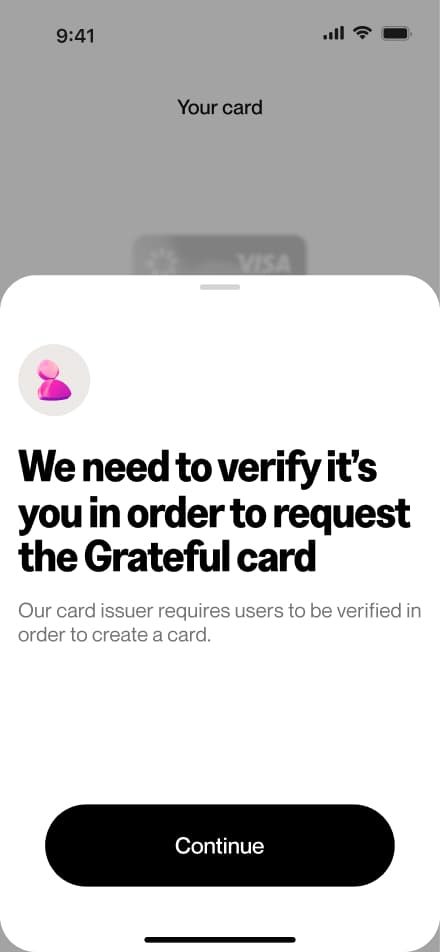
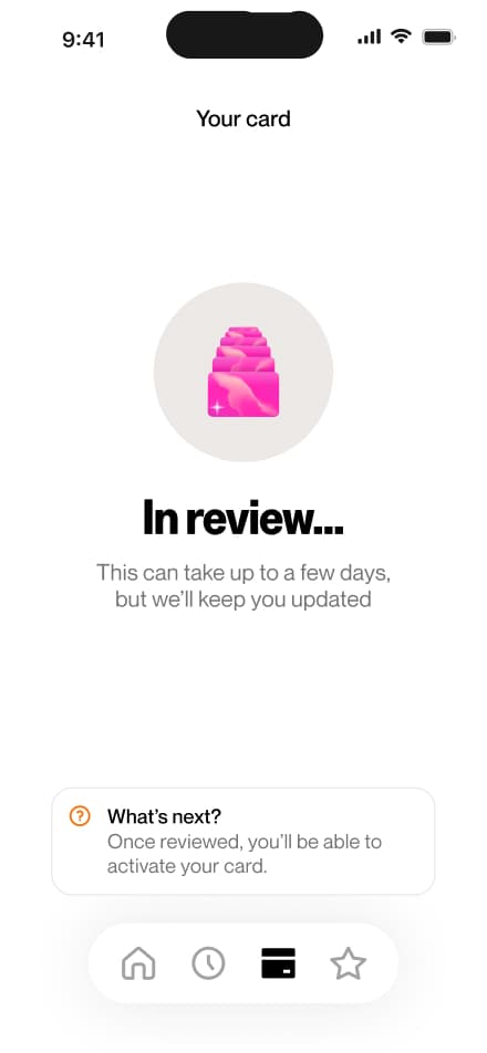
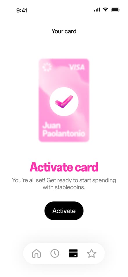
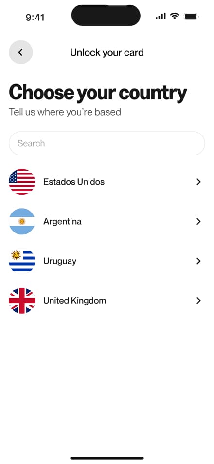
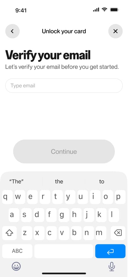
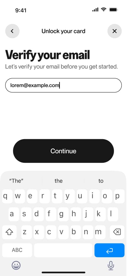
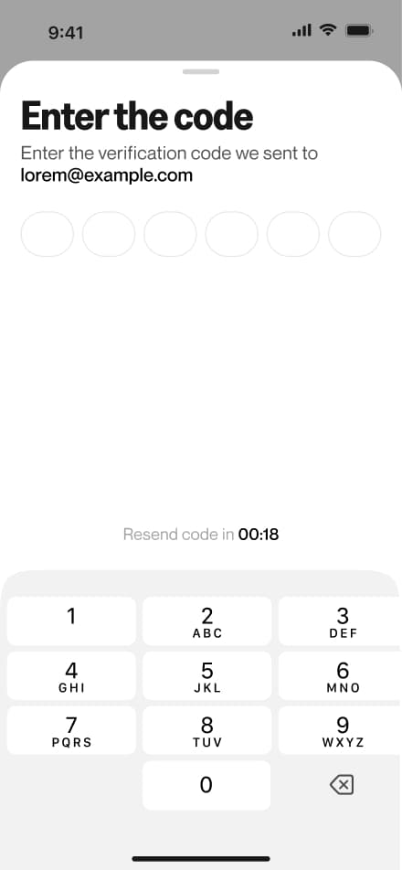
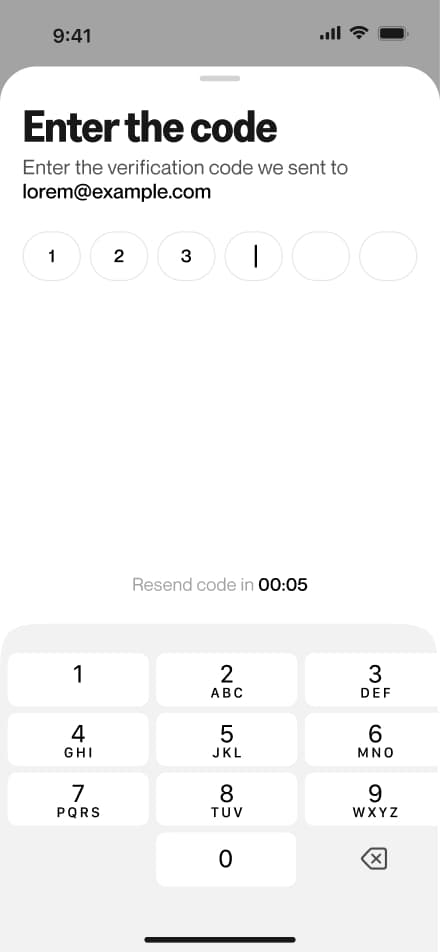
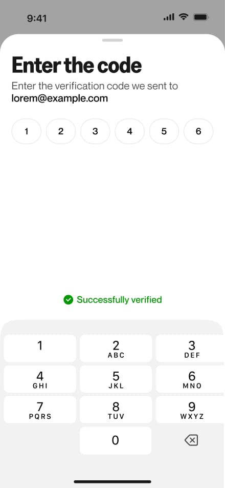
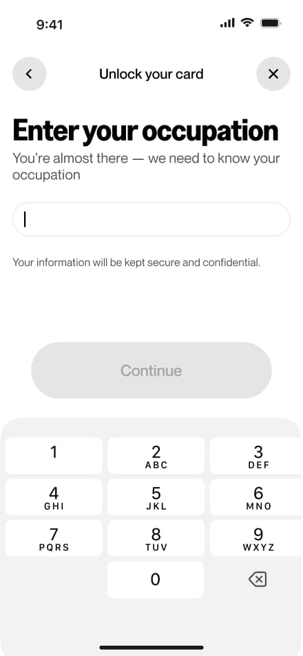
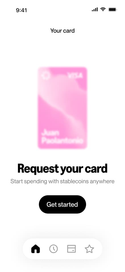
Request card
6 screensThe Request Card flow covers the process of applying for a virtual card. Users navigate to the Card section and submit a request, which triggers an identity verification prompt if KYC hasn't been completed yet. Once verified and approved, users can activate their new virtual card.

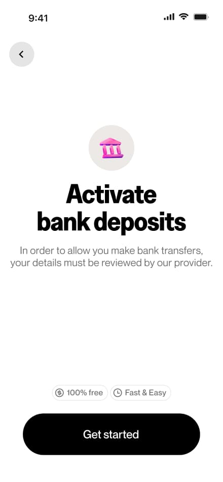
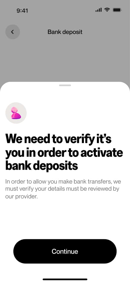
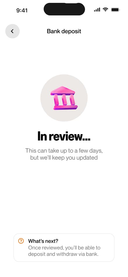
Activate bank transfers
6 screensThe Activate Bank Deposit flow covers the process of enabling bank deposits within the app. Users navigate to the Bank Deposit section, where they are prompted to complete identity verification if not yet done. Once the KYC review is approved, bank deposits become available.


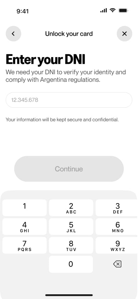
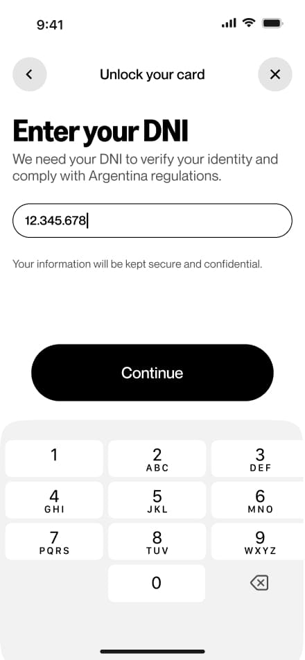
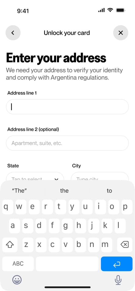
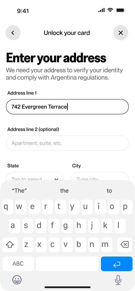
Verify your identity
15 screensThe KYC flow walks users through the identity verification process required to unlock the app's full financial features. Users are prompted to upload a valid government-issued ID and complete a facial recognition check via selfie.
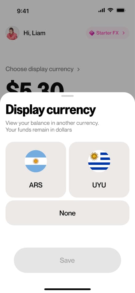
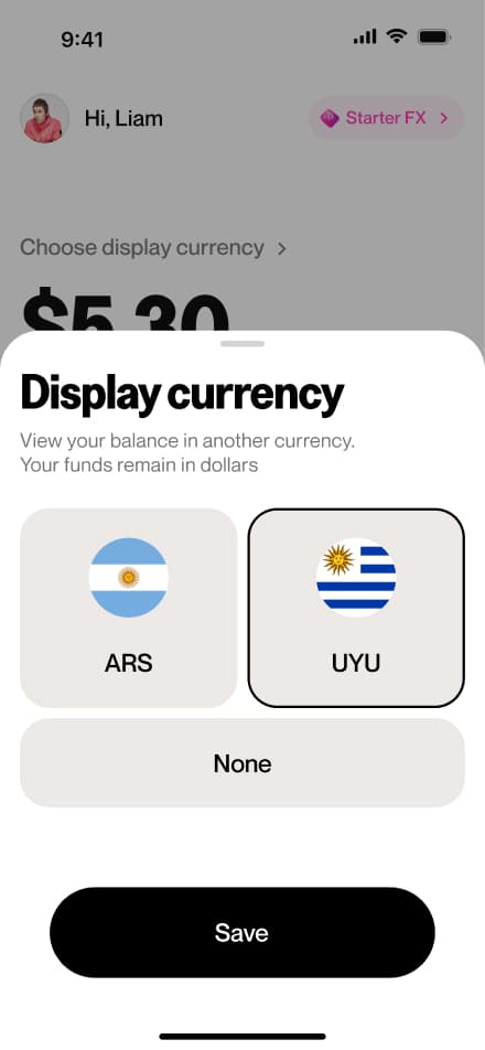
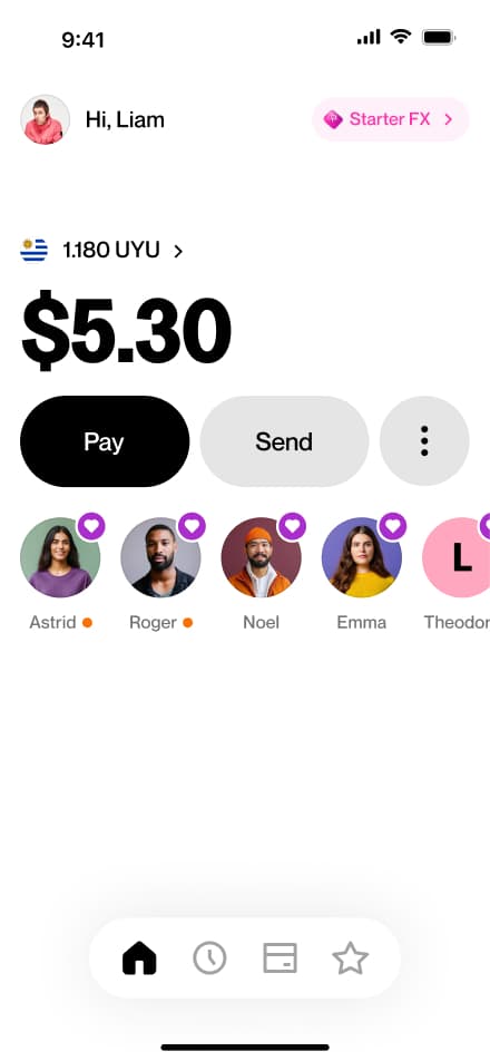
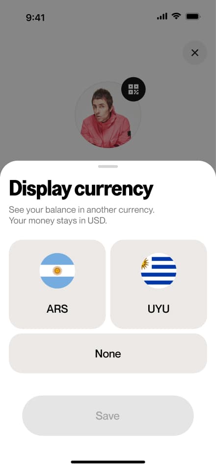
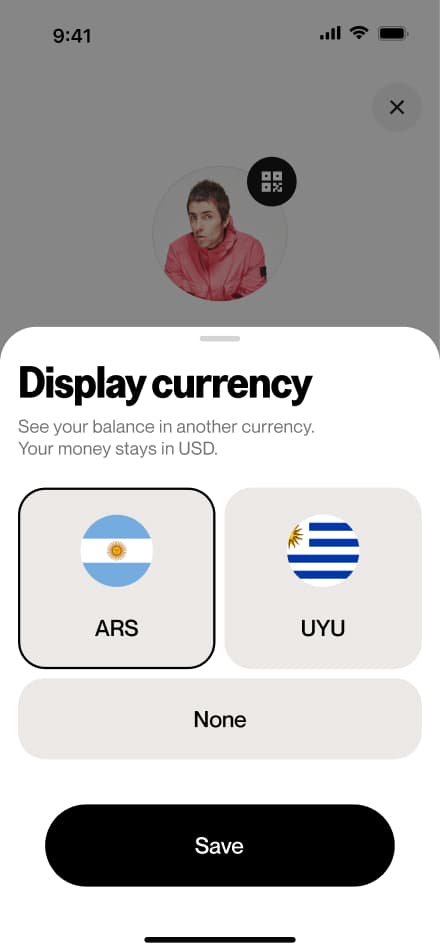
Setting a display currency
4 screensThe Setting a Display Currency flow allows users to choose a secondary currency in which to view their balance. Users access the setting from the home screen and select their preferred display currency.

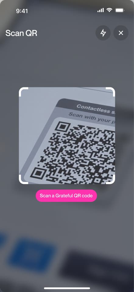
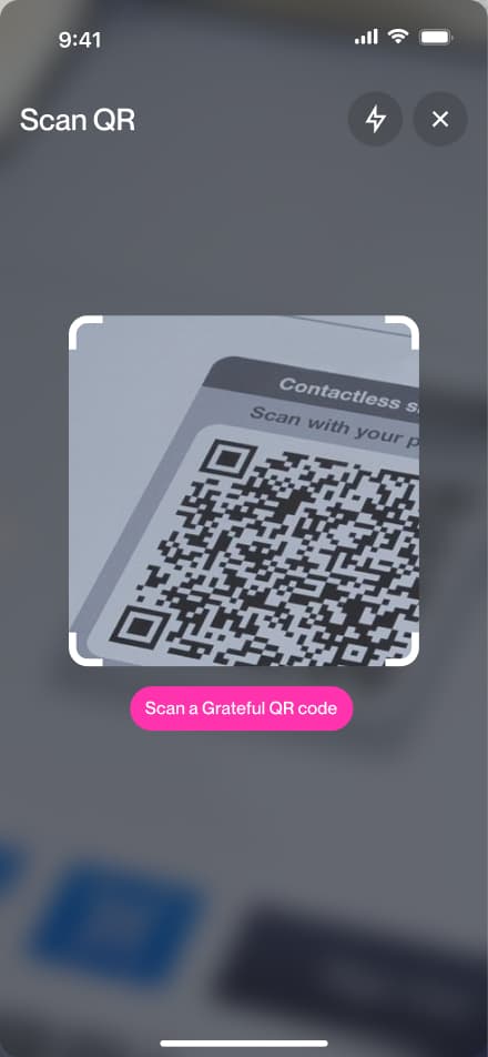
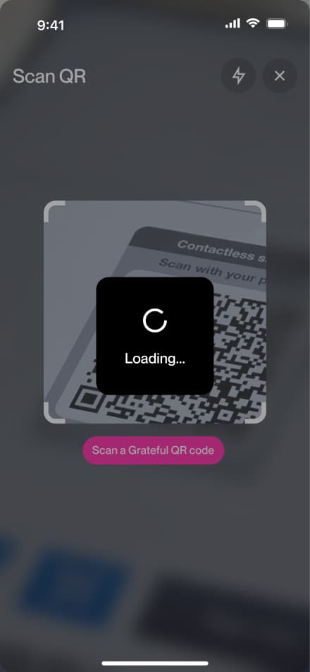
Pay via QR
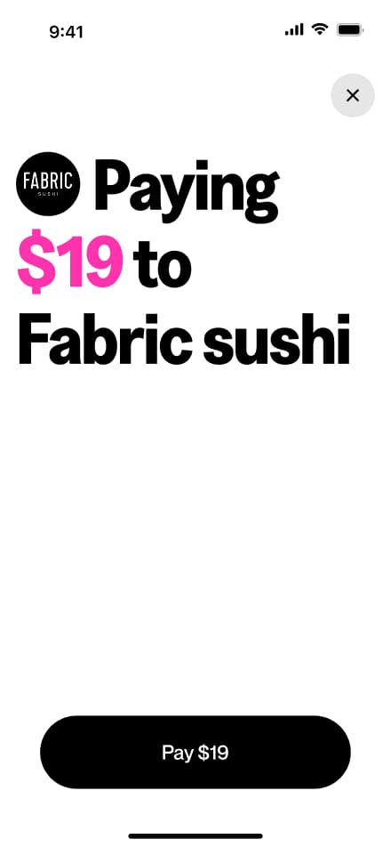
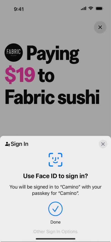
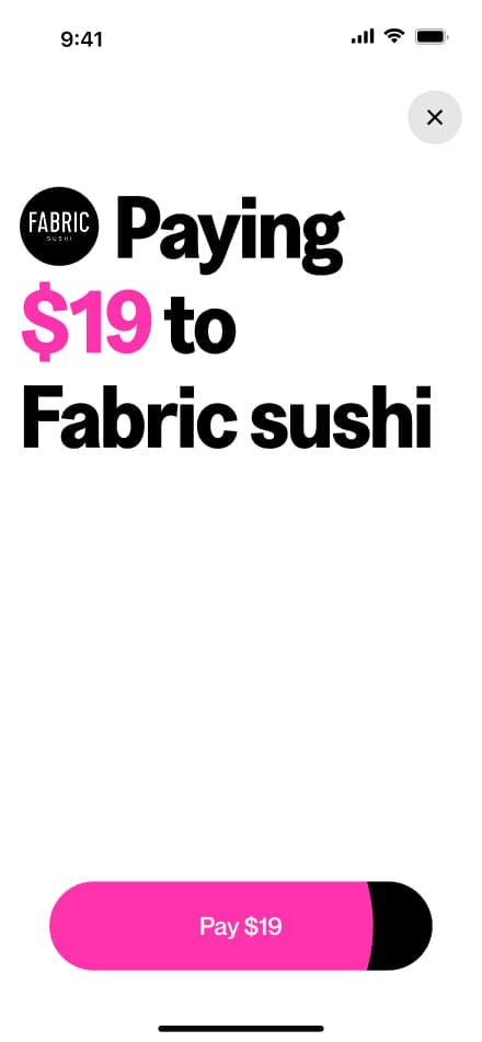
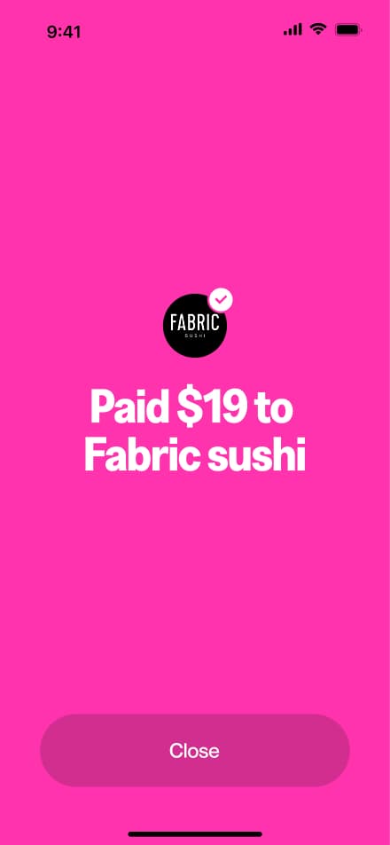
6 screensThe Pay via QR flow allows users to make payments by scanning a Grateful QR code. Users scan the code, review the payment amount, and confirm the transaction.


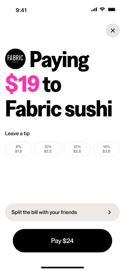
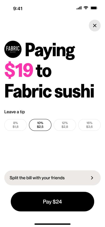
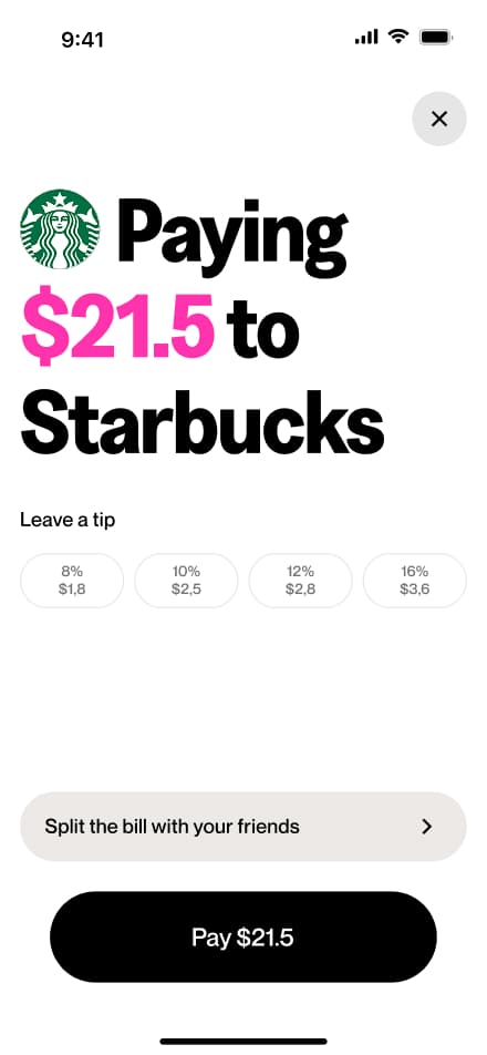
Add a tip
4 screensThe Add a Tip flow allows users to include a tip when paying via QR. During the payment process, users can select or enter a tip amount before confirming the transaction.


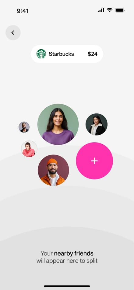
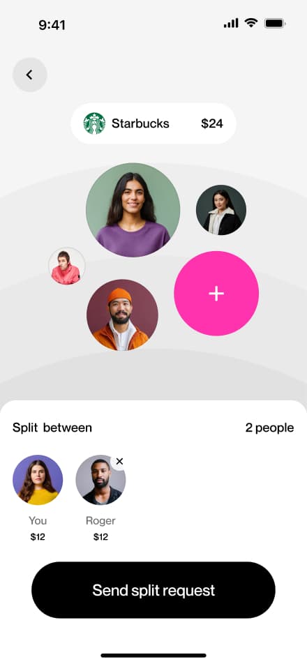
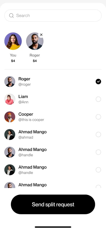
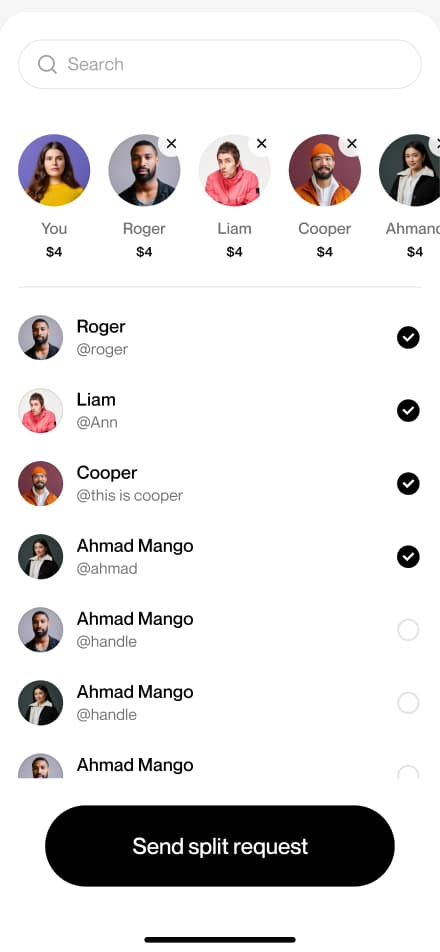
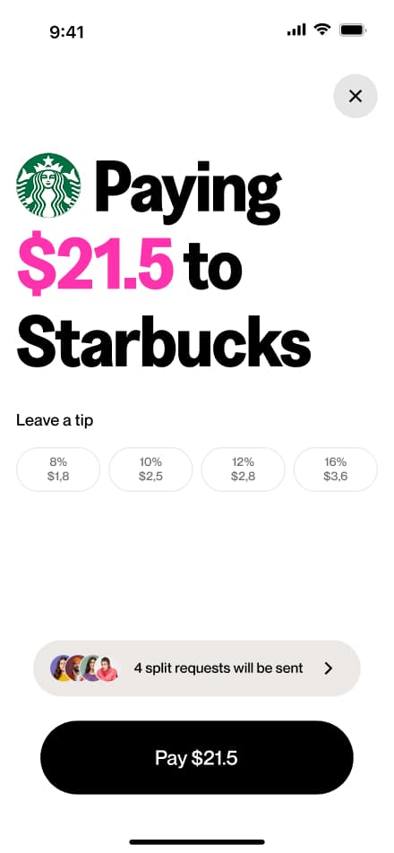
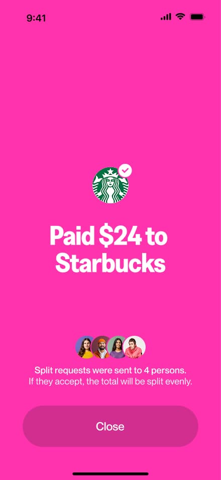
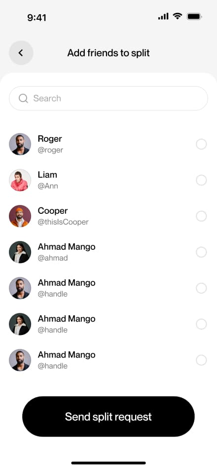
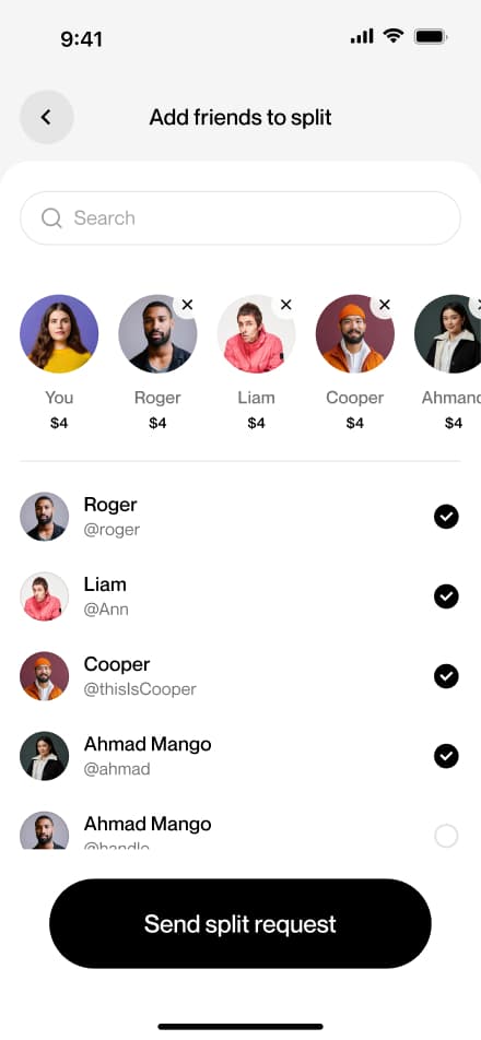
Split pay
10 screensThe Split the Bill flow allows users to divide a QR payment equally among multiple people at the time of purchase.


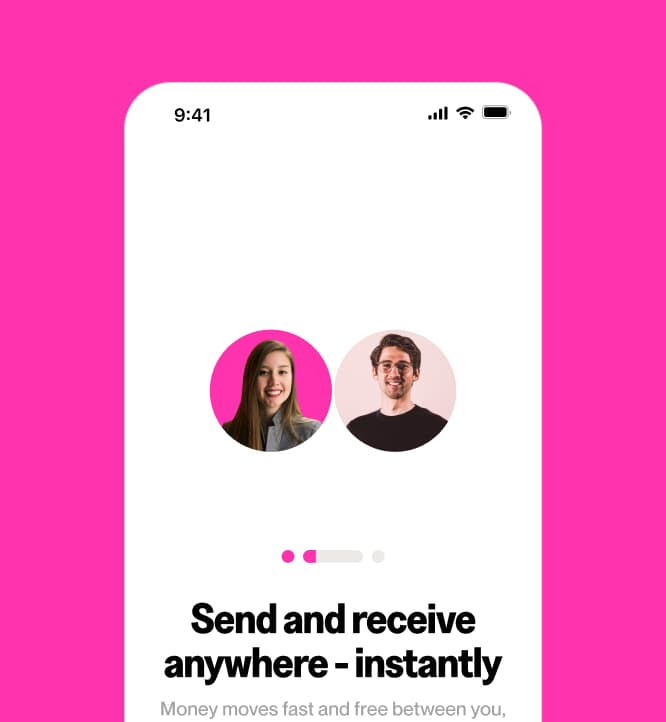
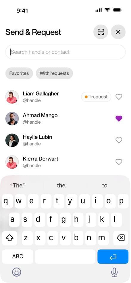
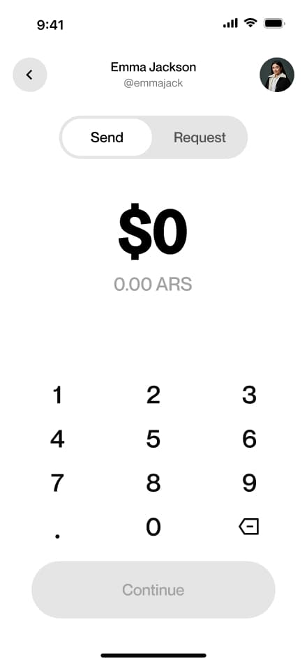
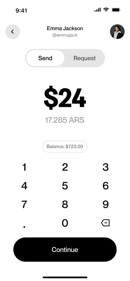
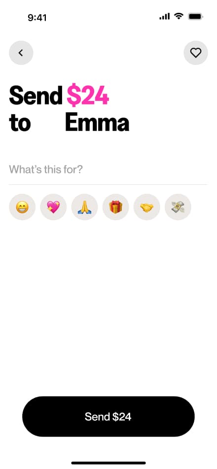
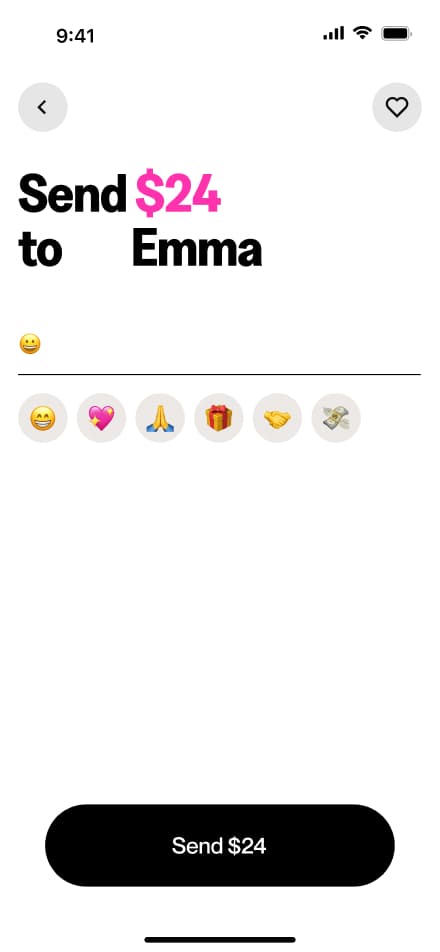
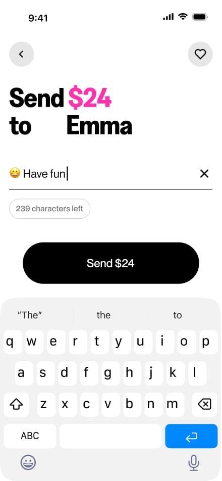
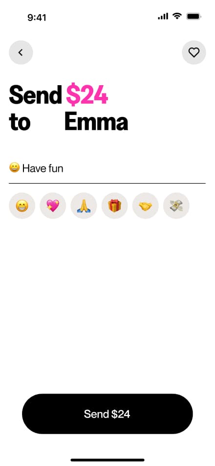
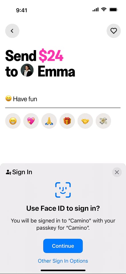
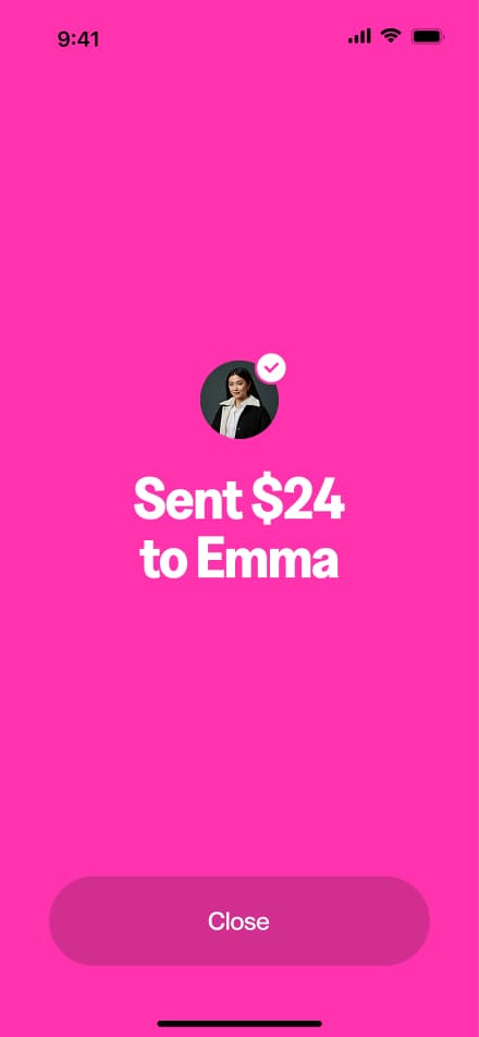
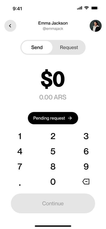
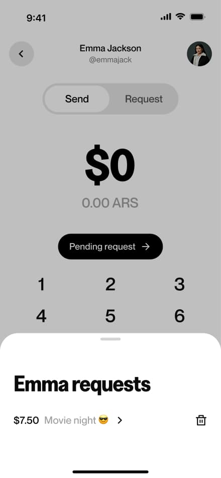
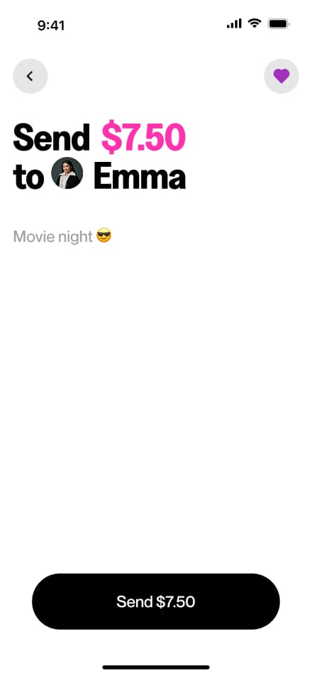
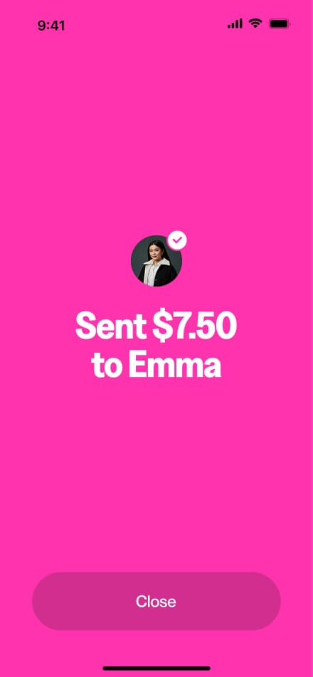
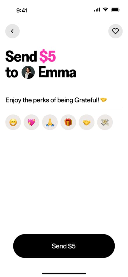
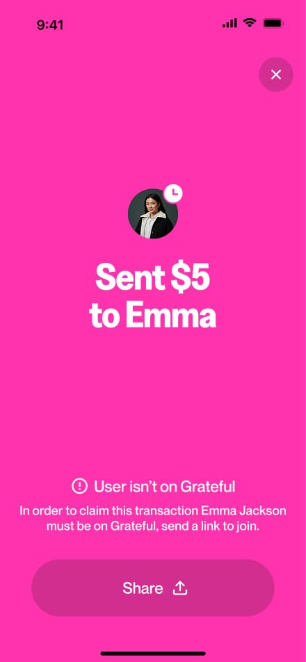
Send money
12 screensThe Send Money flow allows users to transfer funds to other users. Users select a recipient, enter the amount, add an optional note, and confirm the transaction.


Send request
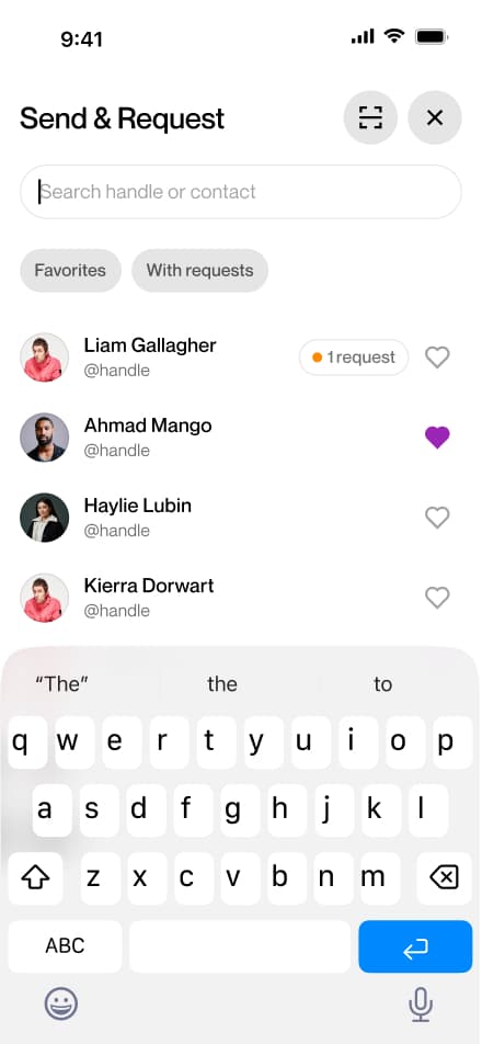
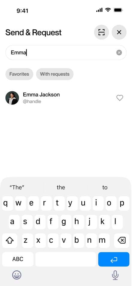
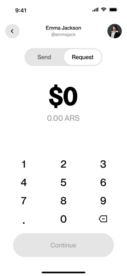
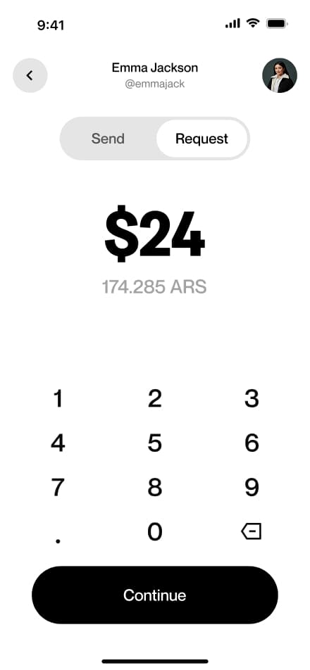
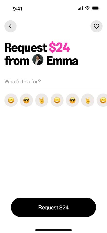
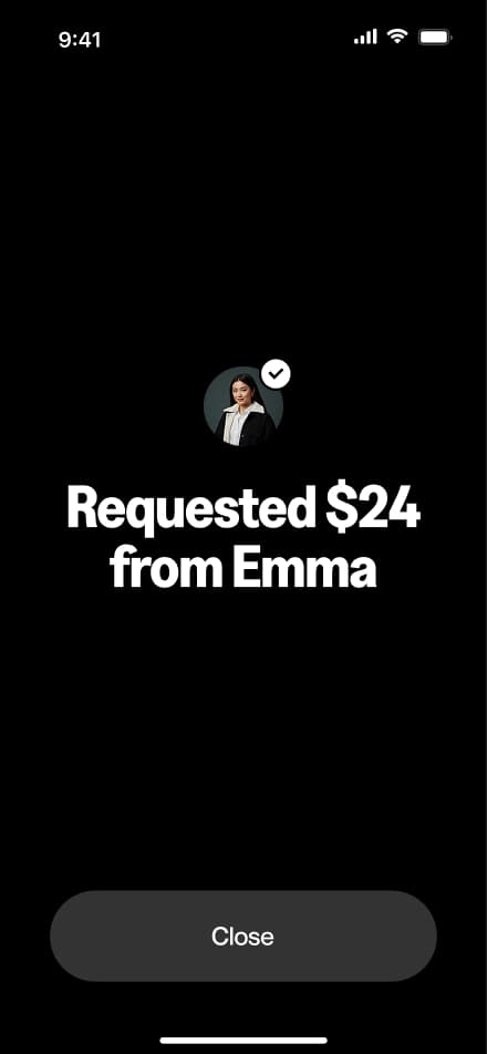
8 screensThe Request Money flow allows users to request funds from other users. Users navigate to the Request section, select a recipient, enter the desired amount, and confirm the request.

Respond request
5 screensThe Respond Request flow allows users to fulfill incoming money requests. Users select the requesting contact, review the request details, and confirm the payment to complete the transfer.

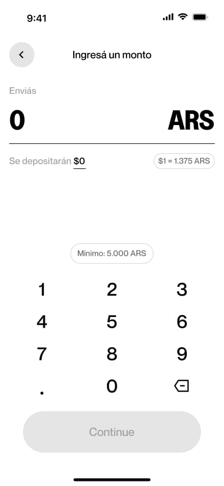
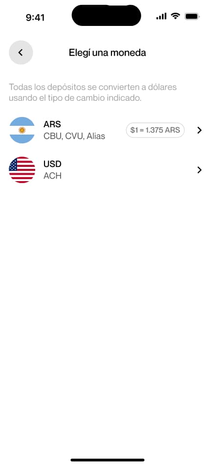
ARS deposit
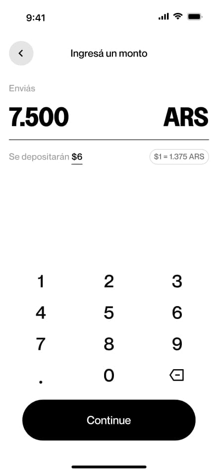
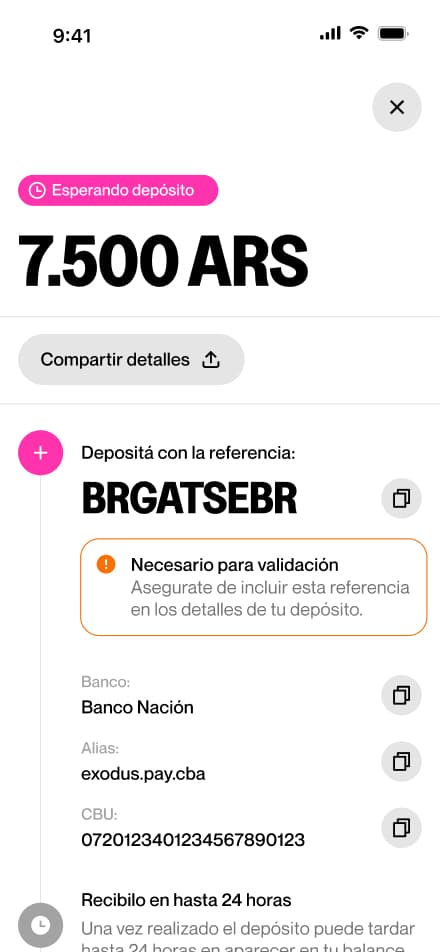
8 screensThe ARS Bank Deposit flow walks users through depositing Argentine pesos into their account. Users navigate to the Deposit section, select bank deposit as their method, choose their currency, enter the desired amount, and confirm the request.


USD deposit
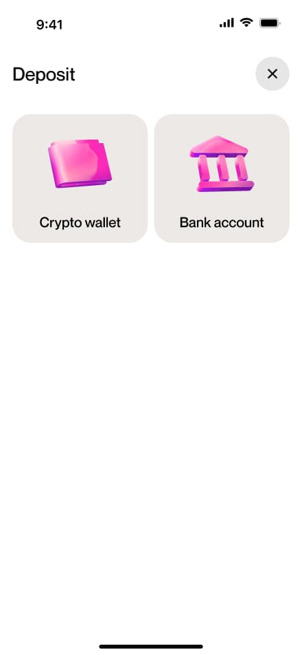
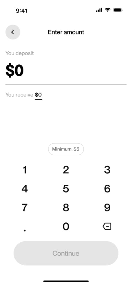
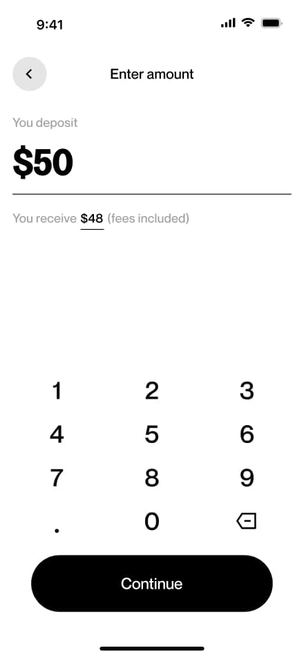
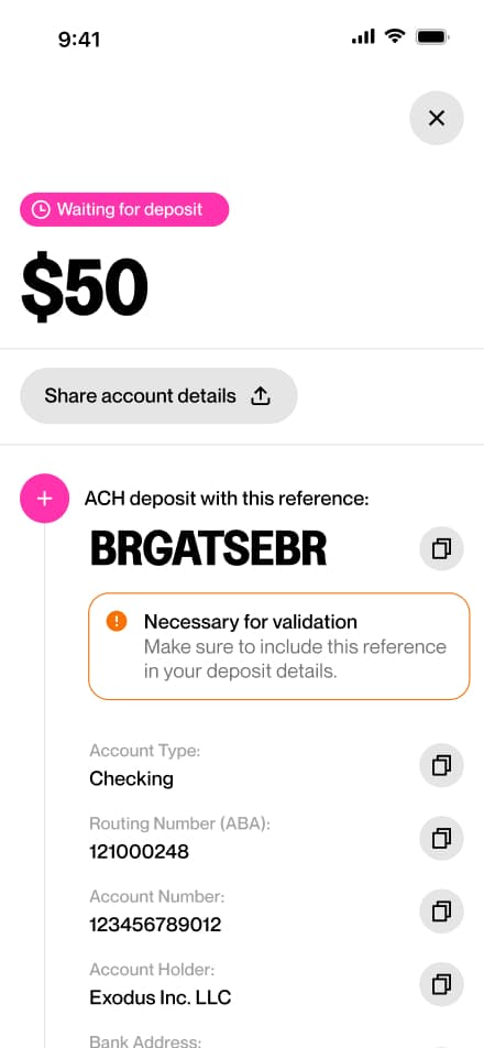
8 screensThe USD Bank Deposit flow walks users through depositing US dollars into their account. Users navigate to the Deposit section, select bank deposit as their method, choose their currency, enter the desired amount, and confirm the request.


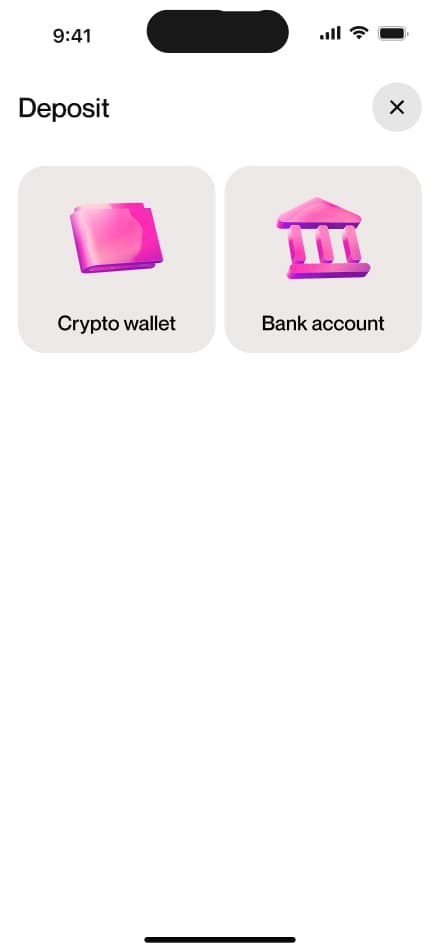
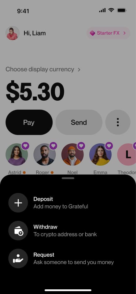
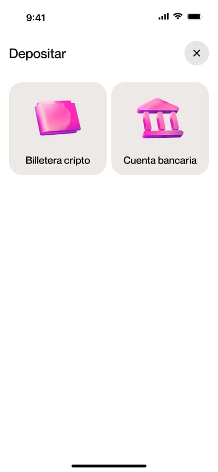
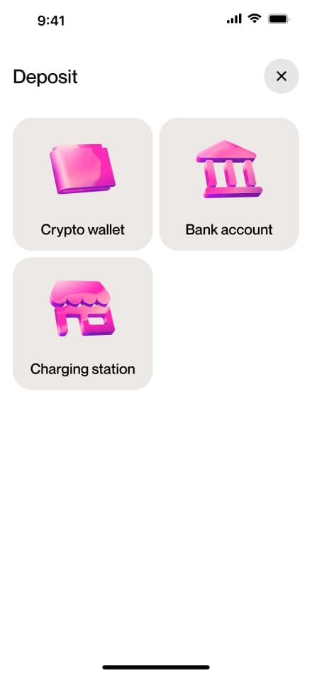
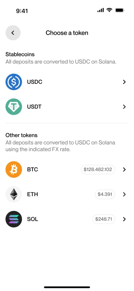
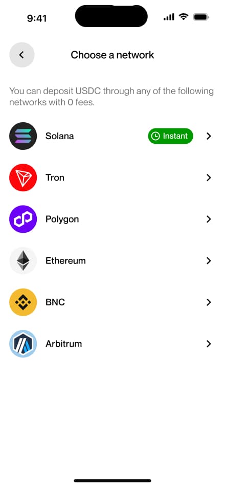
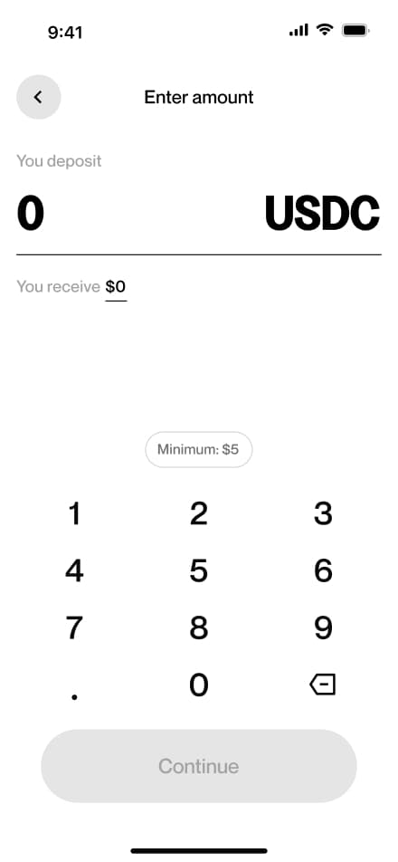
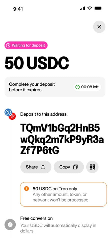
Crypto deposit
8 screensThe Crypto Deposit flow walks users through depositing cryptocurrency into their account. Users navigate to the Deposit section, select crypto as their method, choose their preferred token and network, and confirm the request.


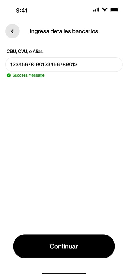
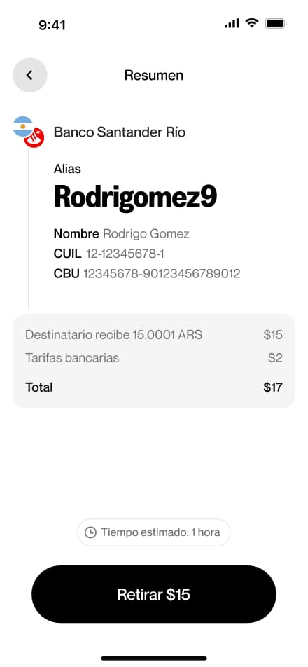
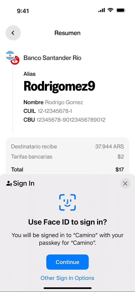
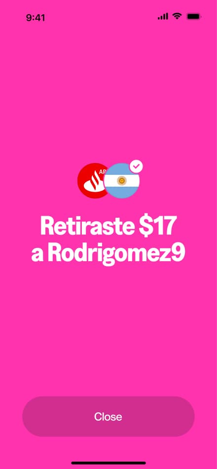
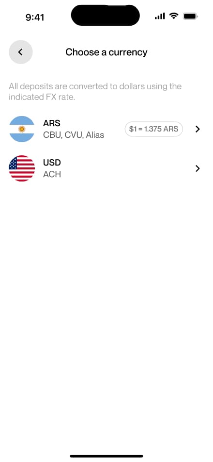
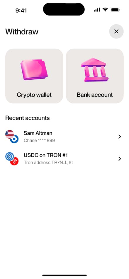
ARS withdraw
12 screensThe ARS Withdraw flow guides users through withdrawing Argentine pesos from their account. Users navigate to the Withdraw section, select bank as their method, choose their currency, enter the desired amount, provide their bank details, and confirm.

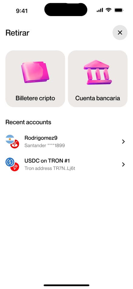
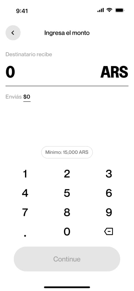
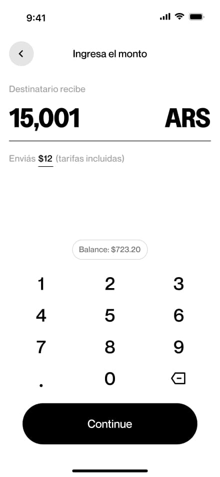
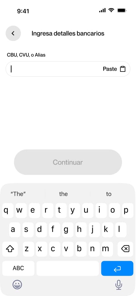
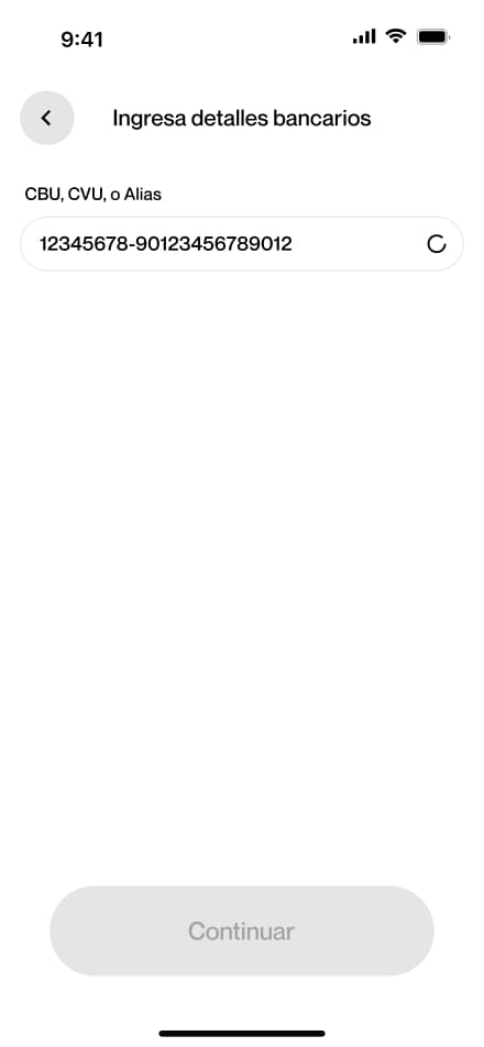
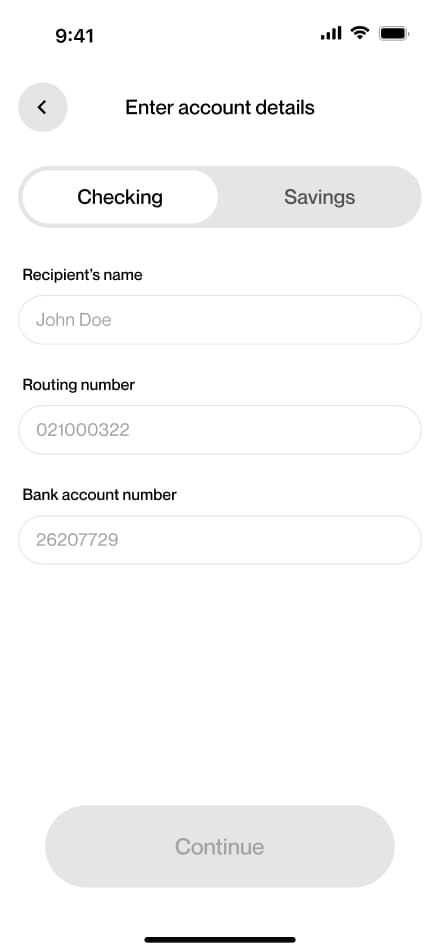
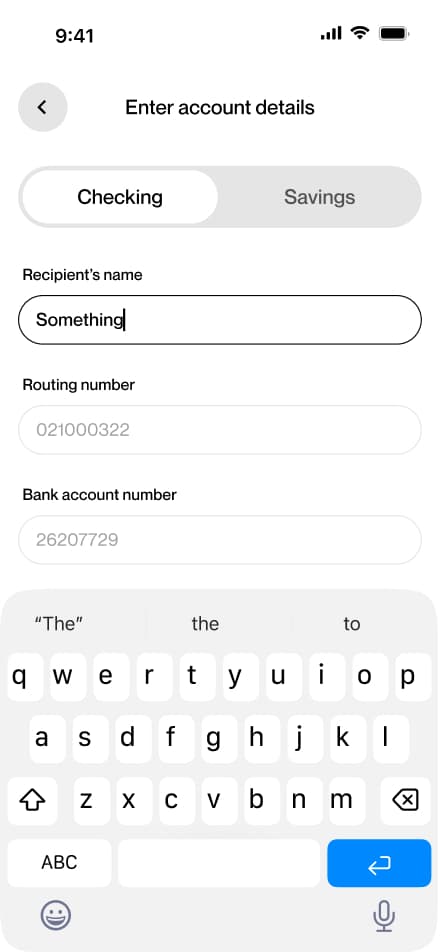
USD withdraw
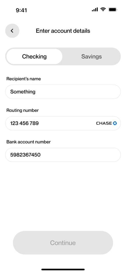
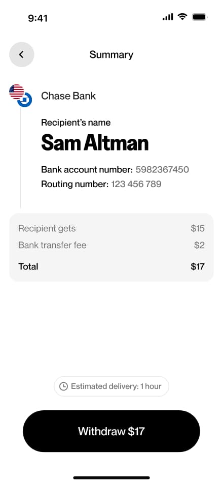
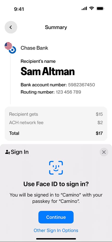
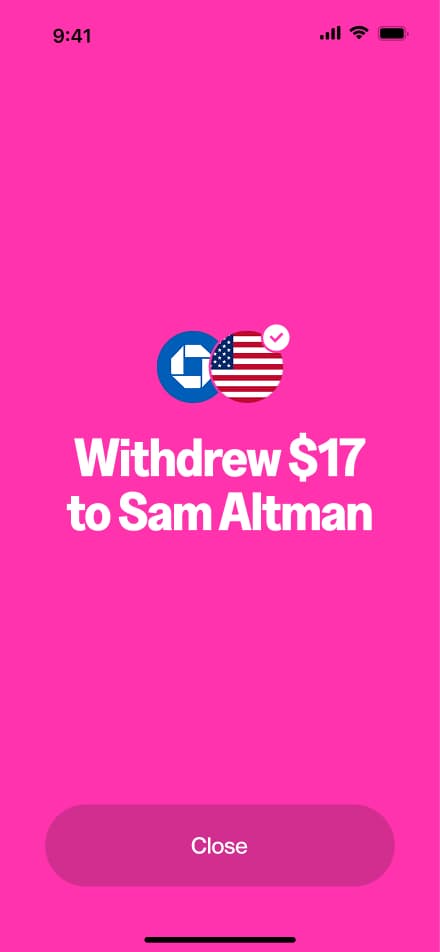
12 screensThe USD Withdraw flow guides users through withdrawing US dollars from their account. Users navigate to the Withdraw section, select bank as their method, choose their currency, enter the desired amount, provide their bank details, and confirm.


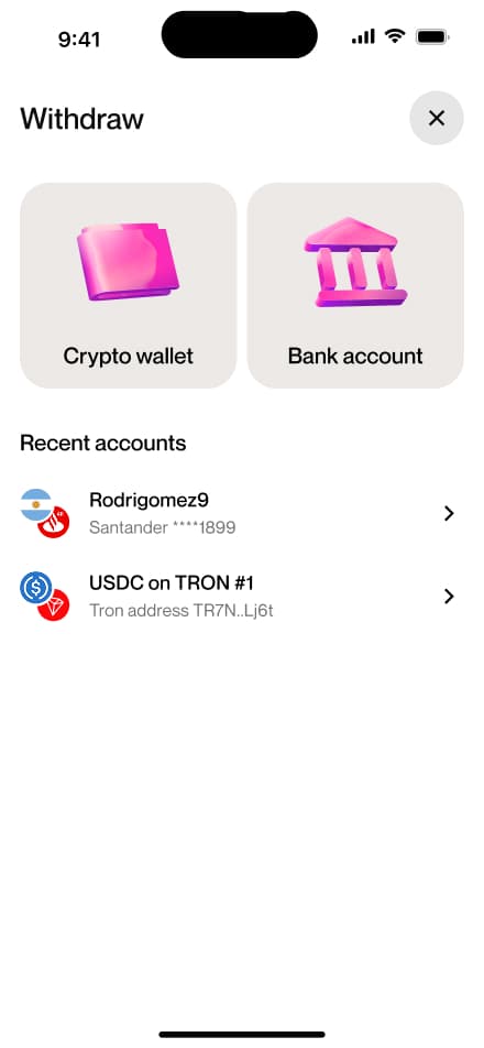


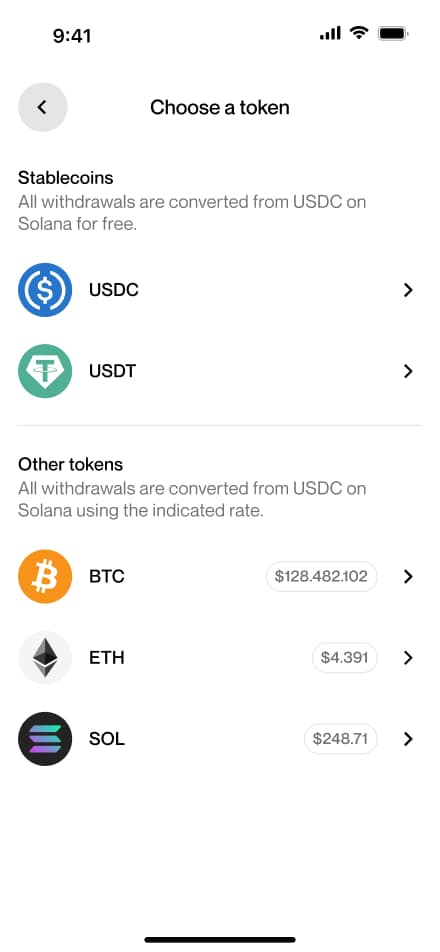
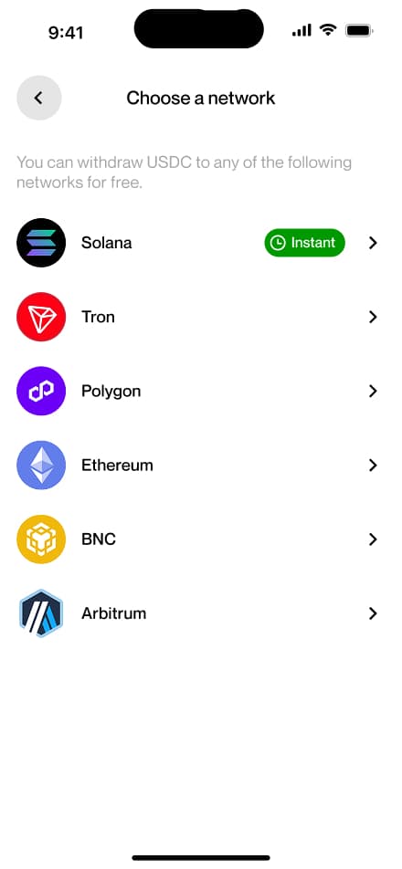
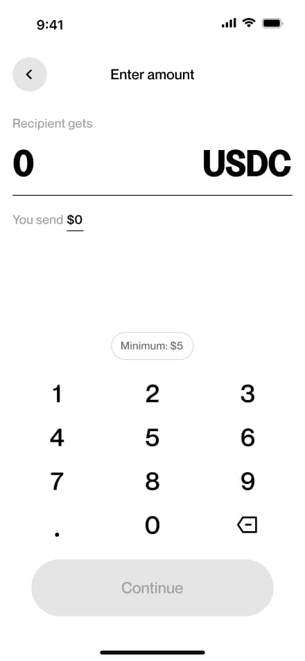
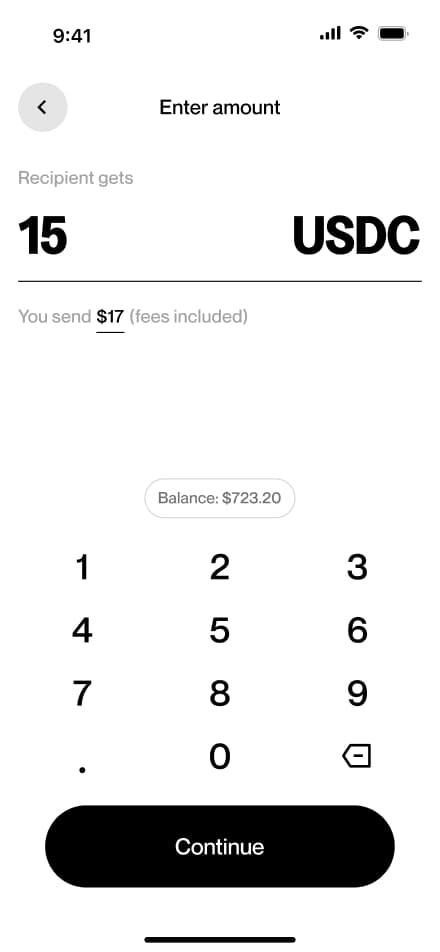
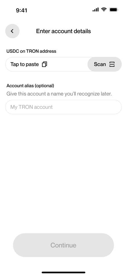
Crypto withdraw
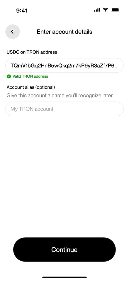
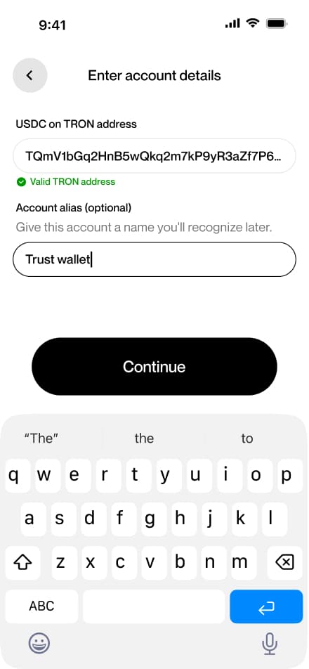
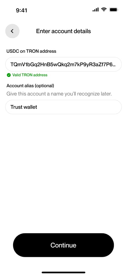
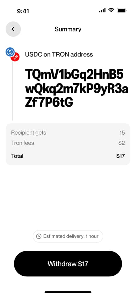
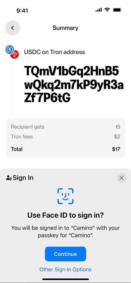
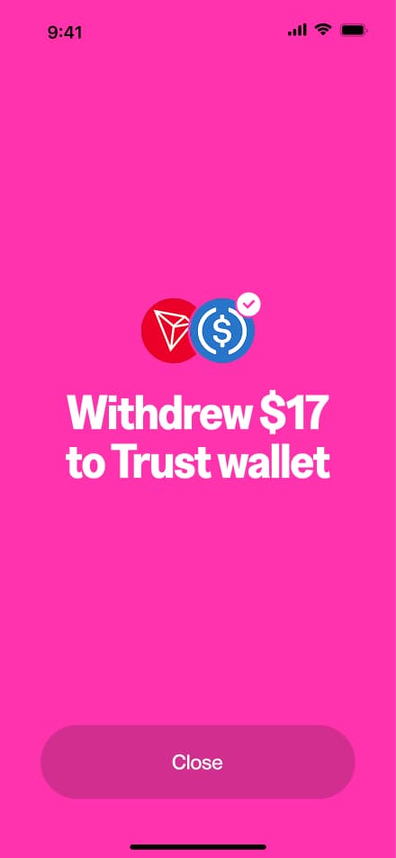
15 screensThe Crypto Withdraw flow guides users through withdrawing cryptocurrency from their account. Users navigate to the Withdraw section, select crypto as their method, choose their preferred token and network, enter the desired amount, provide their destination wallet address, and confirm the withdraw.

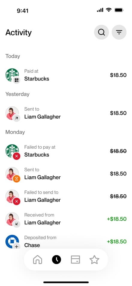
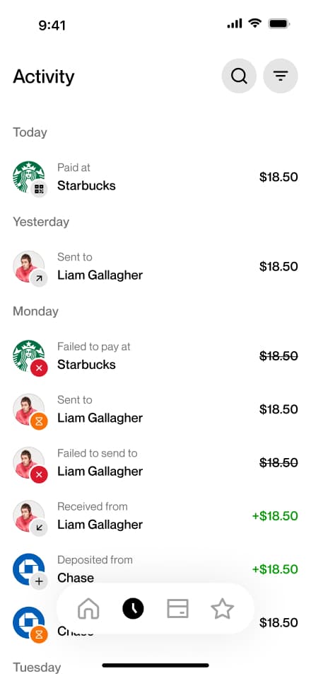
Find a USD tx
3 screensUsers can review their USD transactions in the Activity screen, where all past transactions are listed and available to browse.


Find an ARS tx
3 screensUsers can review their ARS transactions in the Activity screen, where all past transactions are listed and available to browse.

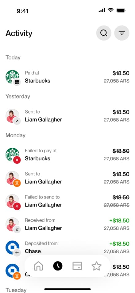
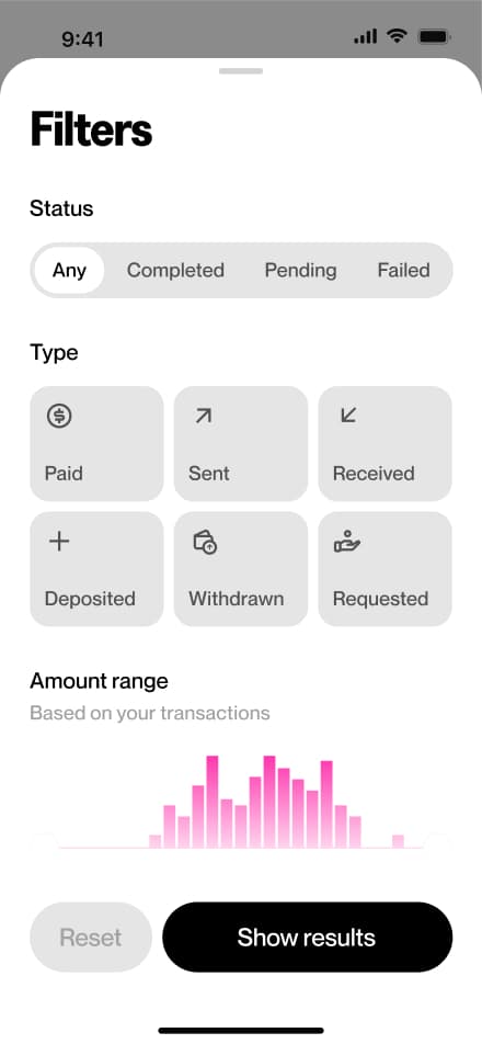
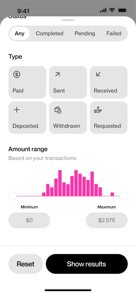
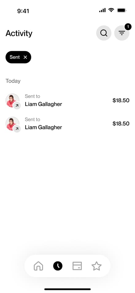
Filter transactions
6 screensThe Filter Transactions flow allows users to narrow down their payment history directly from the Activity screen.


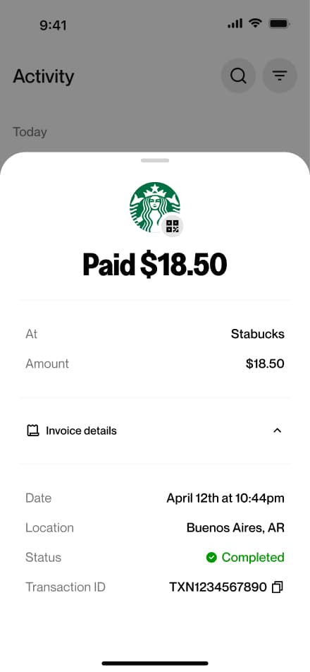
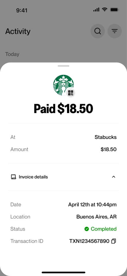
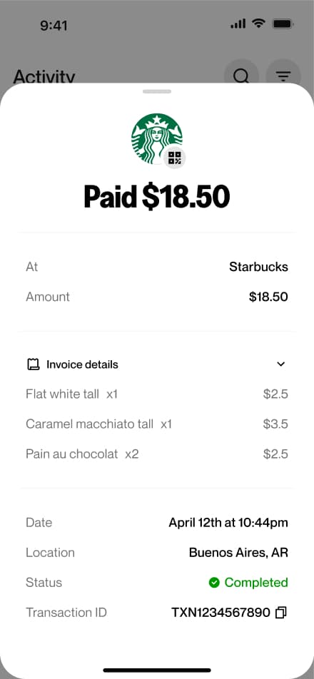
Find an invoice
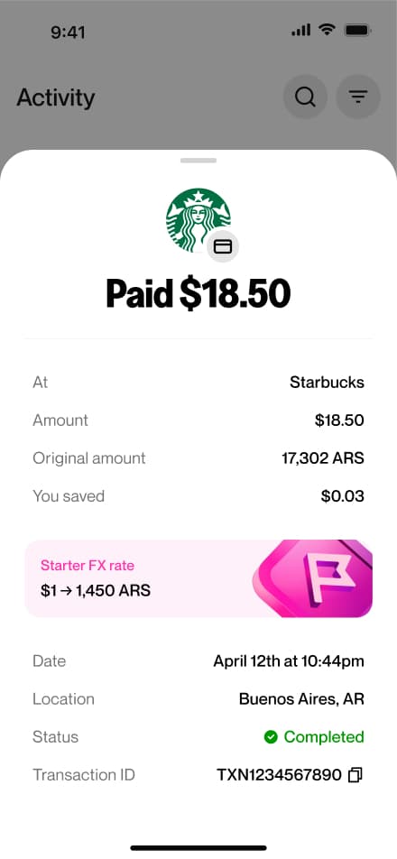
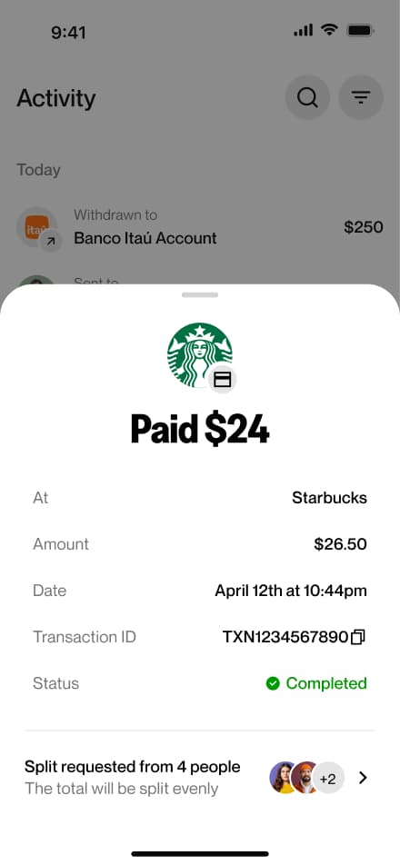
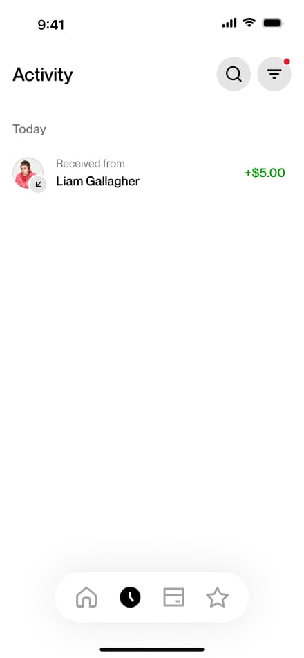
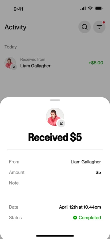
4 screensThe Find an Invoice flow allows users to access the details of a specific transaction. Users navigate to the Activity screen, open a transaction, and expand the invoice to view its full details.


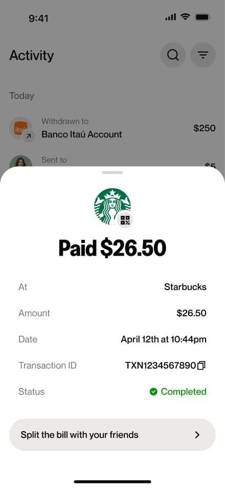
Split payment
6 screensUsers can split a payment among multiple people from the activity screen opening the relevant payment and initiating a split directly from there.

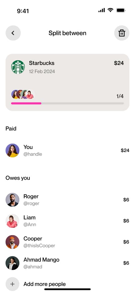
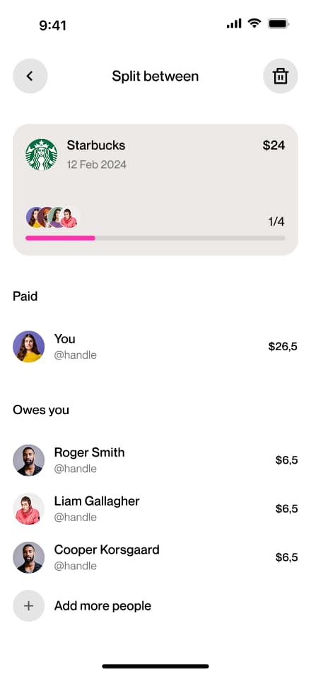
Manage split
5 screensThe Manage a Split flow allows users to track the status of a previously split payment. Users navigate to the Activity screen, select the relevant transaction, and view a breakdown of who has already paid and who still has a pending balance.


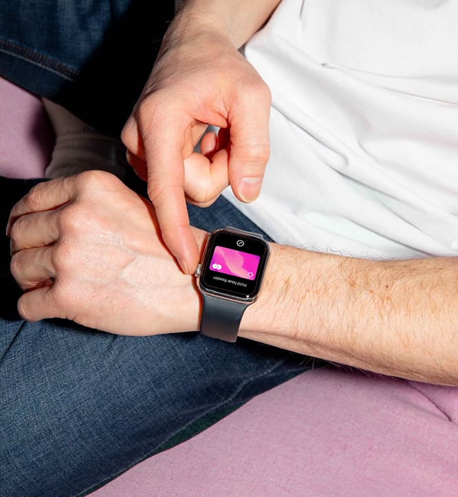
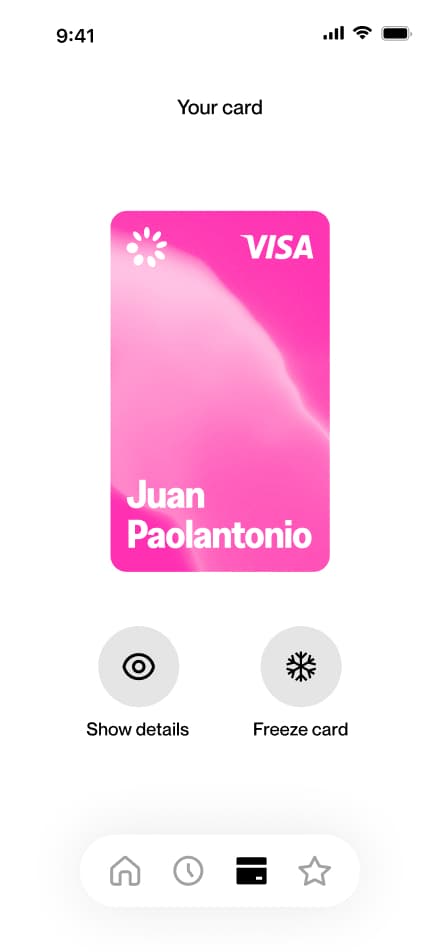
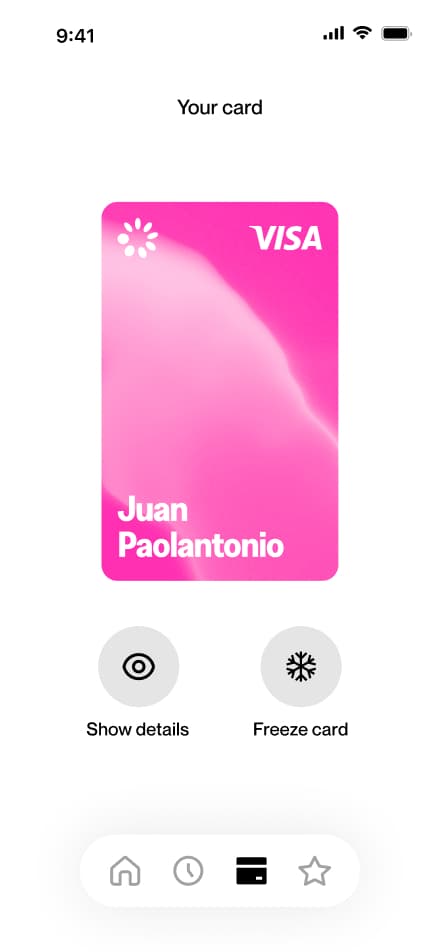
Show card details
3 screensThe Showing Card Details flow allows users to view their virtual card information. Users navigate to the Card section and select Show Card Details to access their full card data.


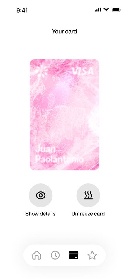
Freeze card
3 screensThe Freezing Card flow allows users to temporarily freeze their virtual card. Users navigate to the Card section, select Freeze Card, and the card is immediately suspended.

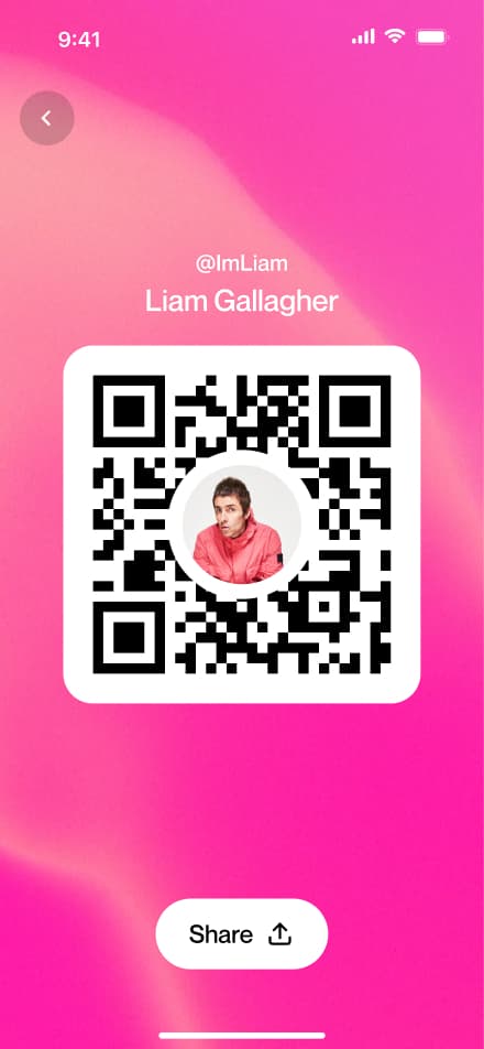
Share profile
4 screensThe Sharing Your Profile flow allows users to share their profile with others. Users navigate to the Profile section, tap their QR code, and hit share.


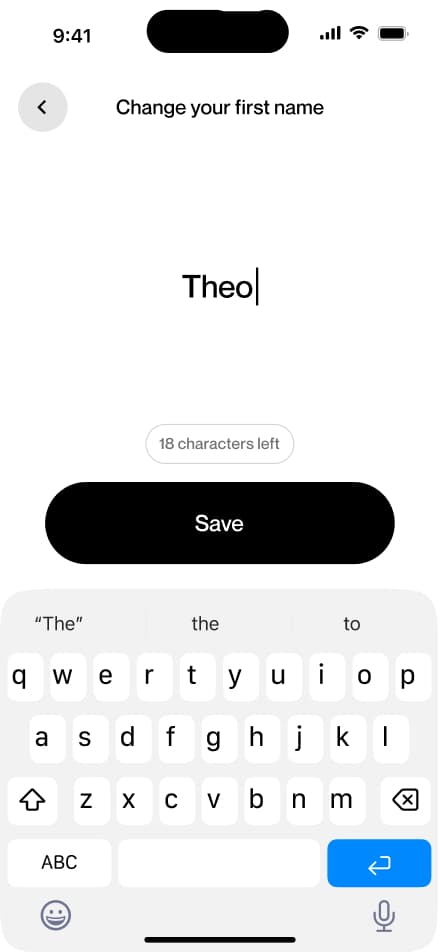
Change name
5 screensThe Changing Your Name flow allows users to update their display name directly from the Profile screen.


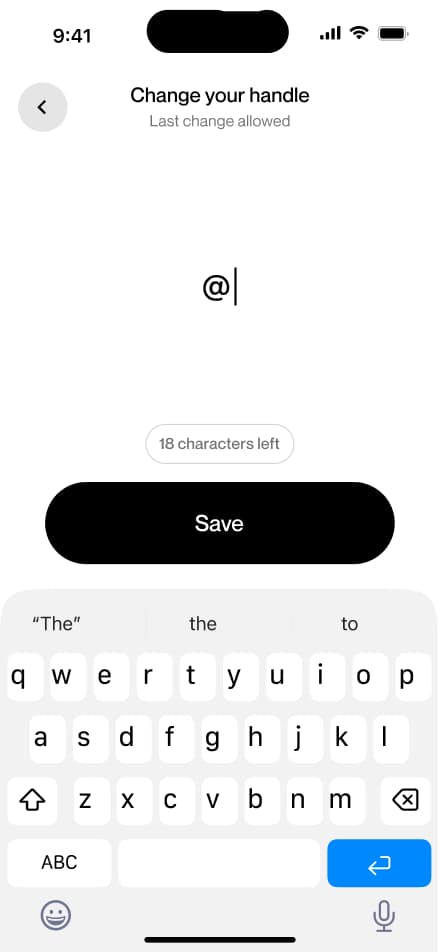
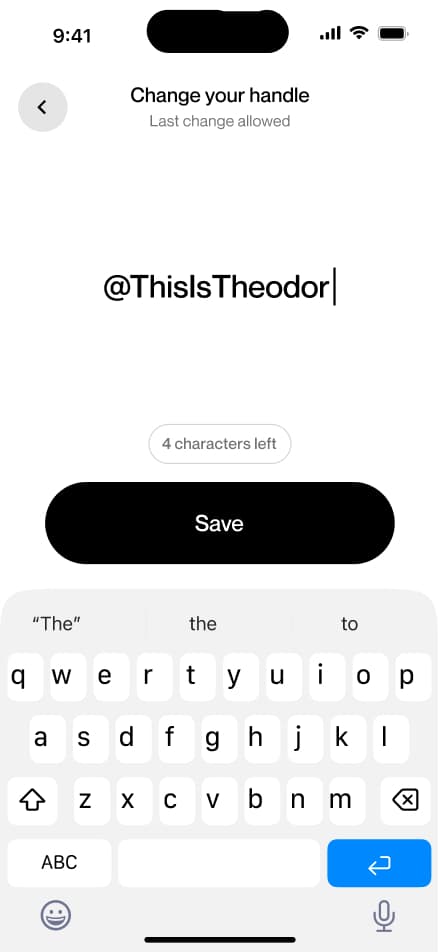
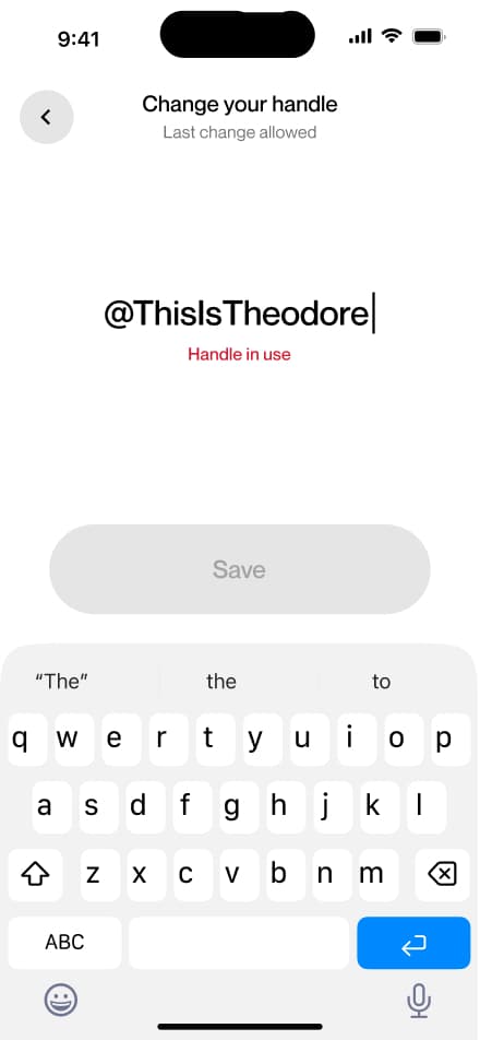
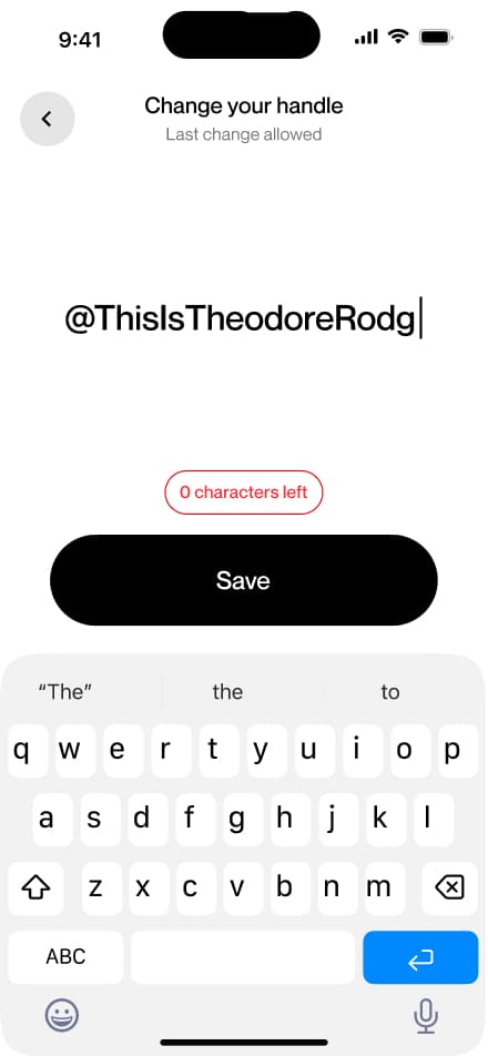
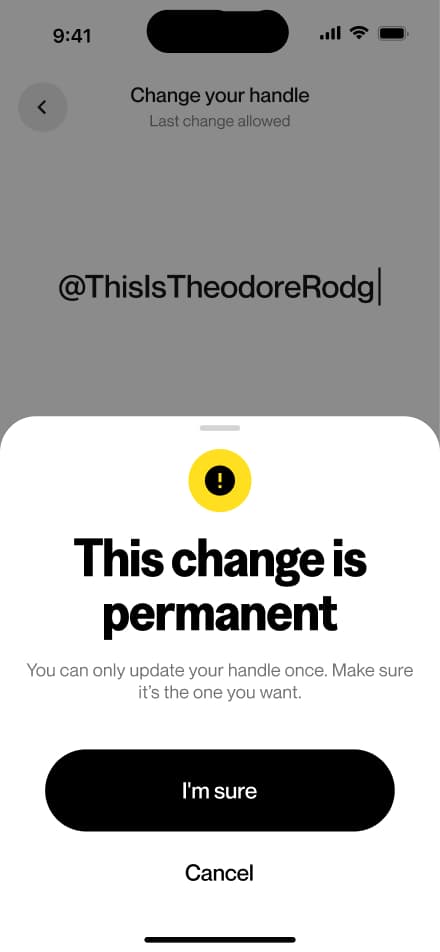
Change handle
7 screensThe Change Handle flow allows users to update their username directly from the Profile screen. Note that a handle can only be changed once, so users are encouraged to choose carefully before confirming.


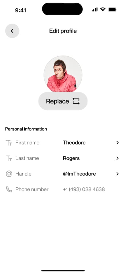
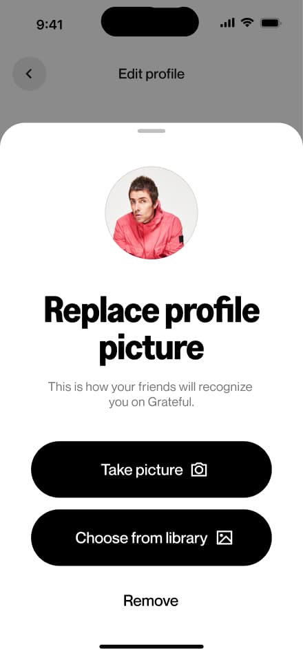
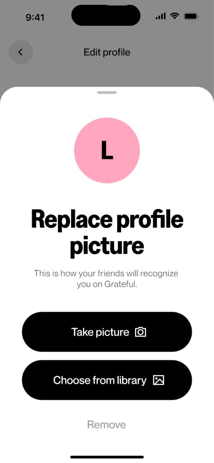
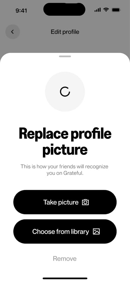
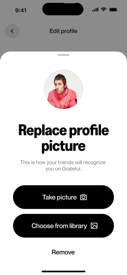
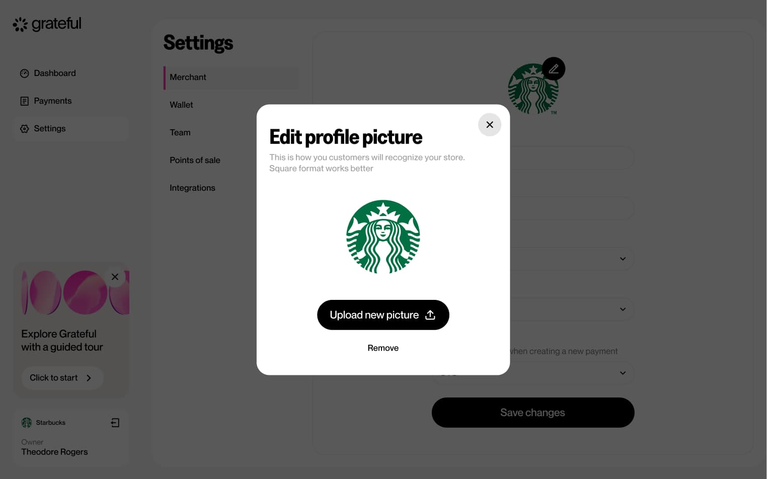
Change picture
7 screensThe Change Profile Picture flow allows users to update their profile photo directly from the Profile screen.


Change currency
5 screensThe Change Display Currency flow allows users to update their preferred display currency directly from the Profile screen.


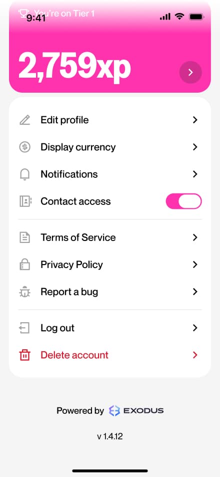
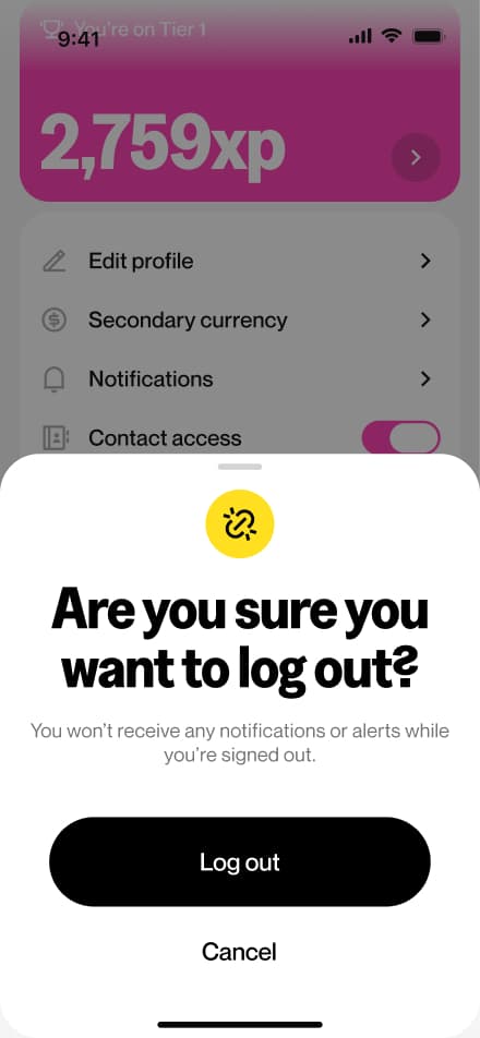
Logout
4 screensThe Logout flow allows users to sign out of their account directly from the Profile screen.


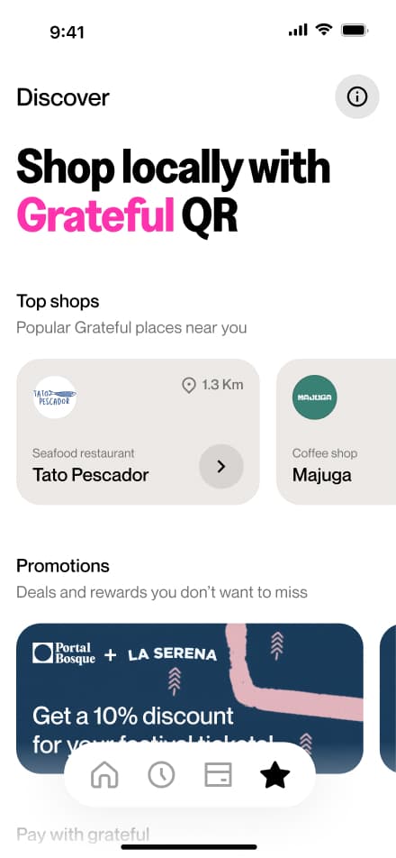
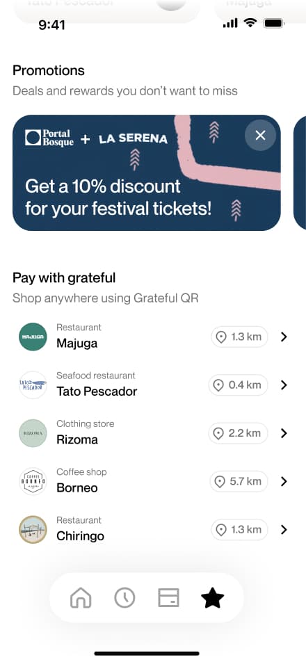
Find a Grateful shop
4 screensThe Finding a Grateful Shop flow allows users to discover local businesses that accept Grateful payments. Users navigate to the Discover section, where they can browse and find nearby shops ready to accept payments through the app.
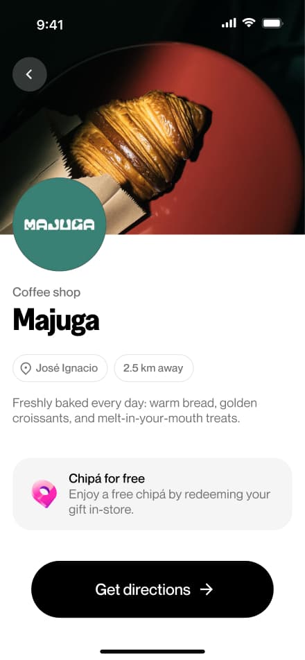
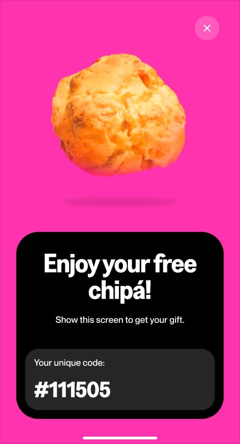
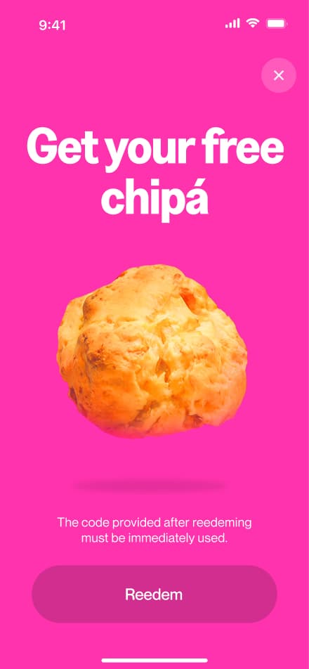
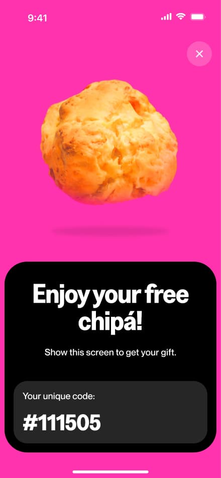
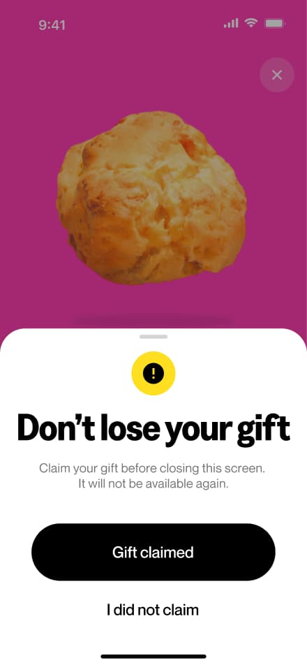
Claim a promotion
6 screensThe Claiming Chipá flow allows users to claim limited food promotions available at participating shops. Users scan the store's code, hit redeem, and the chipá is theirs to enjoy.

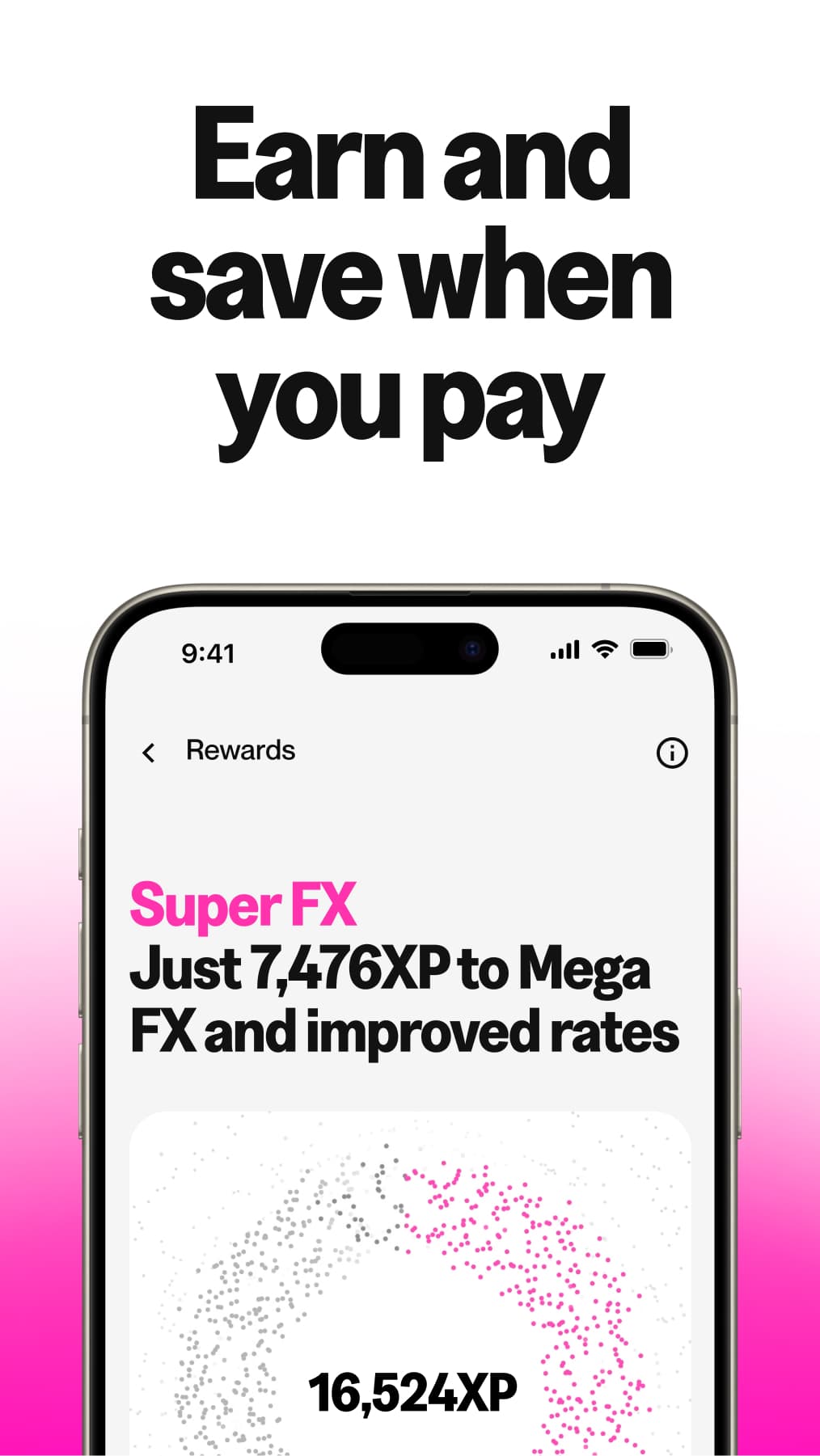
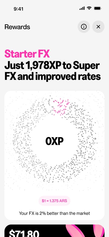
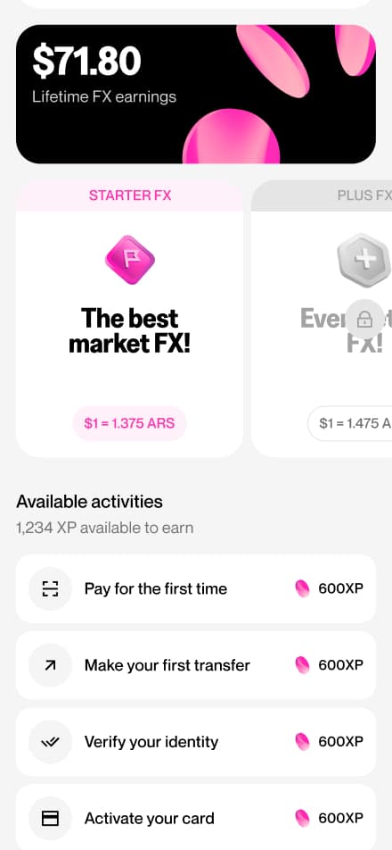
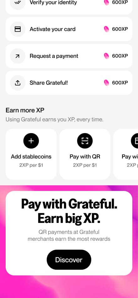
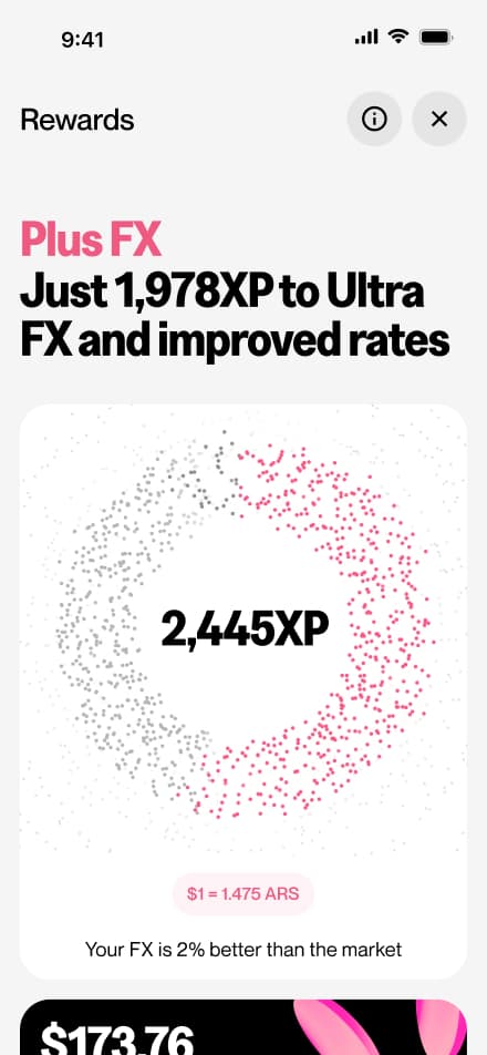
Explore rewards
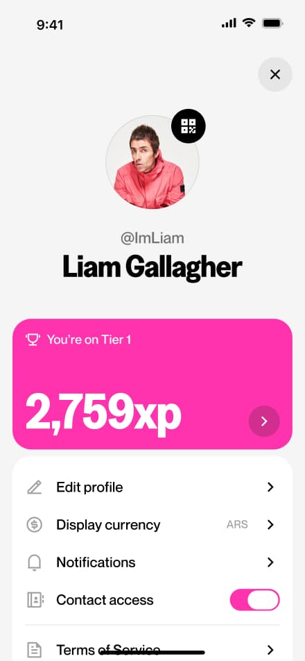
4 screensThis flow gives users a full view of their rewards status. From this screen, users can check their current reward balance, discover ways to earn more, and explore what benefits await them in upcoming tiers.
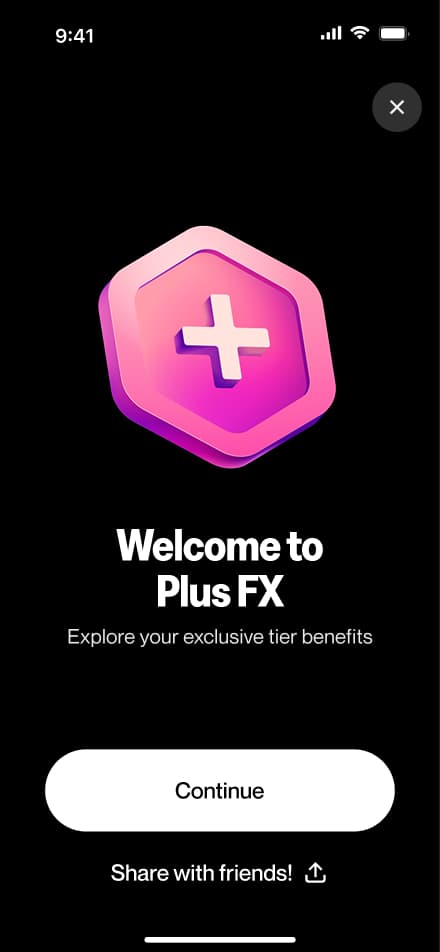
Reach a tier
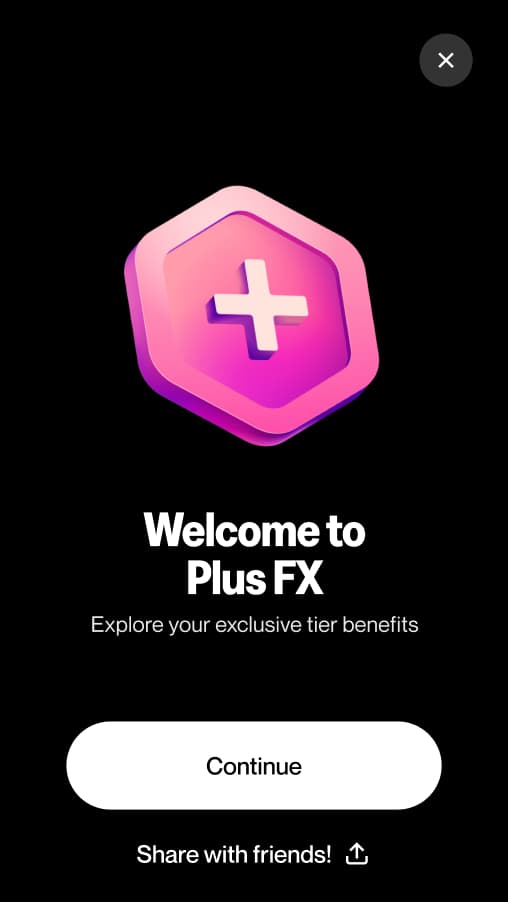
3 screensThe Reach a New Tier flow celebrates users when they unlock a new rewards tier. Upon entering the Rewards screen, users are greeted with a fullscreen welcome animation marking their achievement.

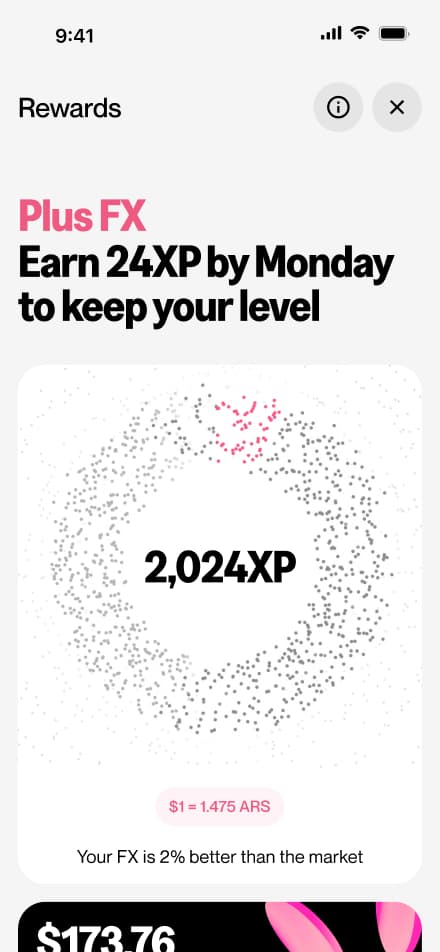
Downgrade risk
2 screensThe Downgrade Risk flow alerts users when they are at risk of losing their current rewards tier. A message is displayed on the Rewards screen, giving users the opportunity to take action before their tier is downgraded.
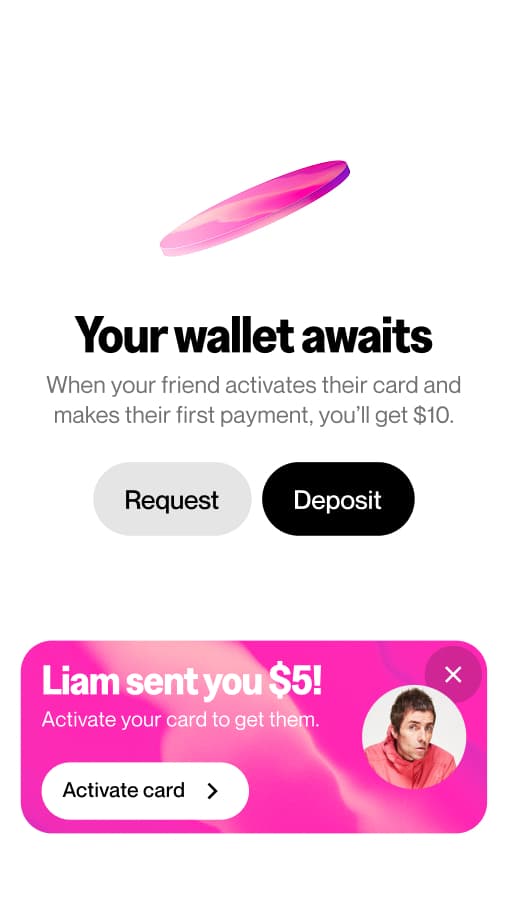
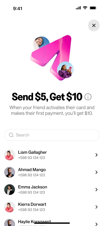
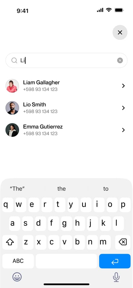
Send an invite
5 screensThe Send an Invite flow encourages users to grow the Grateful community by inviting others directly from the home screen. In return, users receive a reward for each successful invite.
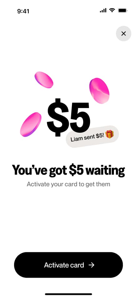
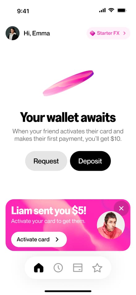
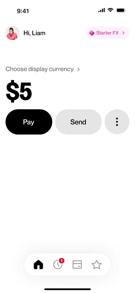
Get $5
7 screensThe Get $5 flow is the invite recipient's side of the referral experience. Upon completing onboarding, users are notified that $5 is waiting for them as a welcome reward, and that they must activate their virtual card to claim it.

Dashboard Flows
Explore the key workflows available to merchants through the Grateful dashboard. This section documents the core journeys that allow businesses to set up their account, manage payments, and configure their operations, focusing on the happy path for each feature. Each flow is presented step by step to provide a clear view of the dashboard experience, from onboarding to day-to-day payment management.
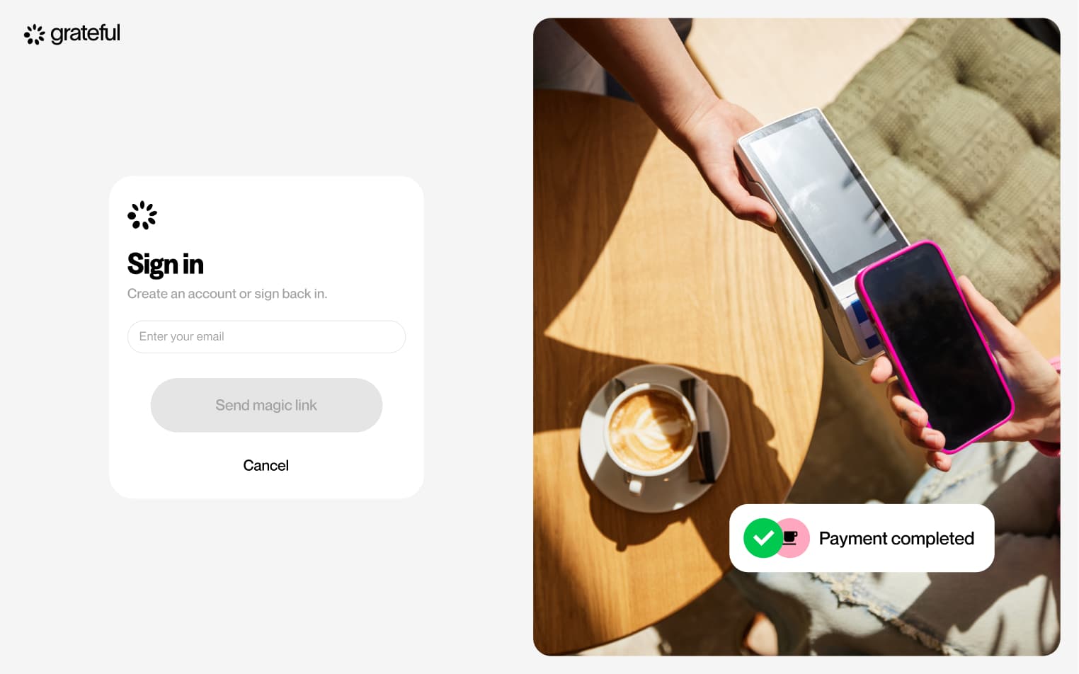
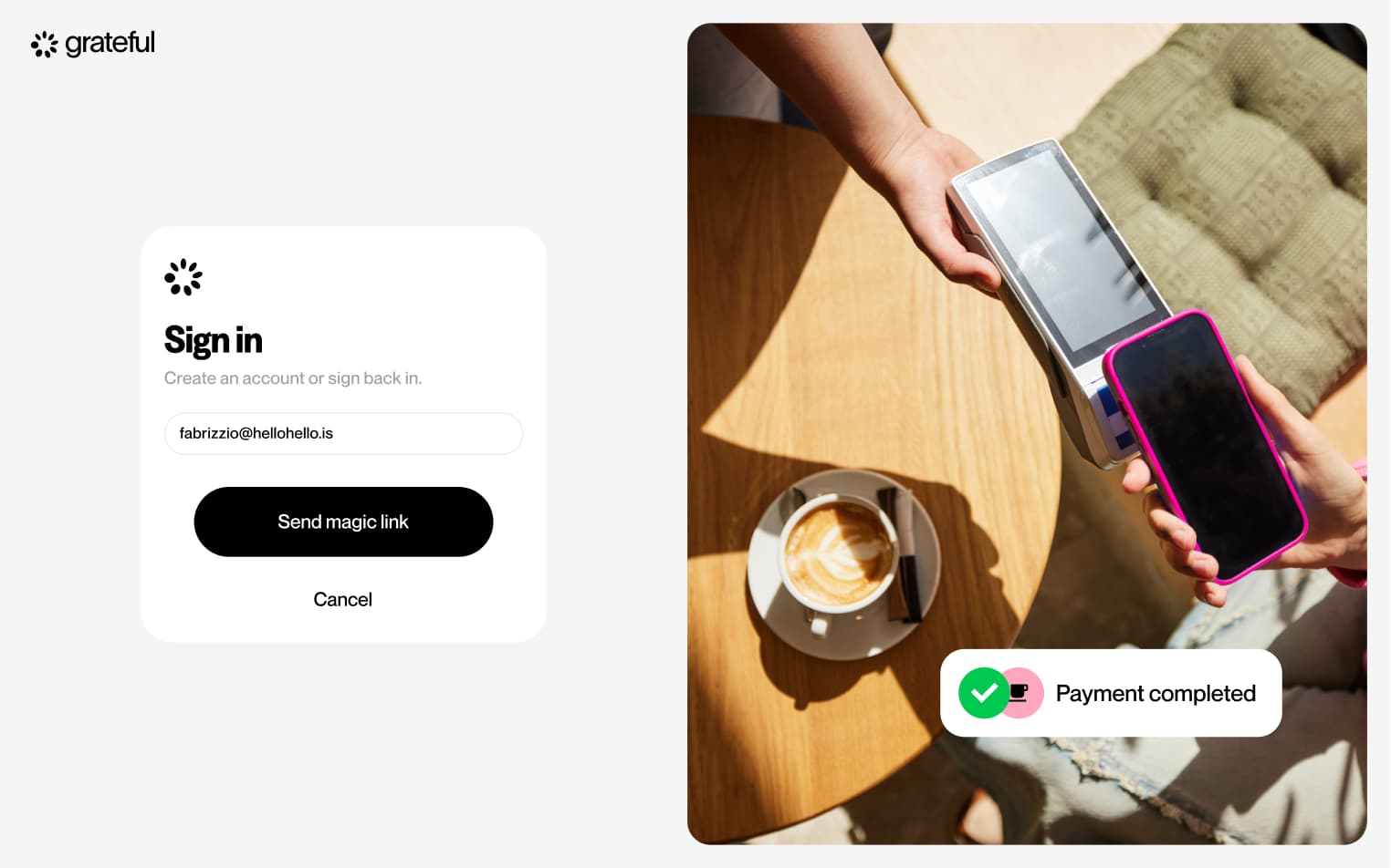
Magic link login
4 screensThe Magic Link Login flow allows merchants to access their dashboard without a password. Users enter their email address, receive a magic link in their inbox, and are taken directly into their account upon clicking it.
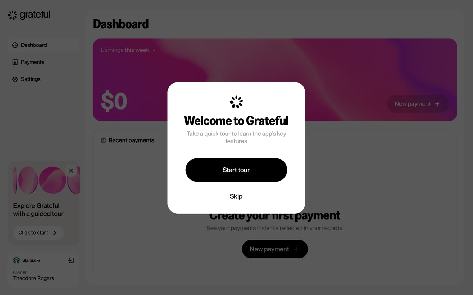
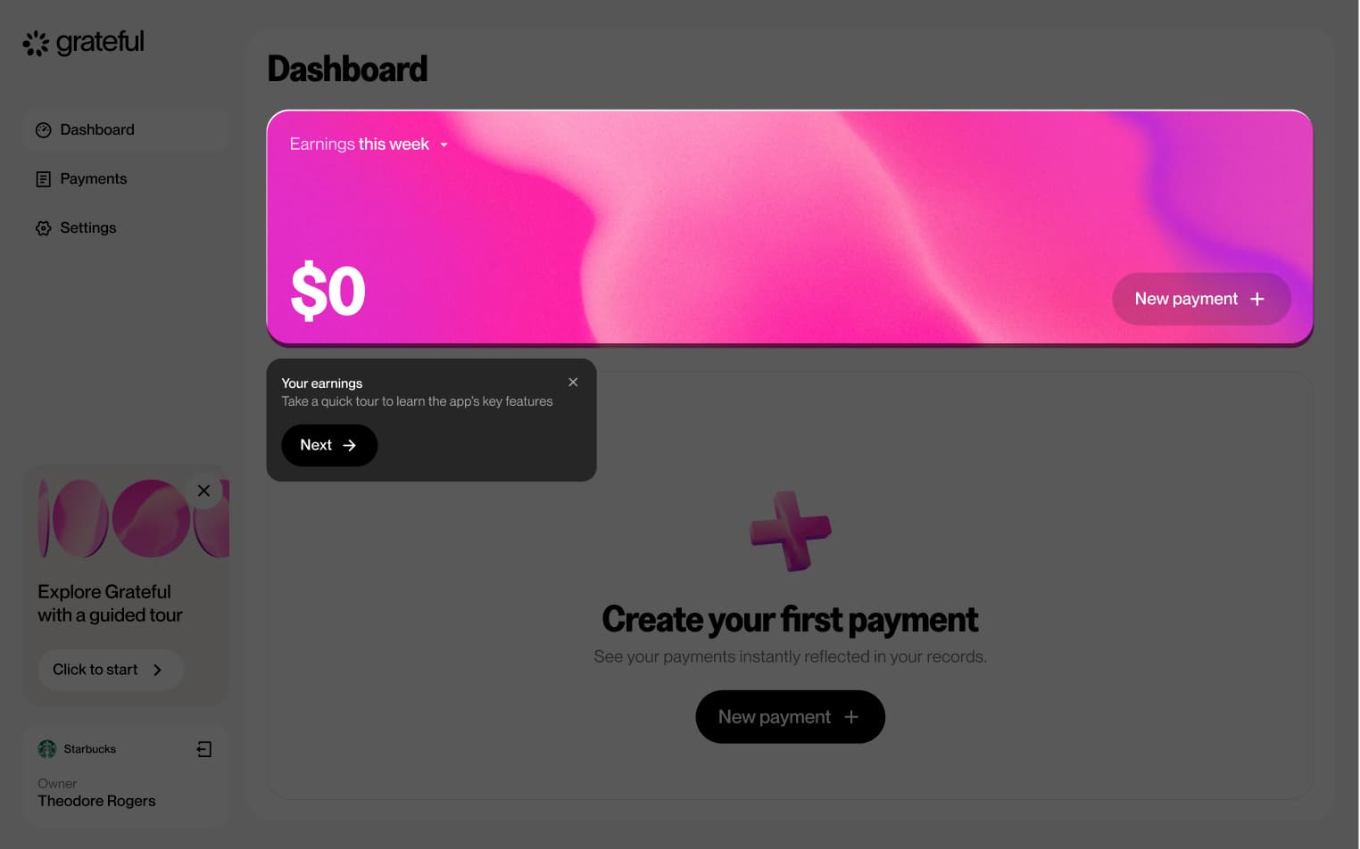
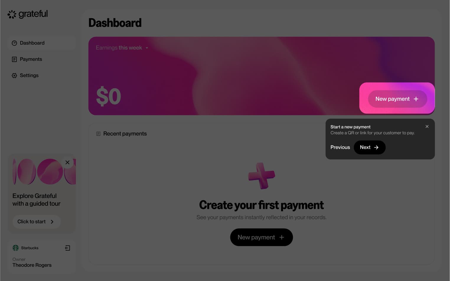
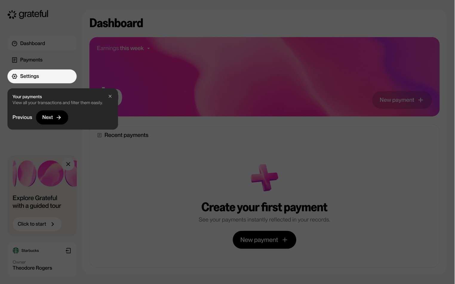
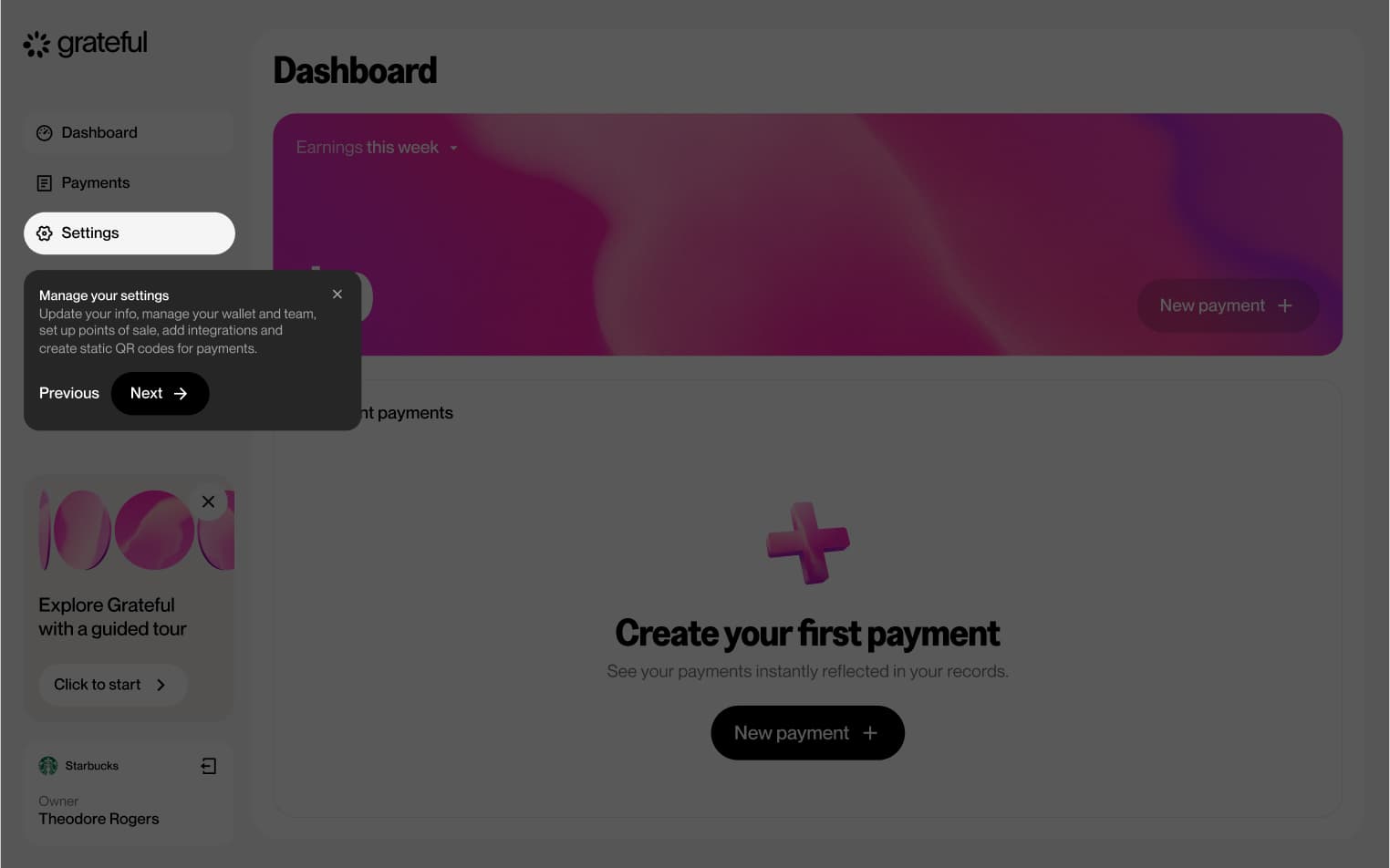
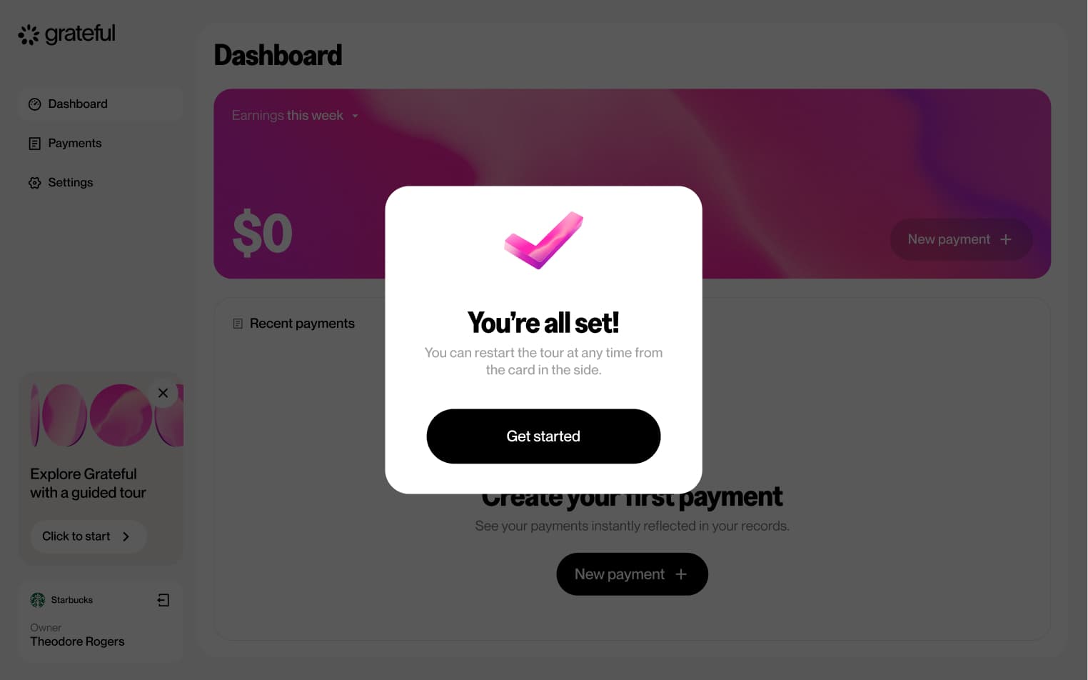
Guided tour
6 screensThe Guided Tour walks merchants through the dashboard's main features upon first access, helping them get familiar with everything available at a glance.
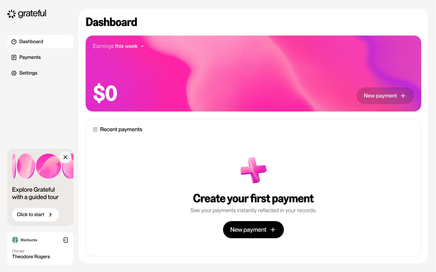
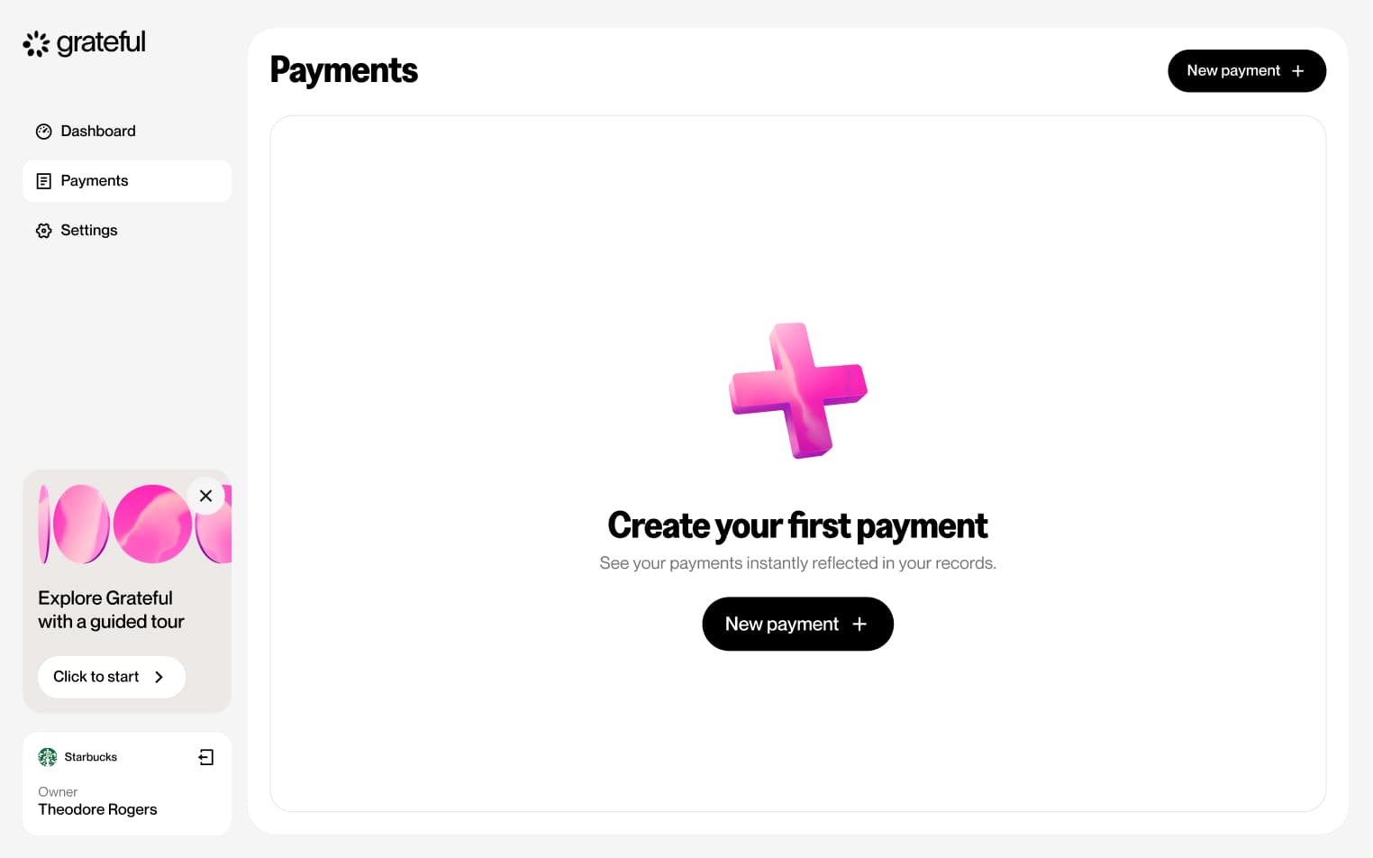
Empty state
1 screenThe Empty State represents the initial dashboard experience for merchants who have not yet received any payments, providing a starting point before their first transaction comes in.
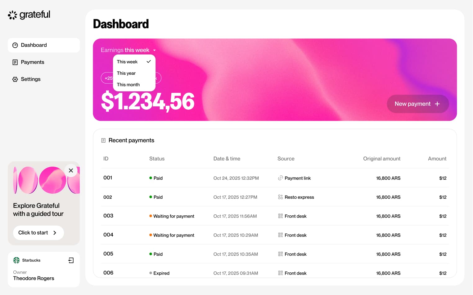
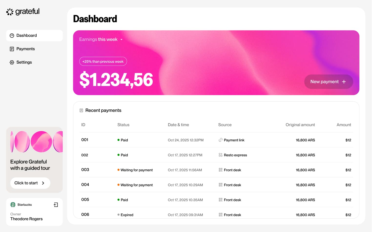
Populated state
1 screenThe Populated State showcases the dashboard experience once a merchant has received payments, displaying their balance and transaction activity in full.

Change period
2 screensThe Change Period flow allows merchants to adjust the time range of the data displayed on their dashboard, giving them a tailored view of their payment activity.

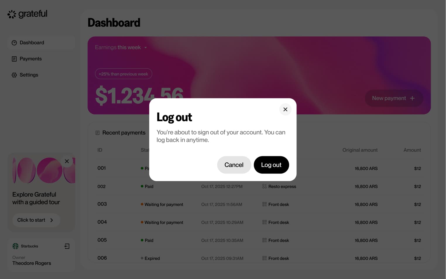
Logout
2 screensThe Logout flow allows merchants to sign out of their account directly from the main dashboard.

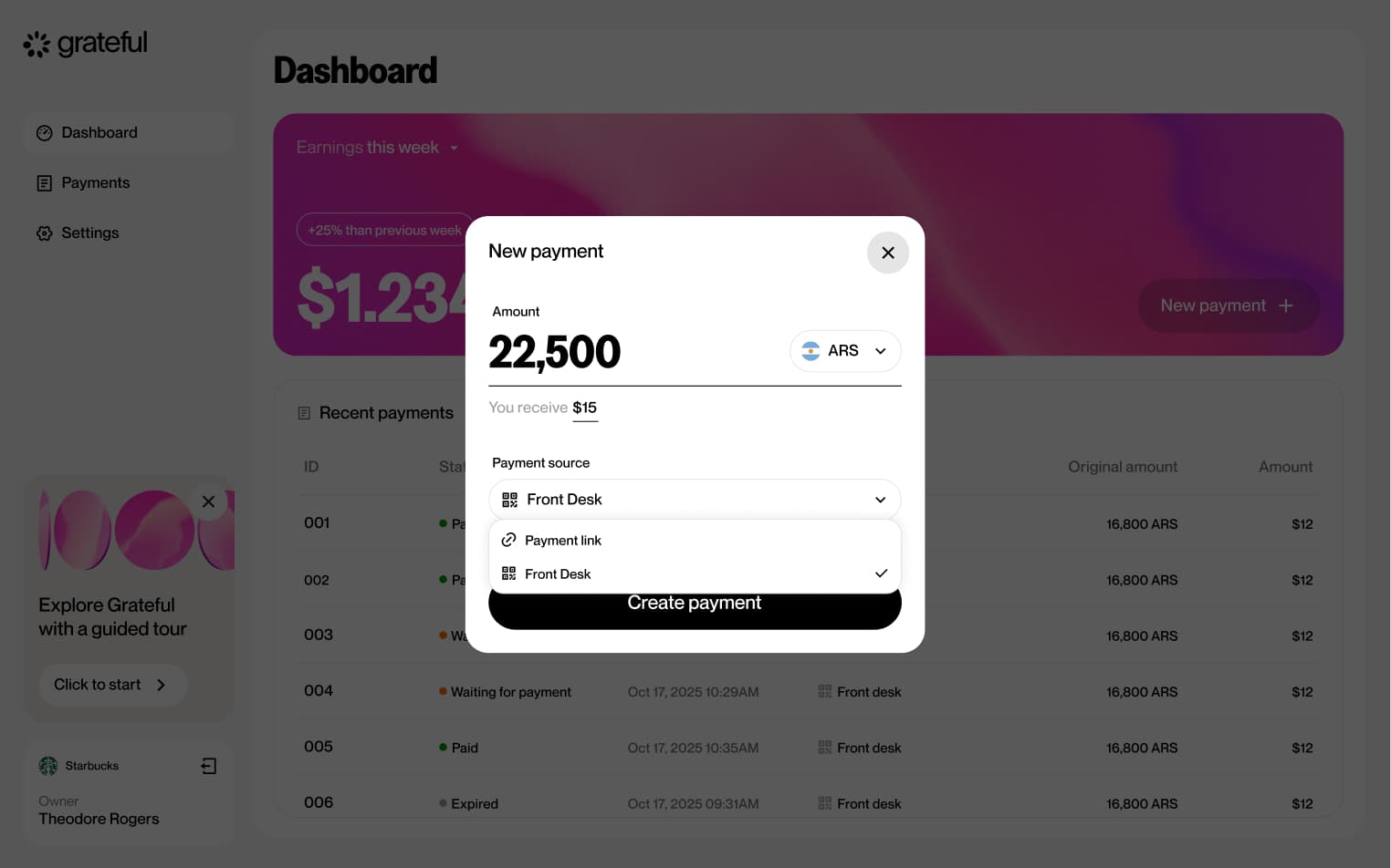
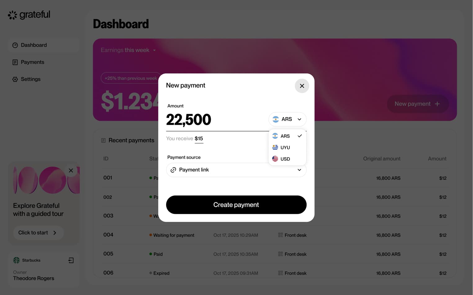
PoS from home
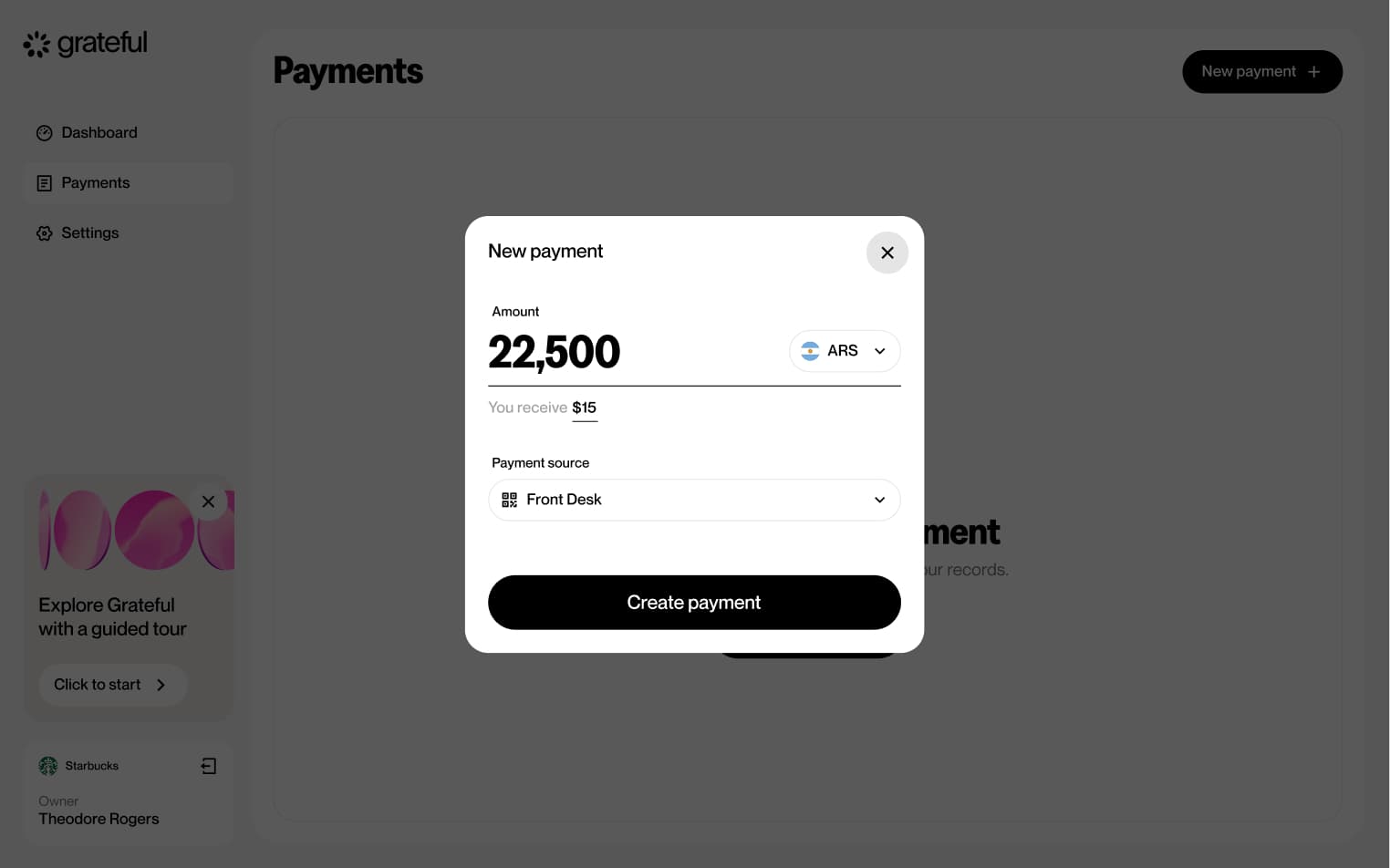
5 screensThe PoS from Home flow allows merchants to quickly initiate a point-of-sale payment directly from the main dashboard. Users select a previously created PoS, choose the currency, enter the amount, and a payment QR is generated ready to be scanned by the customer.


PoS from payments
5 screensThe PoS from Payments flow allows merchants to initiate a point-of-sale payment directly from the Payments screen. Users select a previously created PoS, choose the currency, enter the amount, and a payment QR is generated ready to be scanned by the customer.

PoS lifetime
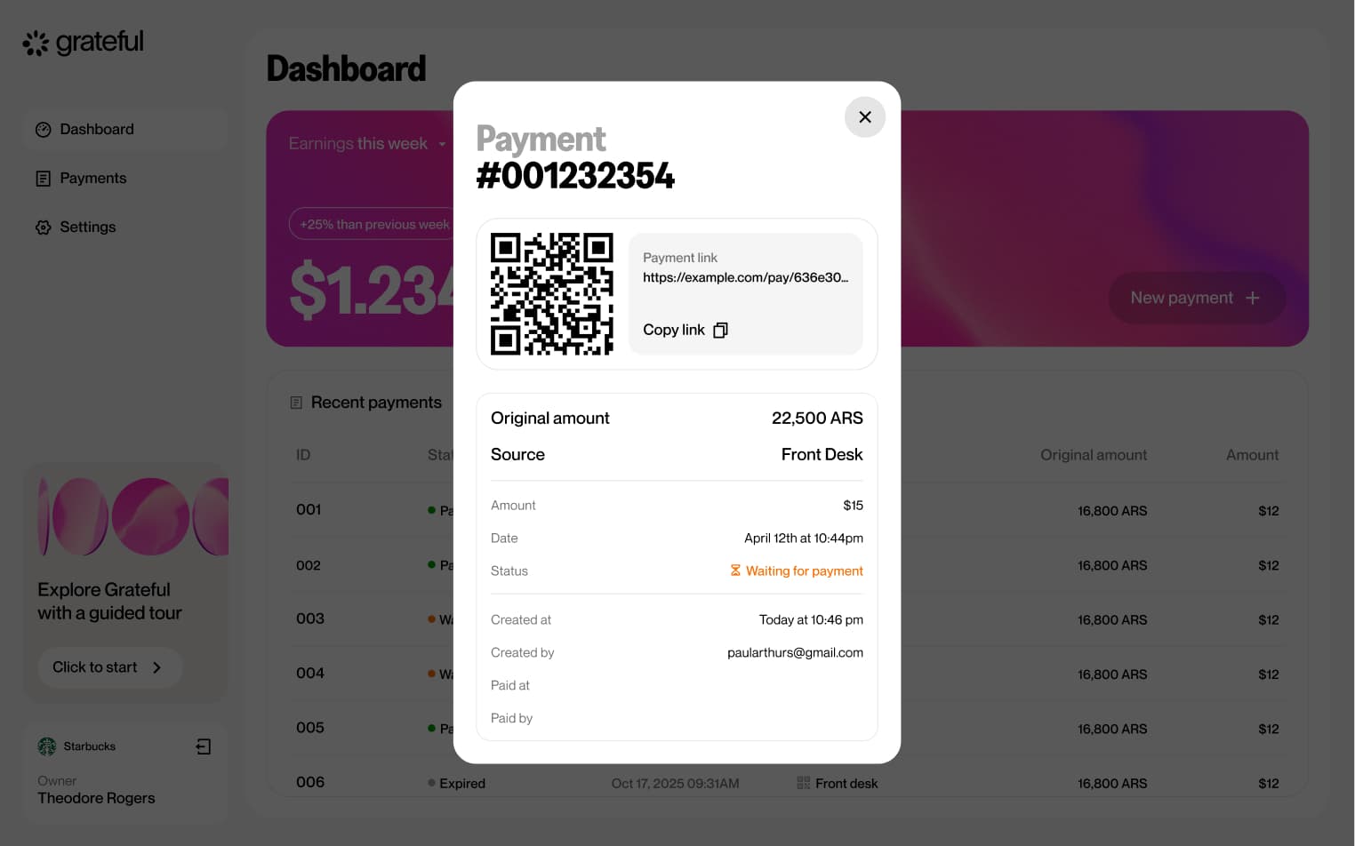
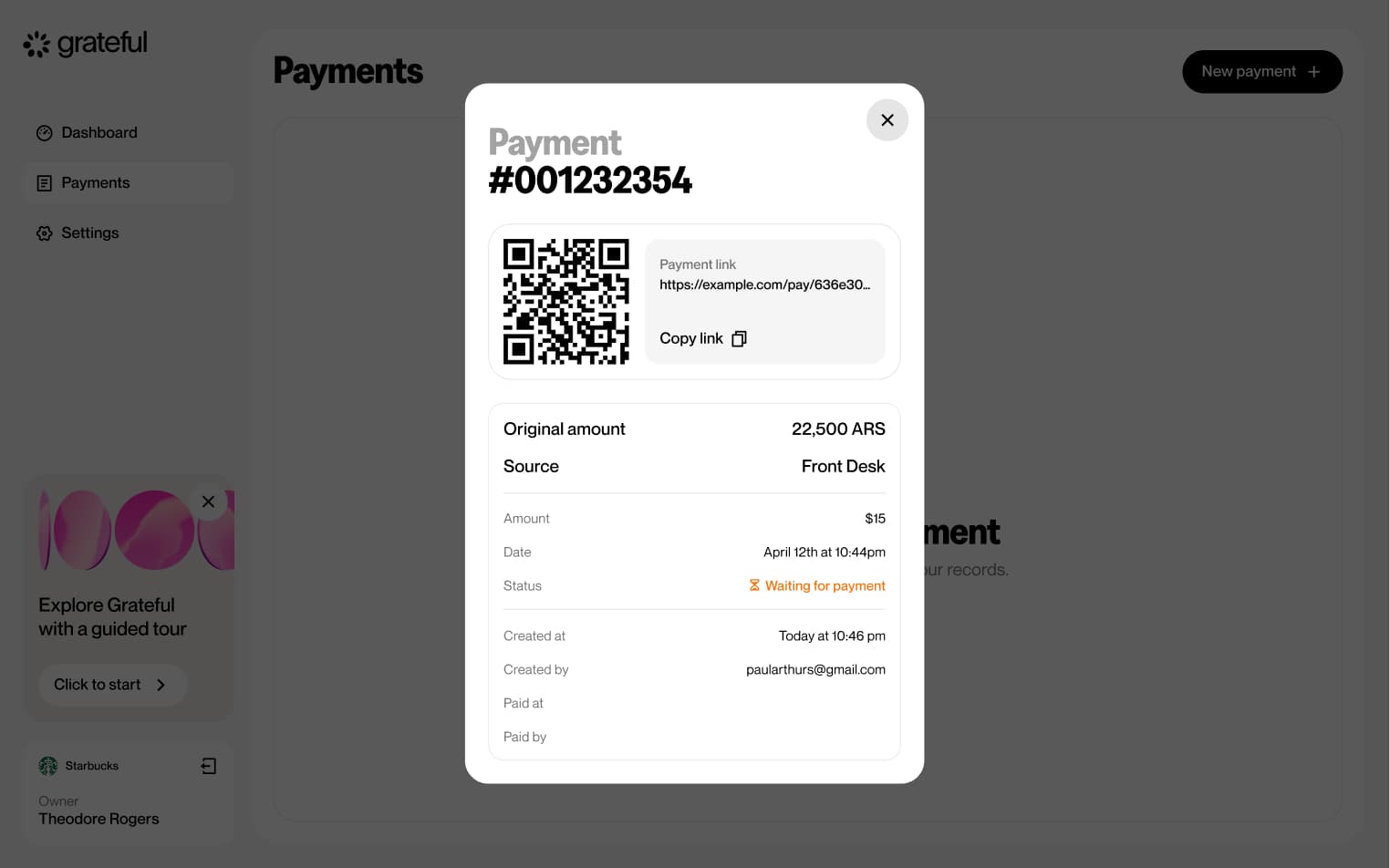
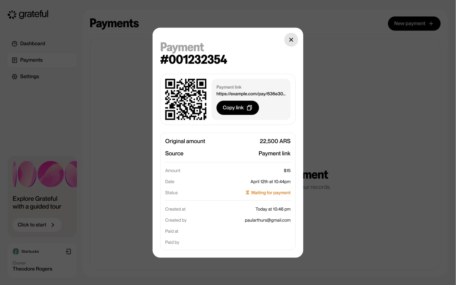
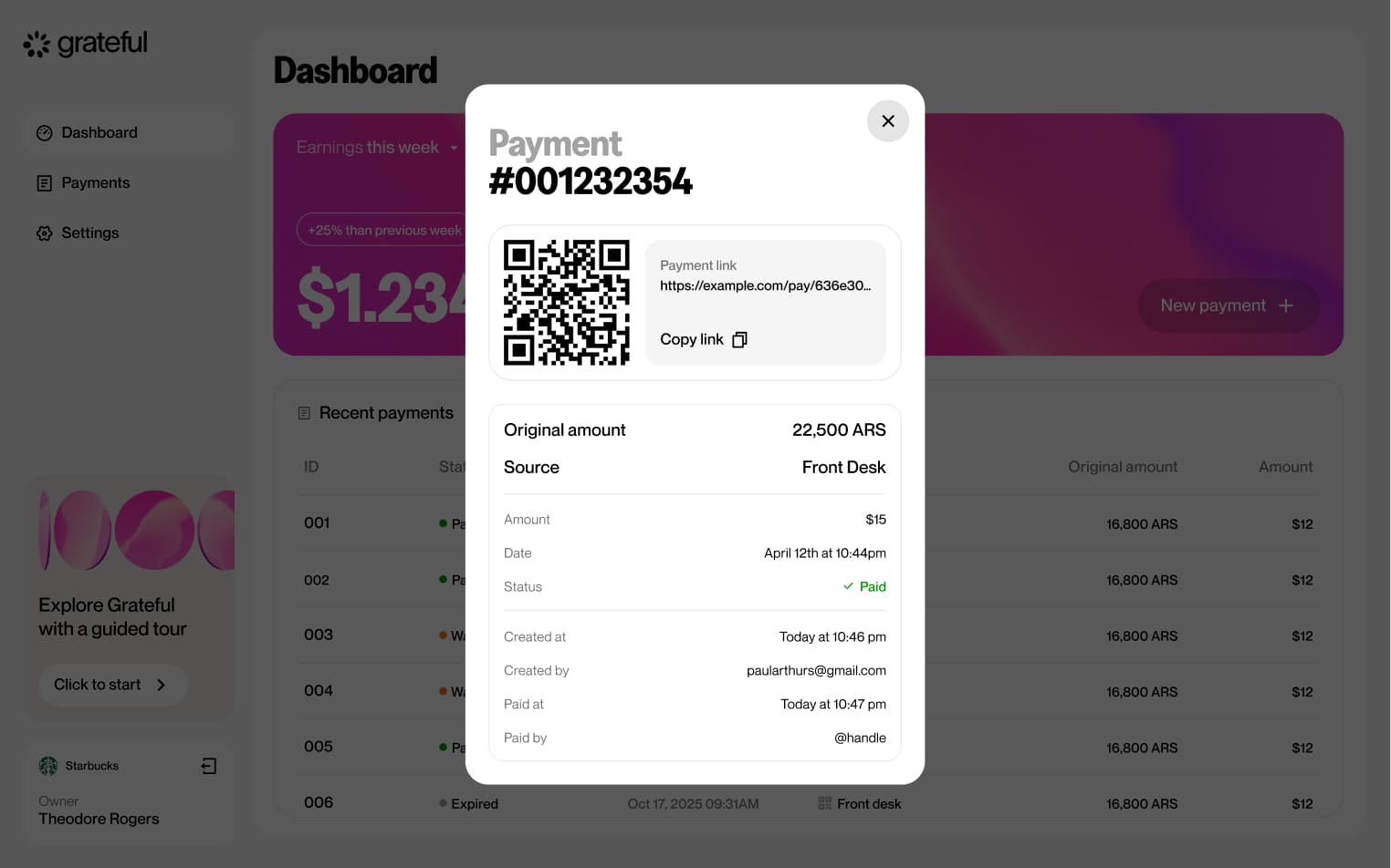
3 screensThe PoS Lifetime flow illustrates the full lifecycle of a QR payment, from the moment it is generated until it is resolved. A payment can transition through three states: waiting for the customer to scan and pay, successfully paid, or expired if no action is taken within the allotted time.


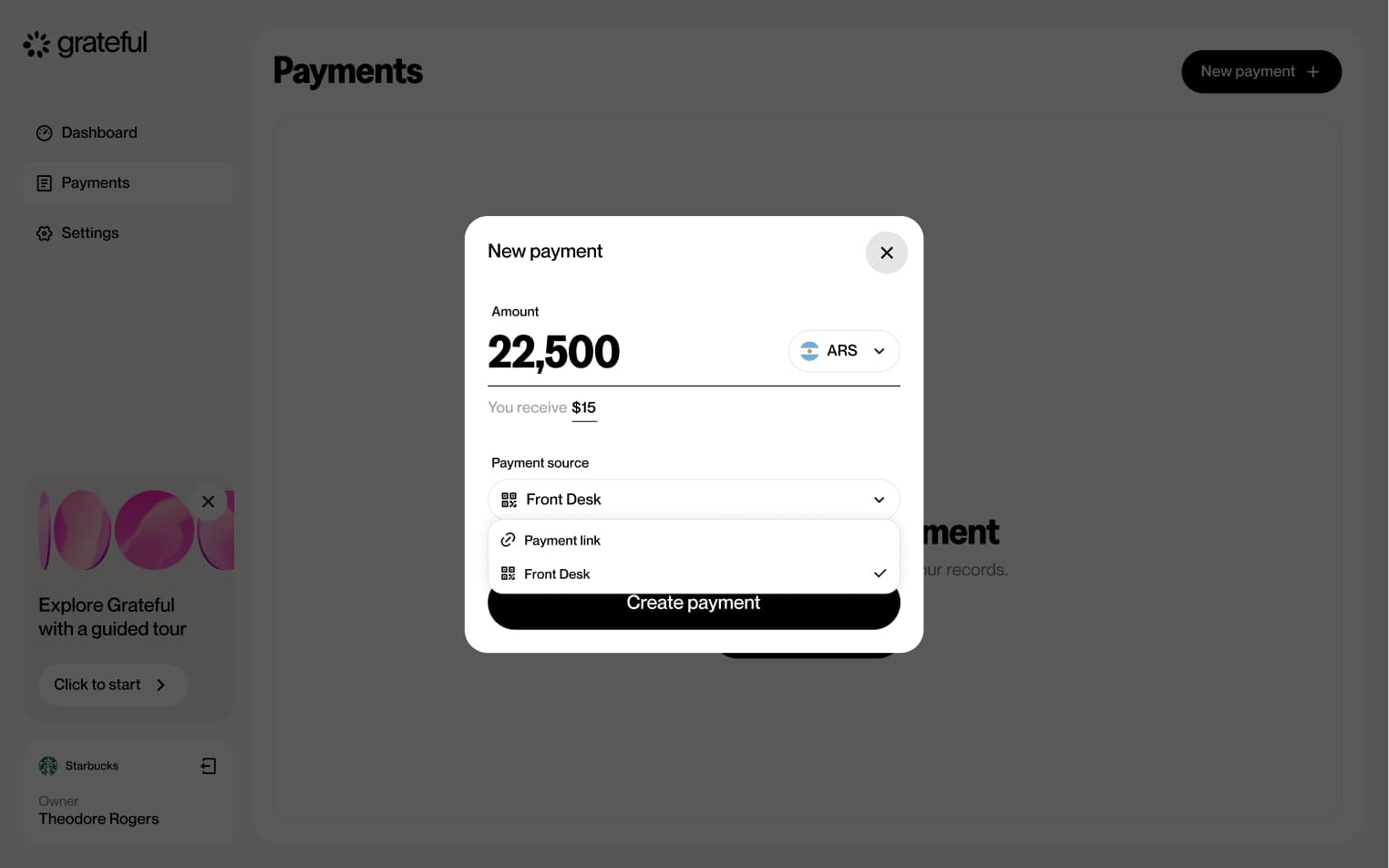
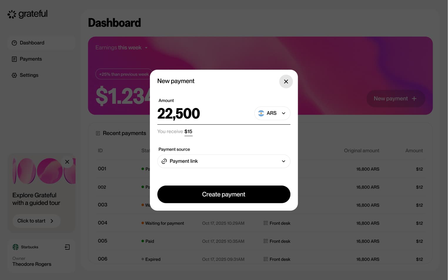
Link from home
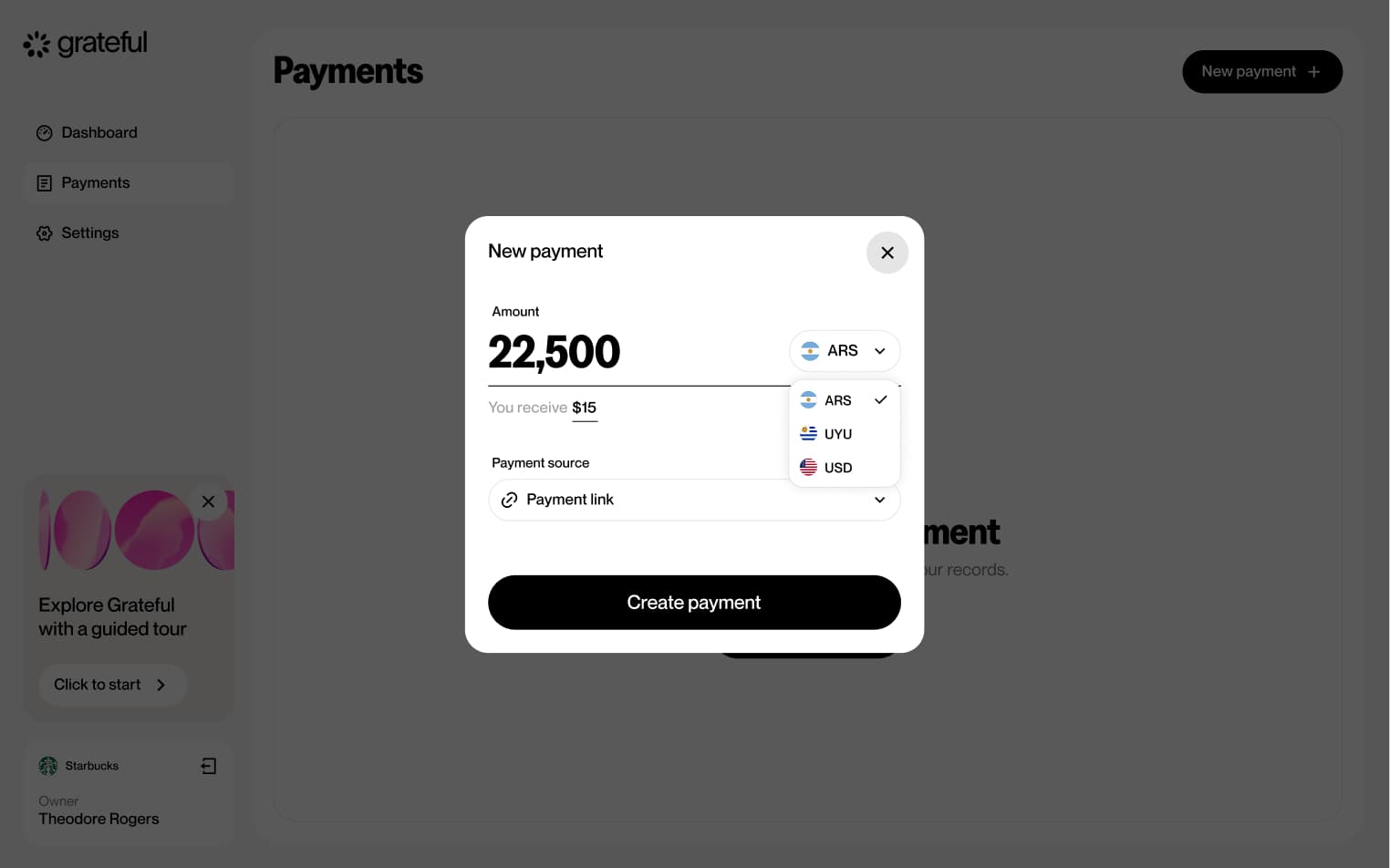
3 screensThe Link from Home flow allows merchants to quickly create a payment link directly from the main dashboard. Users choose the currency, enter the amount, and a shareable payment link is generated ready to be sent to the customer.

Link from payments
3 screensThe Link from Payments flow allows merchants to create a payment link directly from the Payments screen. Users choose the currency, enter the amount, and a shareable payment link is generated ready to be sent to the customer.

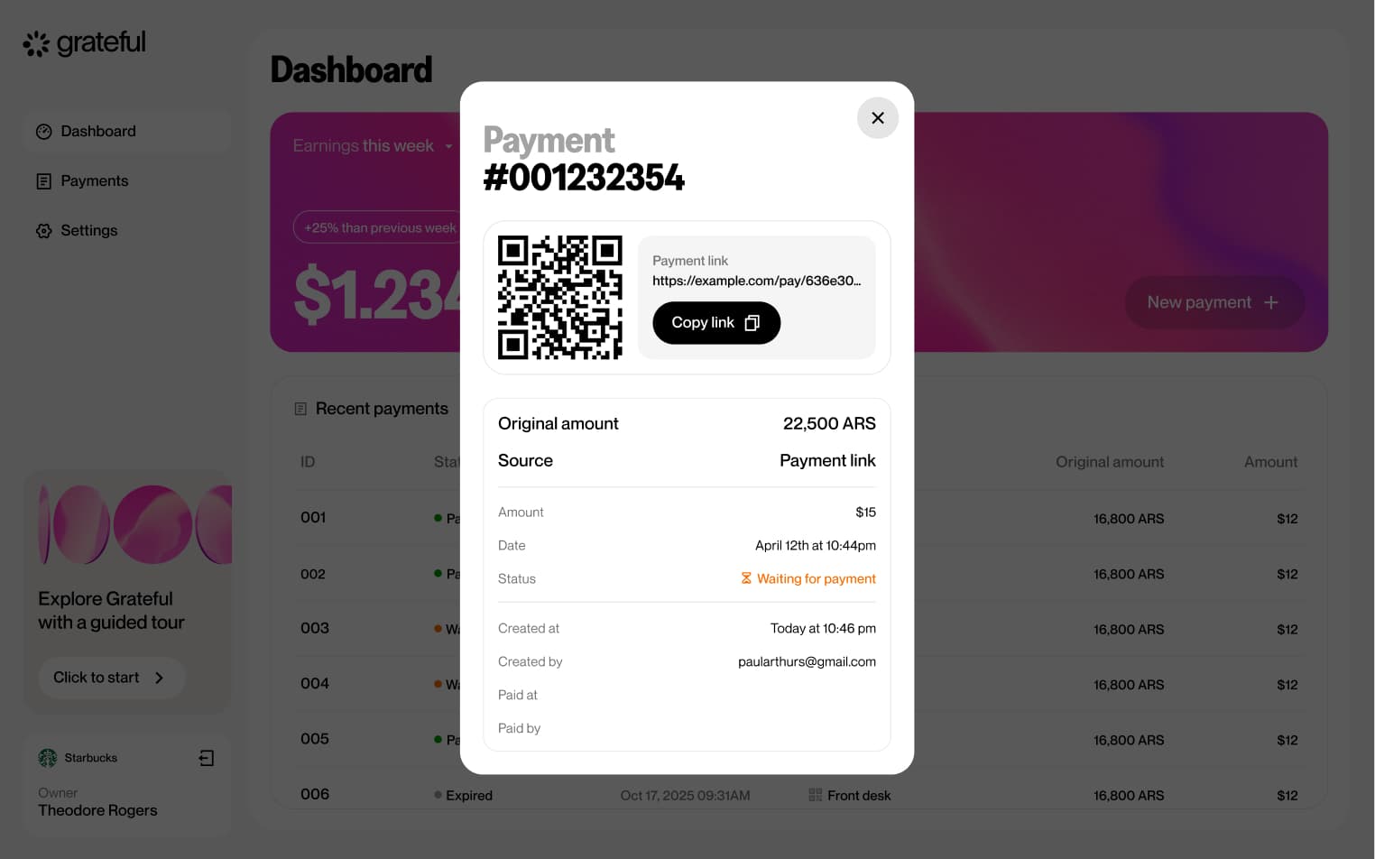
Link lifetime
3 screensThe Link Lifetime flow illustrates the full lifecycle of a payment link, from the moment it is generated until it is resolved. A payment can transition through three states: waiting for the customer to complete the payment, successfully paid, or expired if no action is taken within the allotted time.


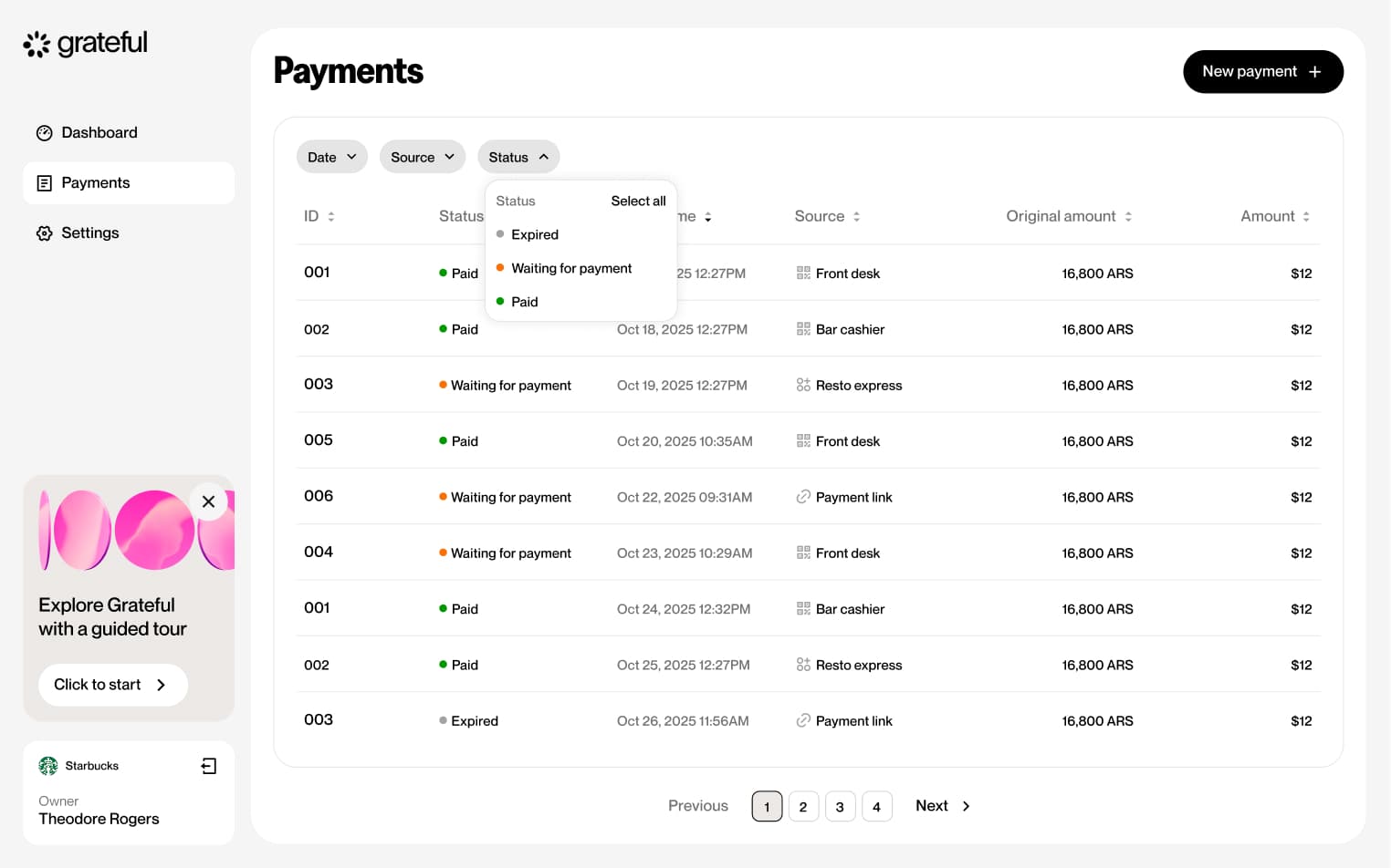
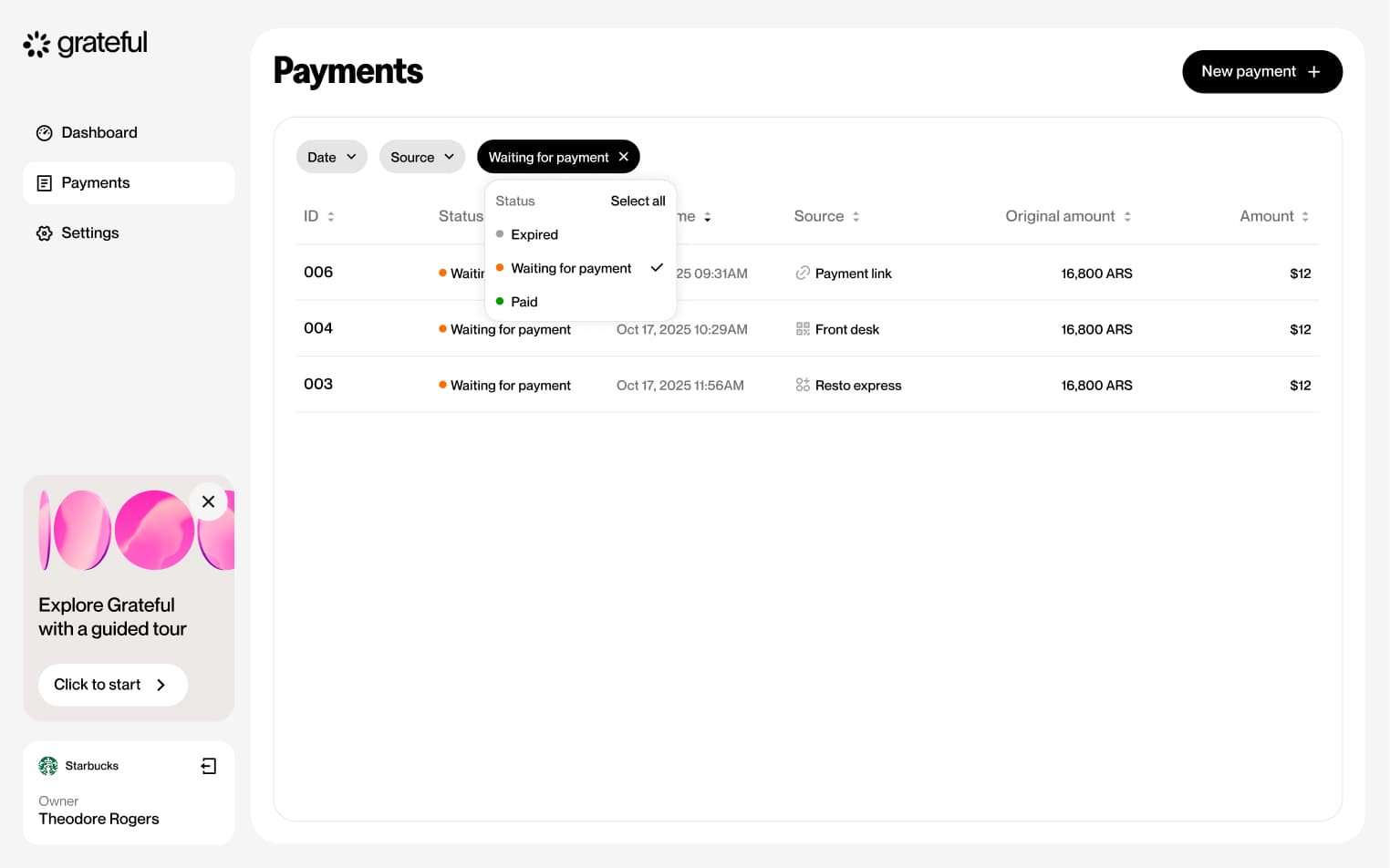
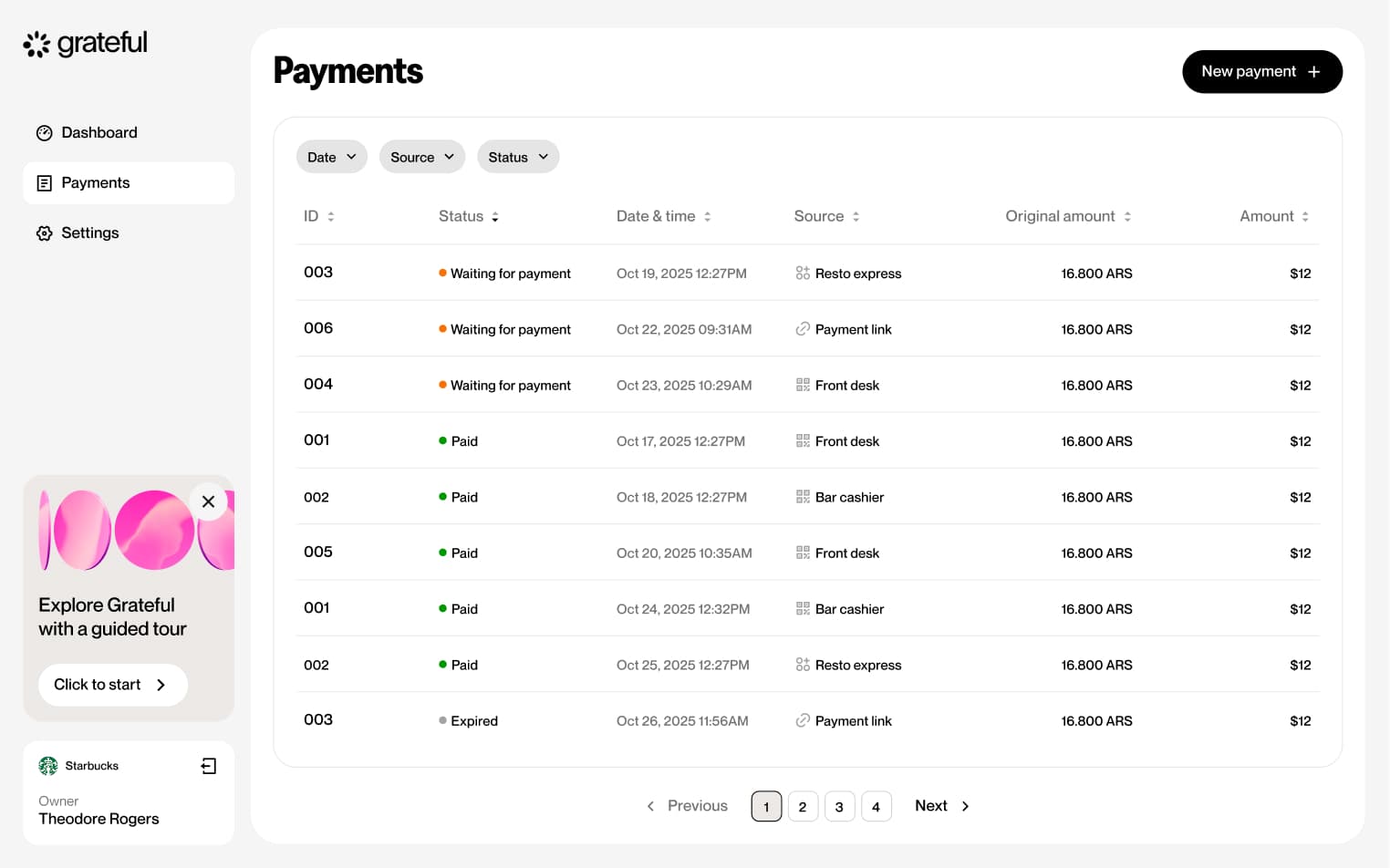
Filter by status
4 screensThe Filter by Status flow allows merchants to narrow down their payment list by status directly from the Payments screen.

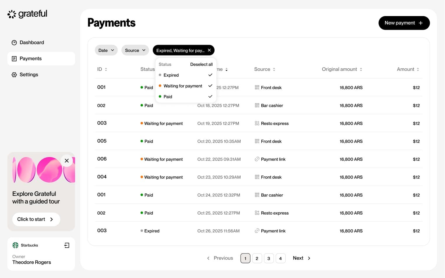
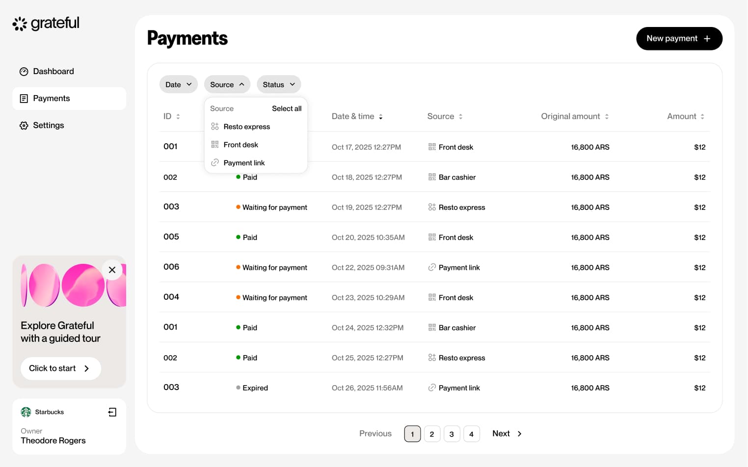
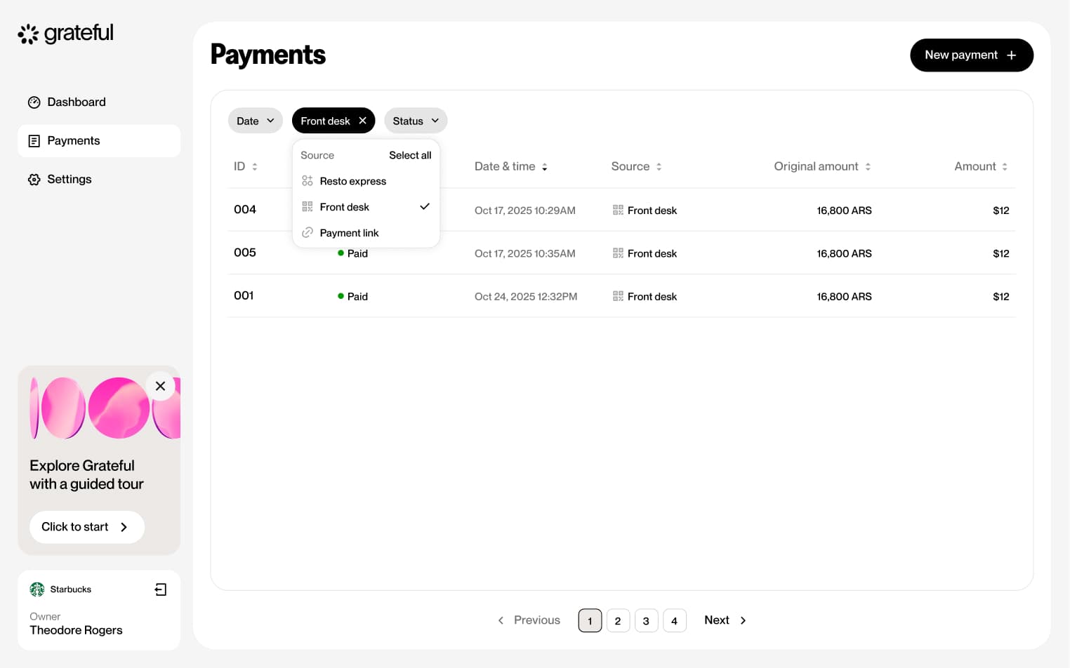
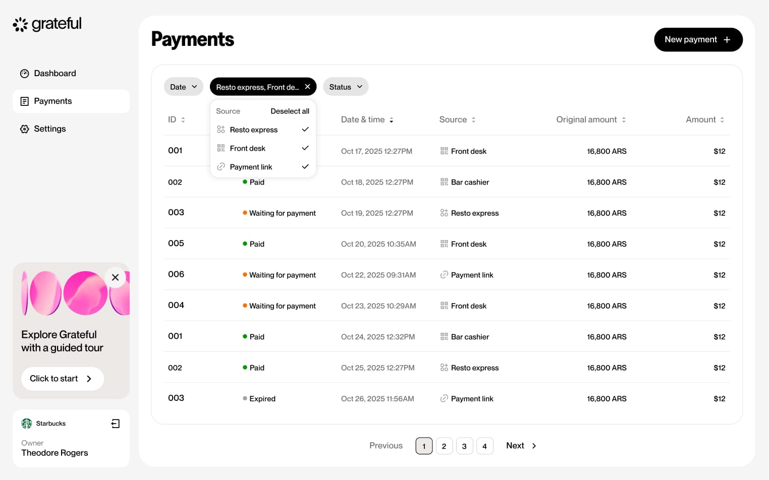
Filter by source
4 screensThe Filter by Source flow allows merchants to narrow down their payment list by payment source directly from the Payments screen.

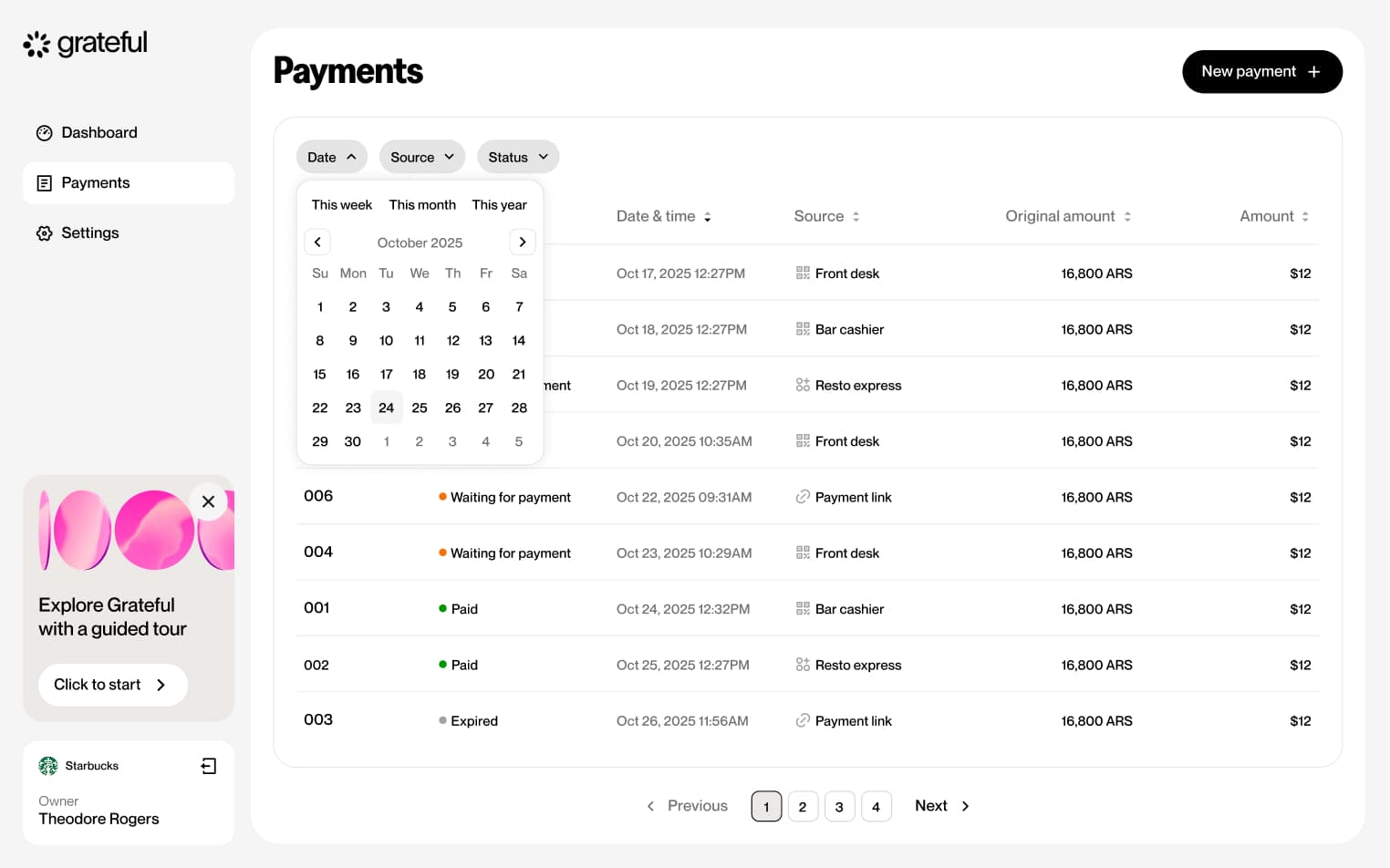
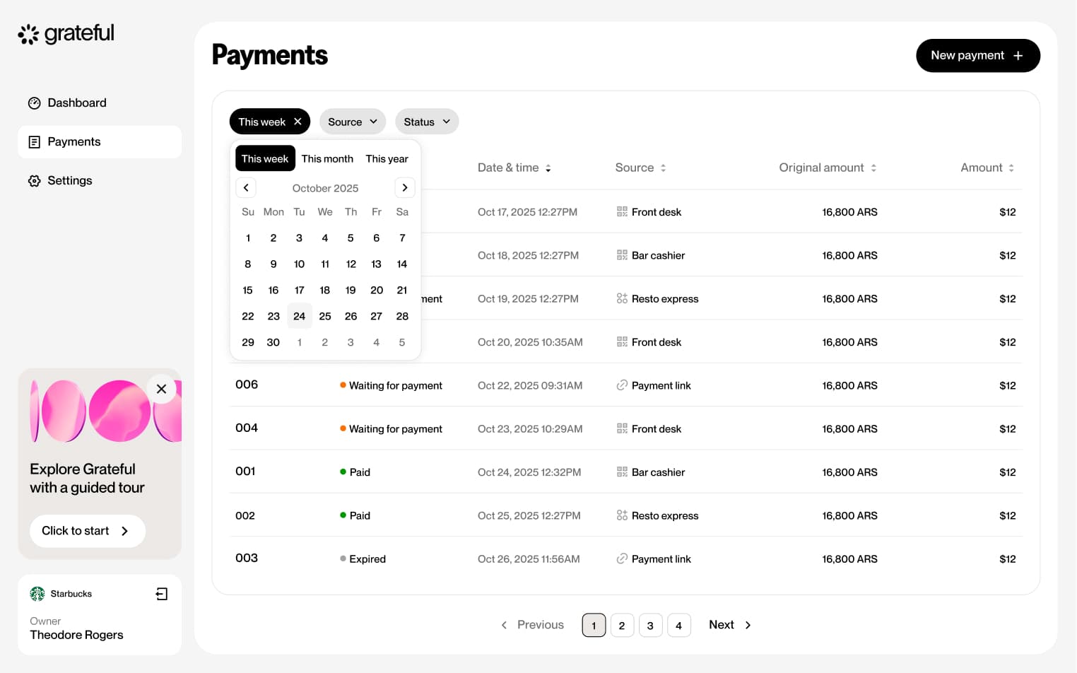
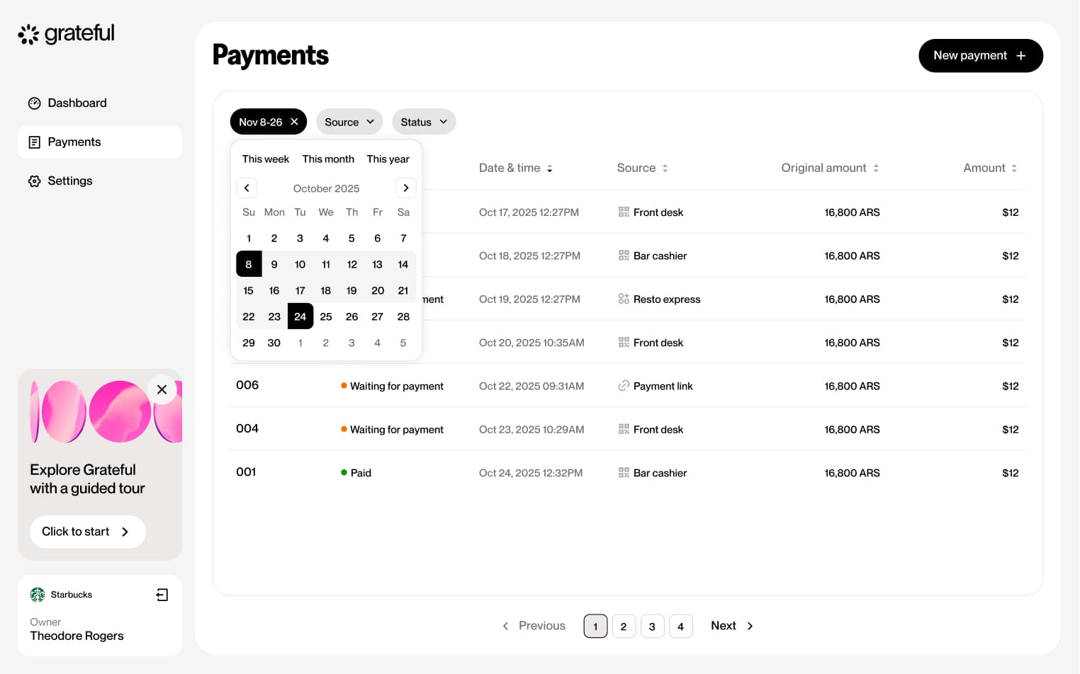
Filter by date
4 screensThe Filter by Date flow allows merchants to narrow down their payment list by date range directly from the Payments screen.

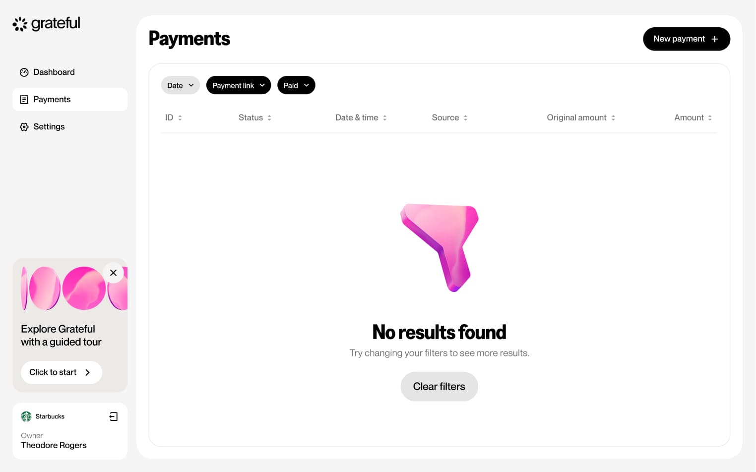
Filter no results
1 screenThe Filter No Results state shows how the Payments screen looks when the applied filters return no matching transactions.
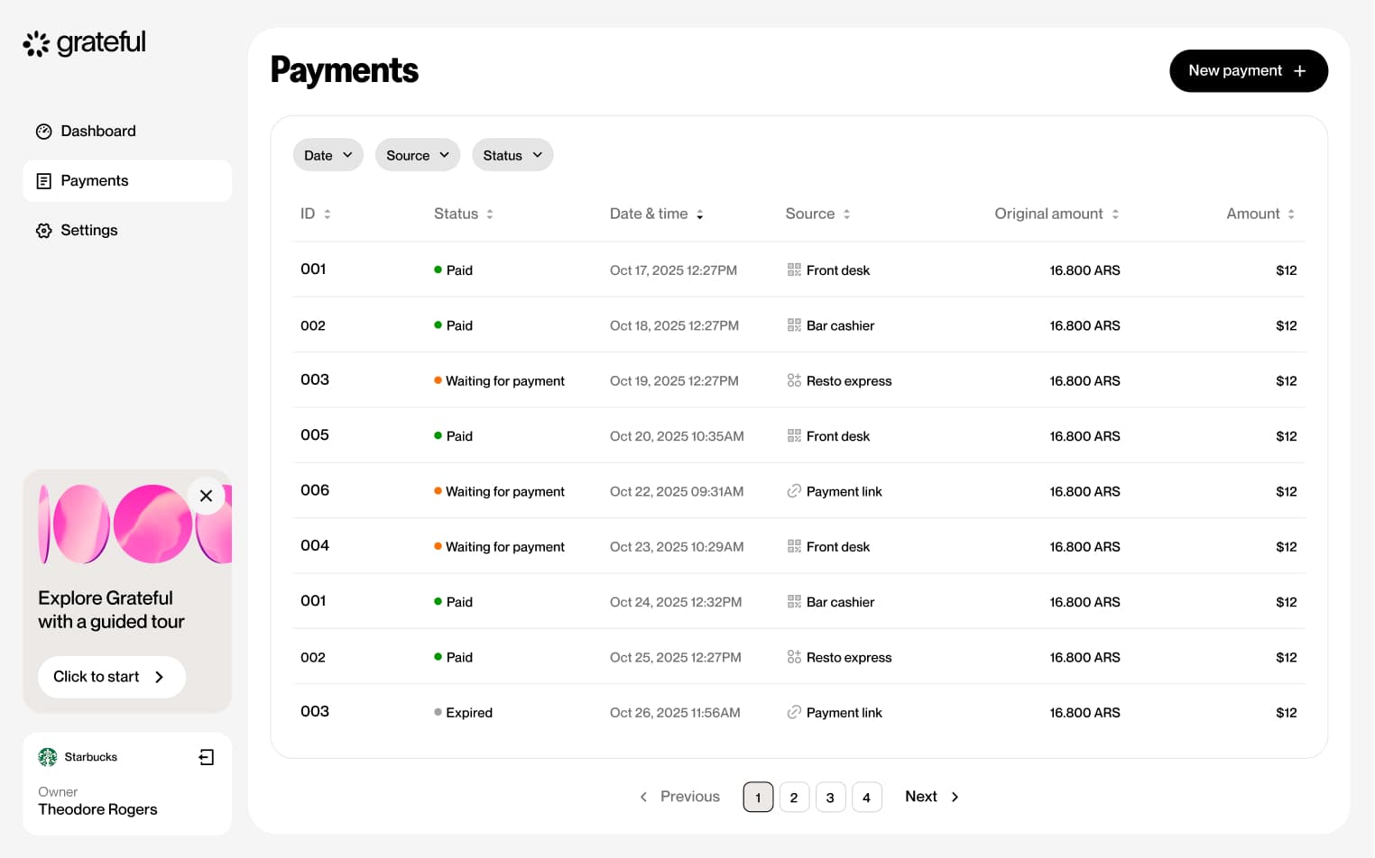
Sort payments
2 screensThe Sort Payments feature allows merchants to organize their payment list by tapping any column header on the Payments screen to sort by that field.
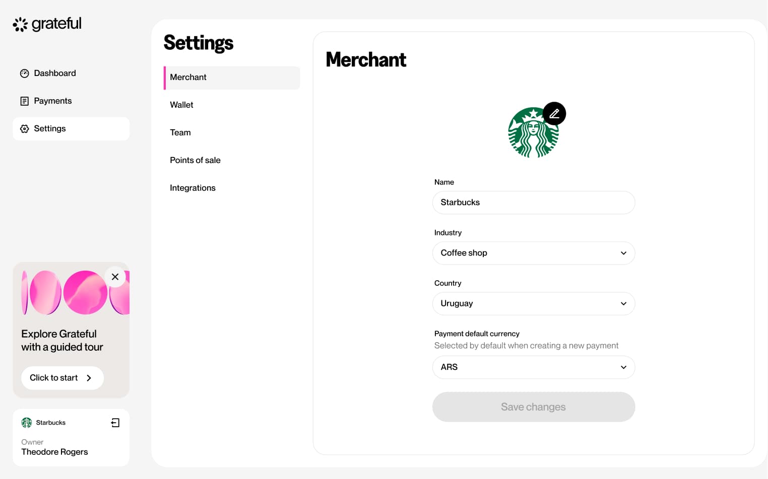
Edit merchant
3 screensThe Edit Merchant flow allows merchants to update their business information directly from the Settings screen.


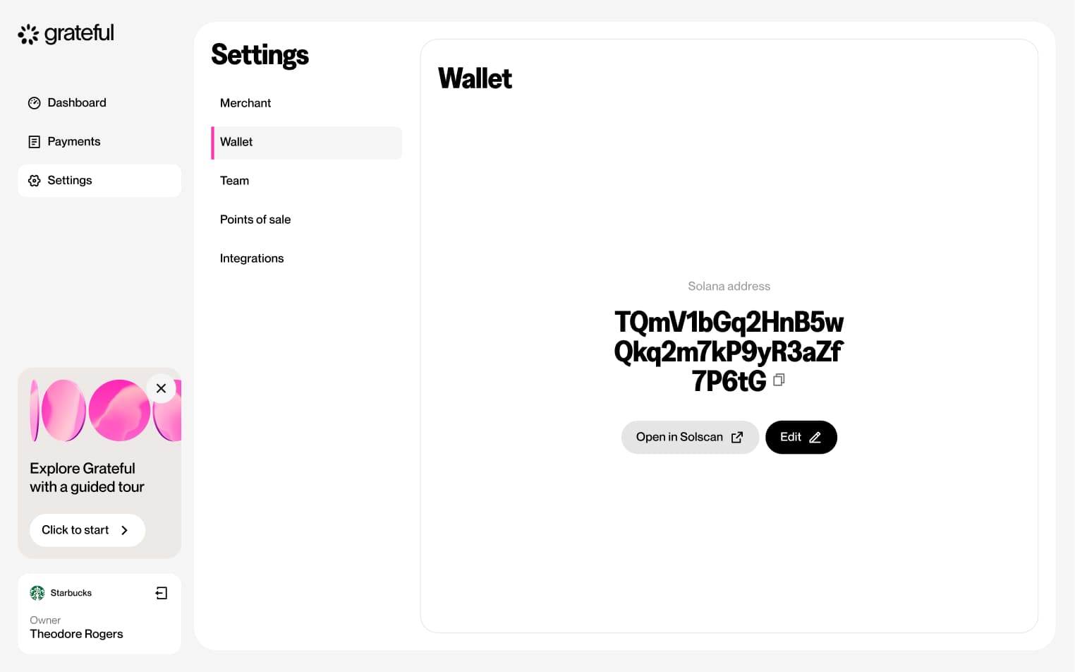
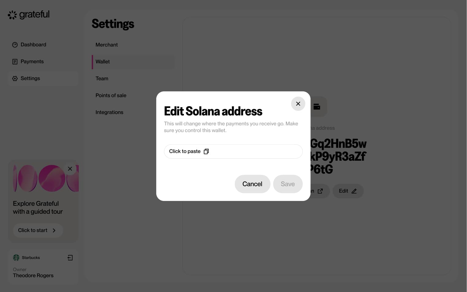
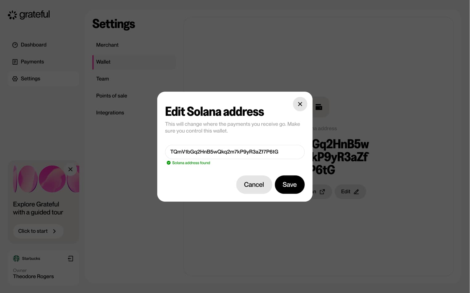
Edit wallet address
5 screensThe Edit Wallet Address flow allows merchants to update their associated wallet address directly from the Settings screen.


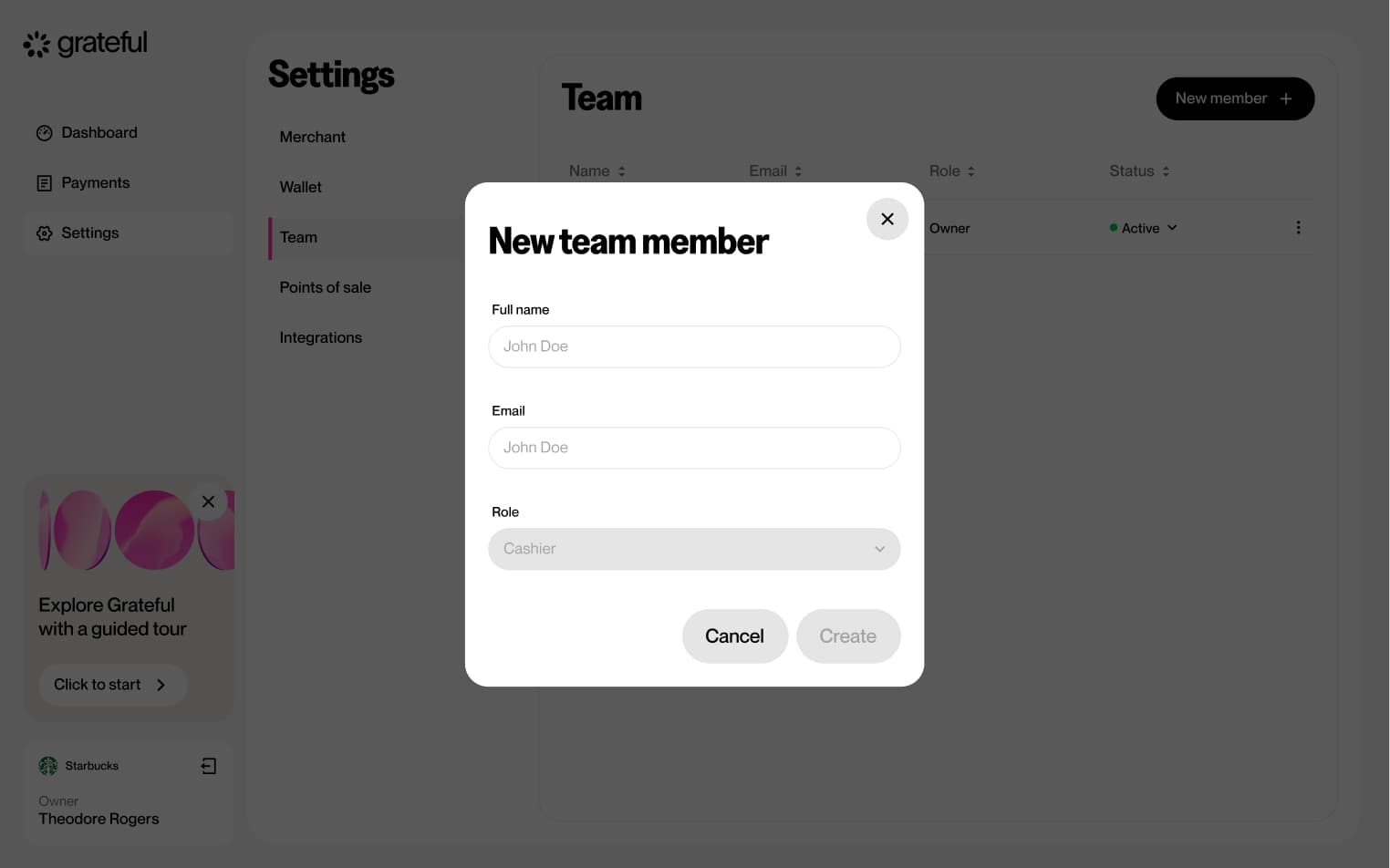
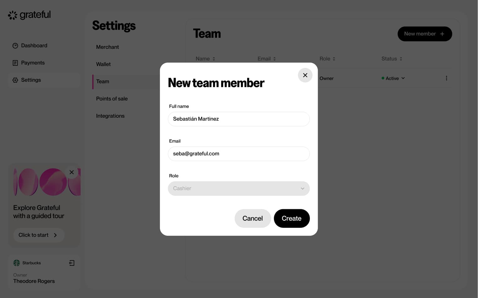
Add team member
5 screensThe Add Team Member flow allows merchants to invite new members to their dashboard.

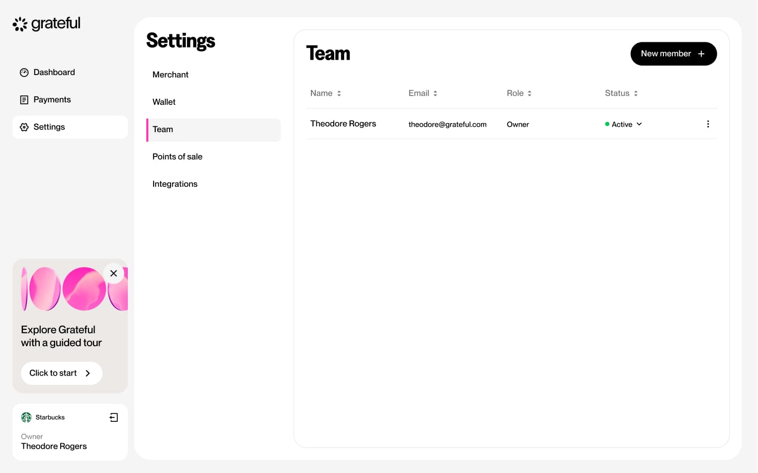
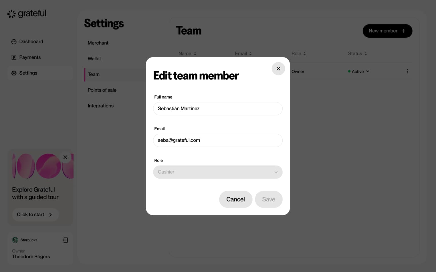
Edit team member
6 screensThe Edit Team Member flow allows merchants to update the details or permissions of an existing team member directly from the Settings screen.


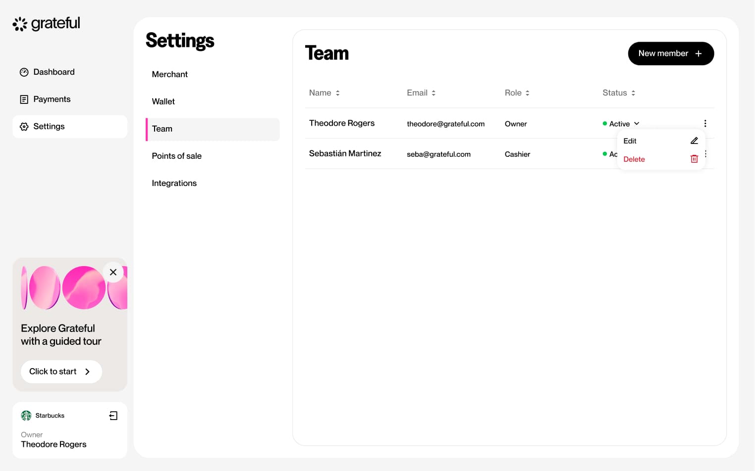

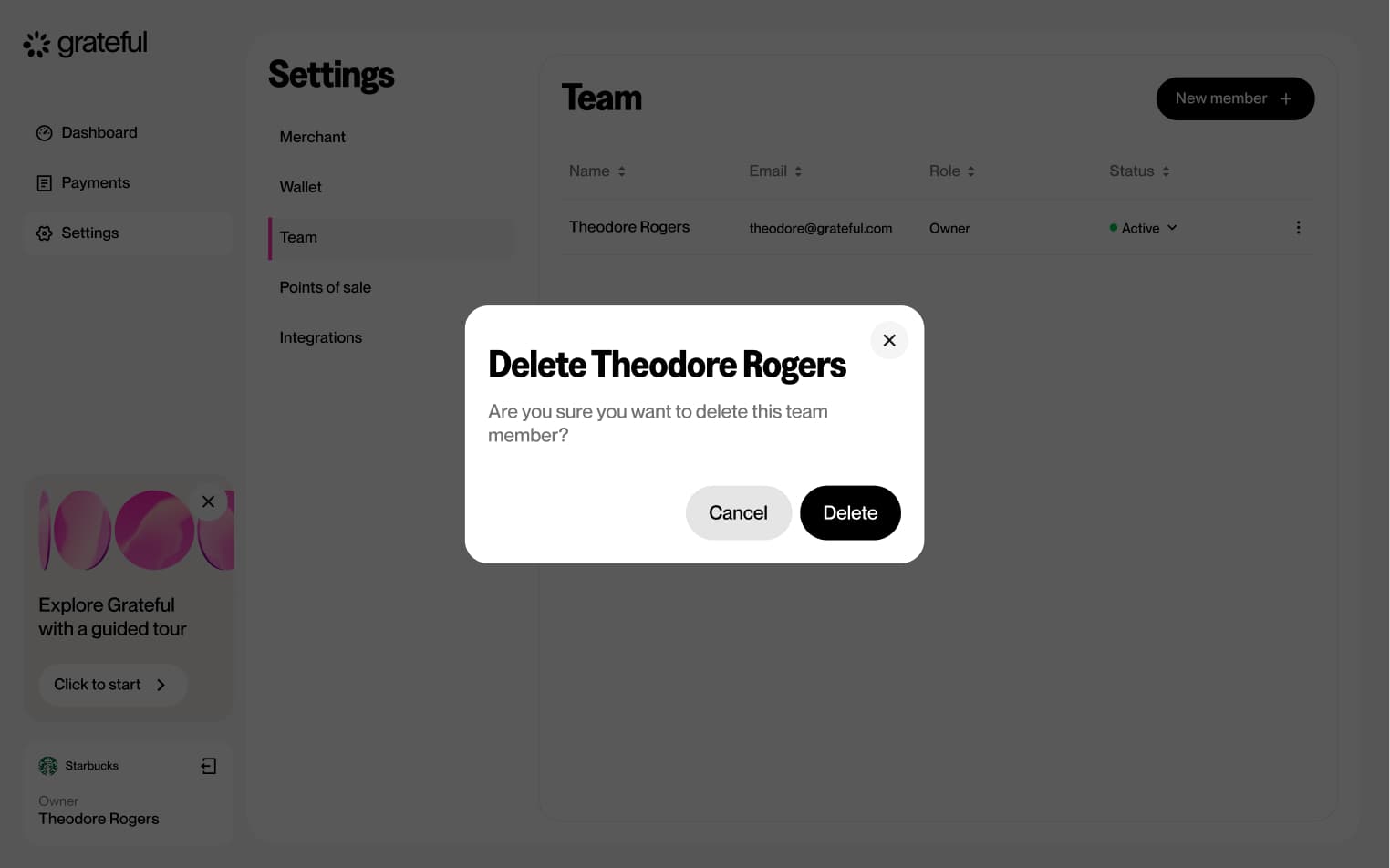
Delete team member
5 screensThe Delete Team Member flow allows merchants to remove a team member from their dashboard directly from the Settings screen.


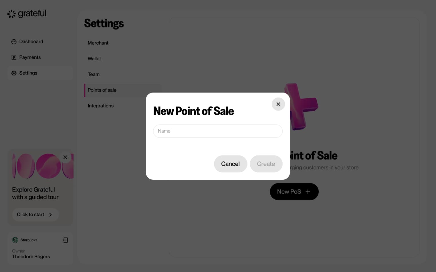
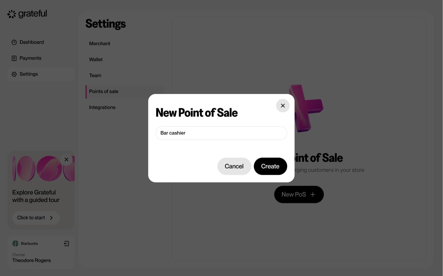
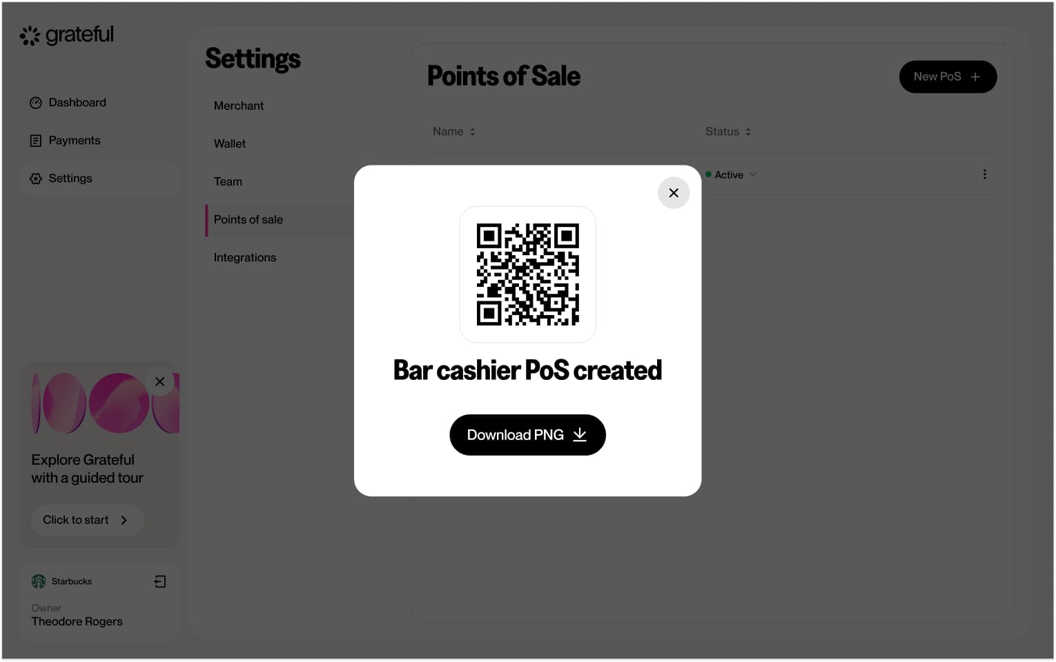
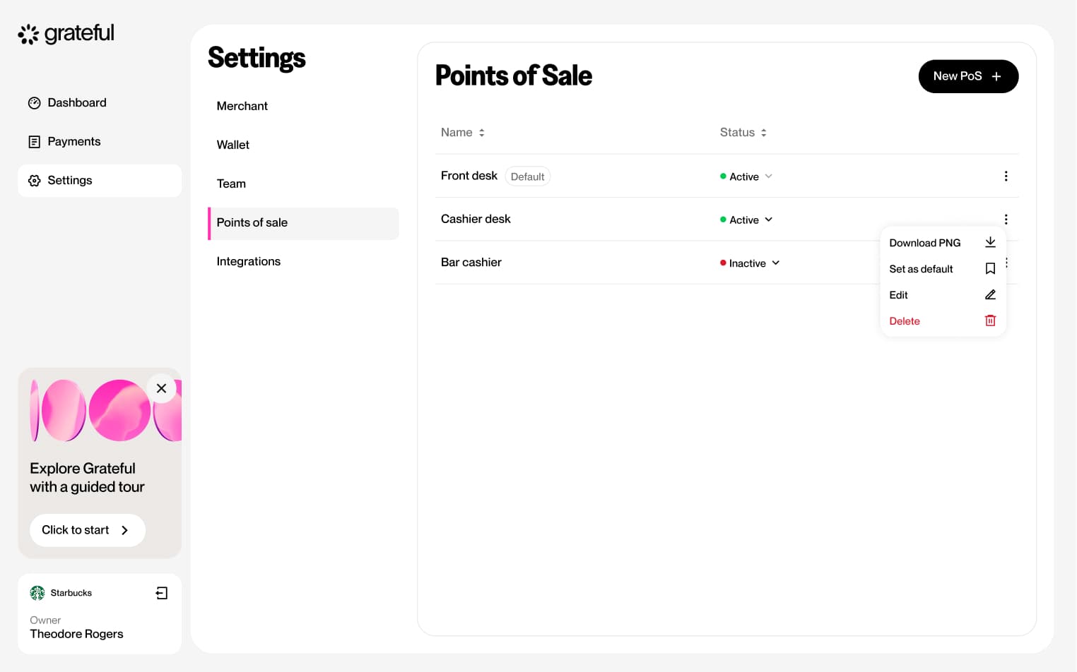
Create PoS
6 screensThe Create PoS flow allows merchants to set up a new point-of-sale directly from Settings. Users navigate to the PoS section, create a new entry, assign it a name, and a unique QR code is generated and displayed.

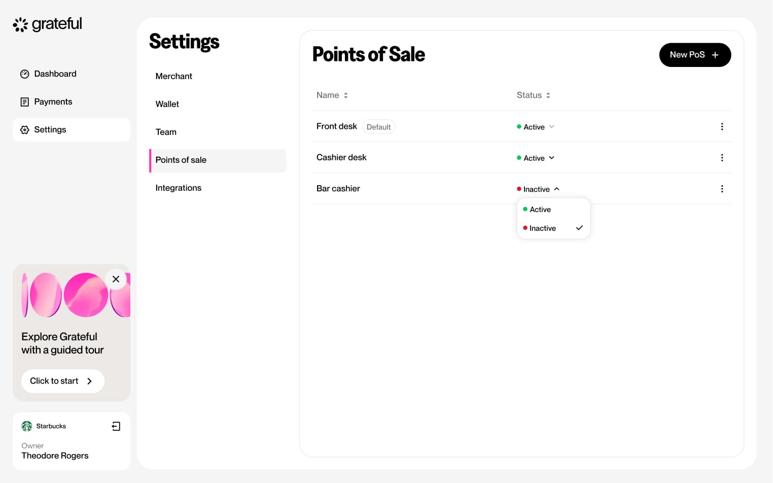
Edit PoS status
4 screensThe Edit PoS Status flow allows merchants to toggle each point-of-sale between active and inactive directly from the Settings screen.


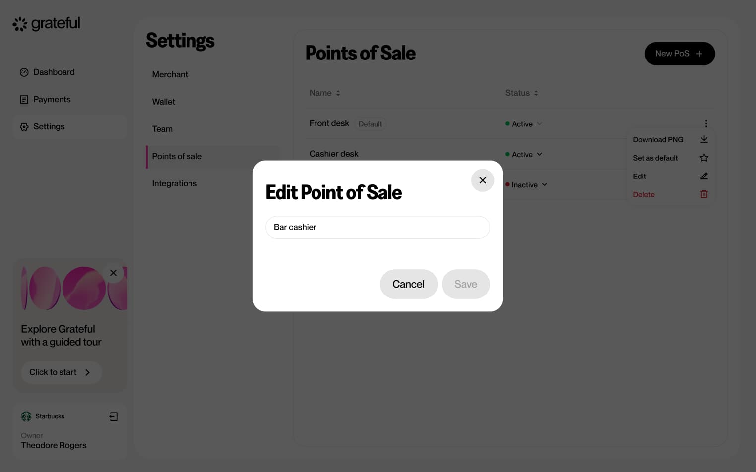
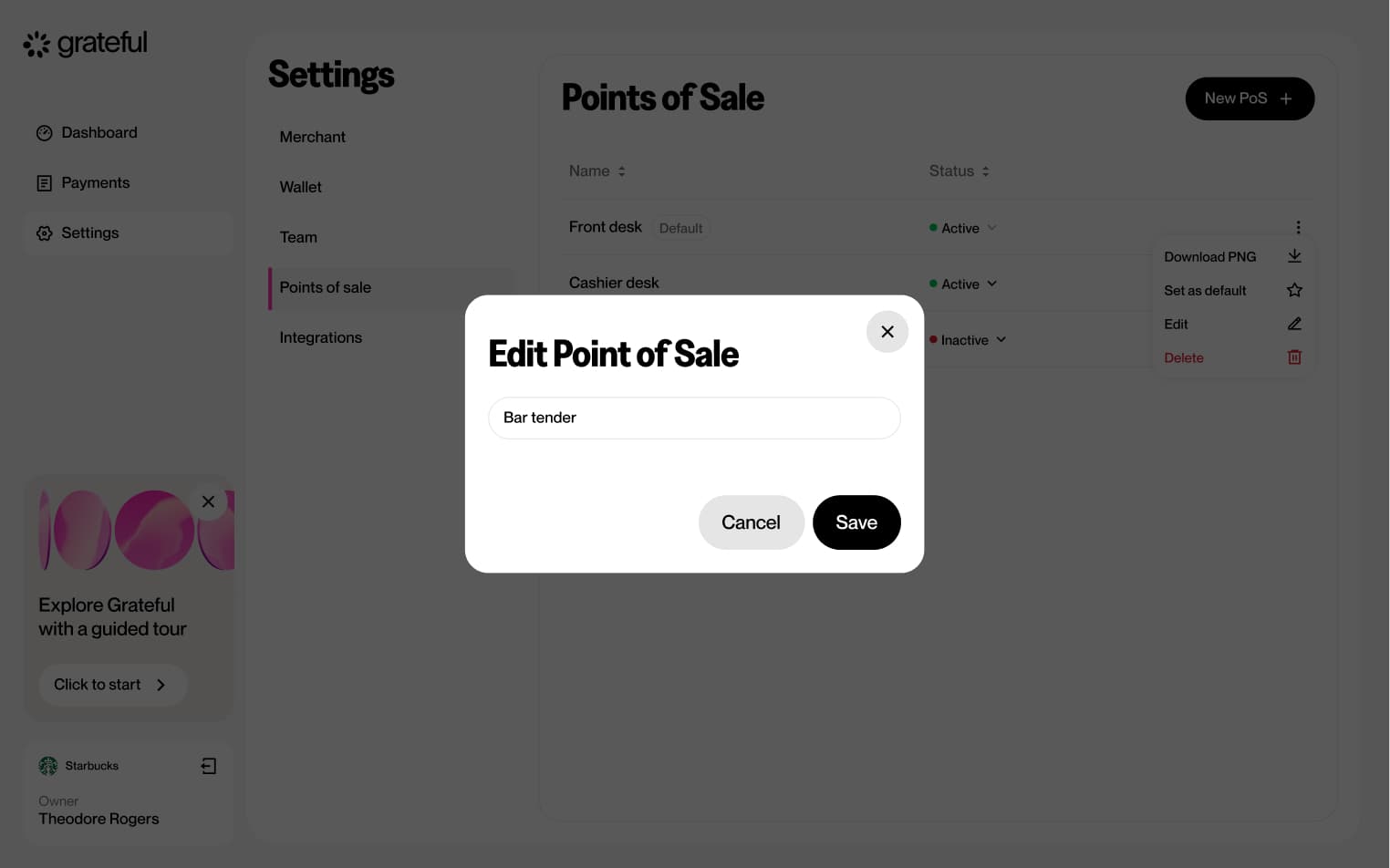
Edit PoS name
6 screensThe Edit PoS Name flow allows merchants to rename an existing point-of-sale directly from the Settings screen.


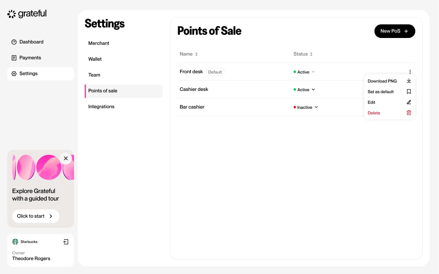
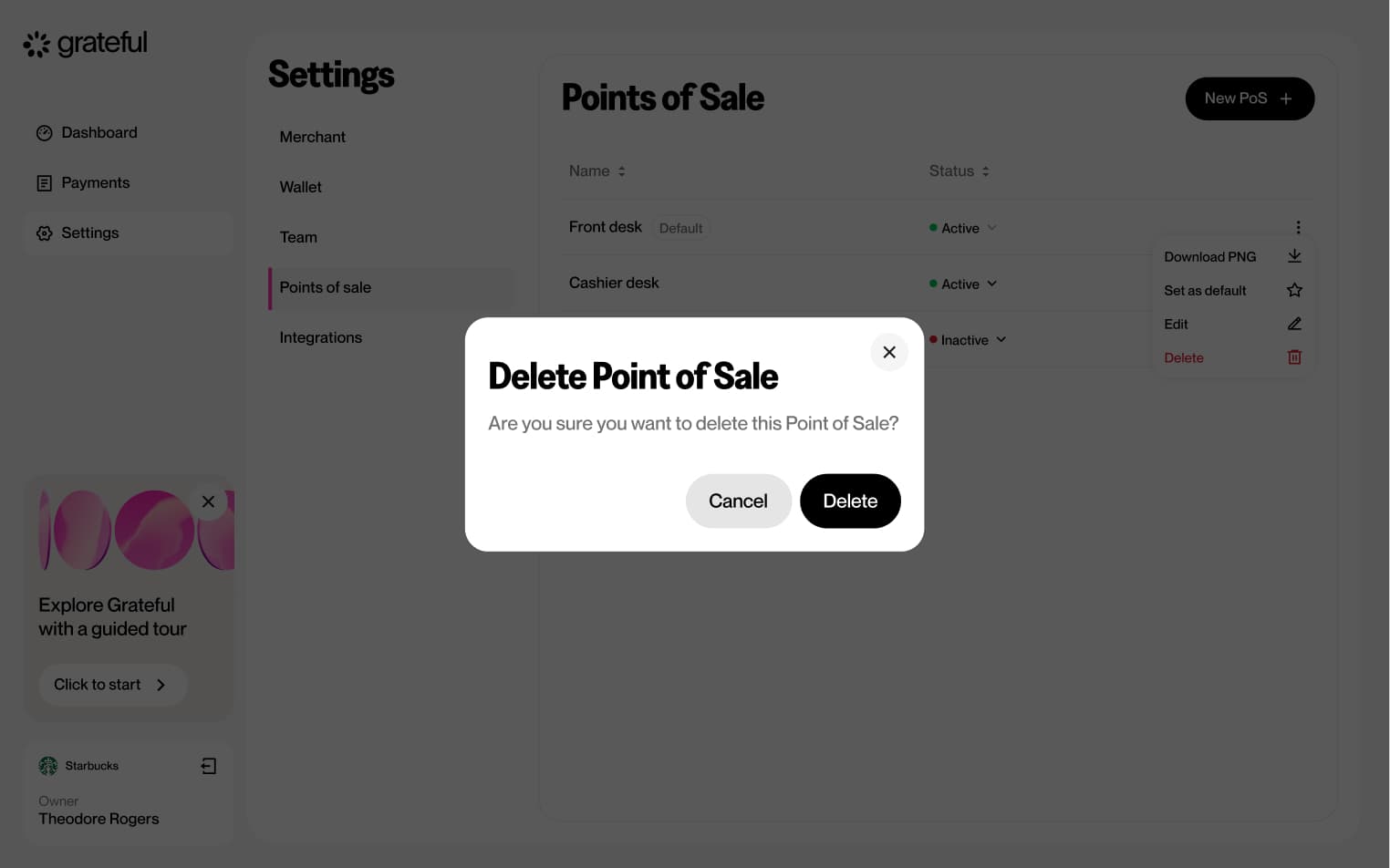
Delete PoS
5 screensThe Delete PoS flow allows merchants to remove an existing point-of-sale directly from the Settings screen.


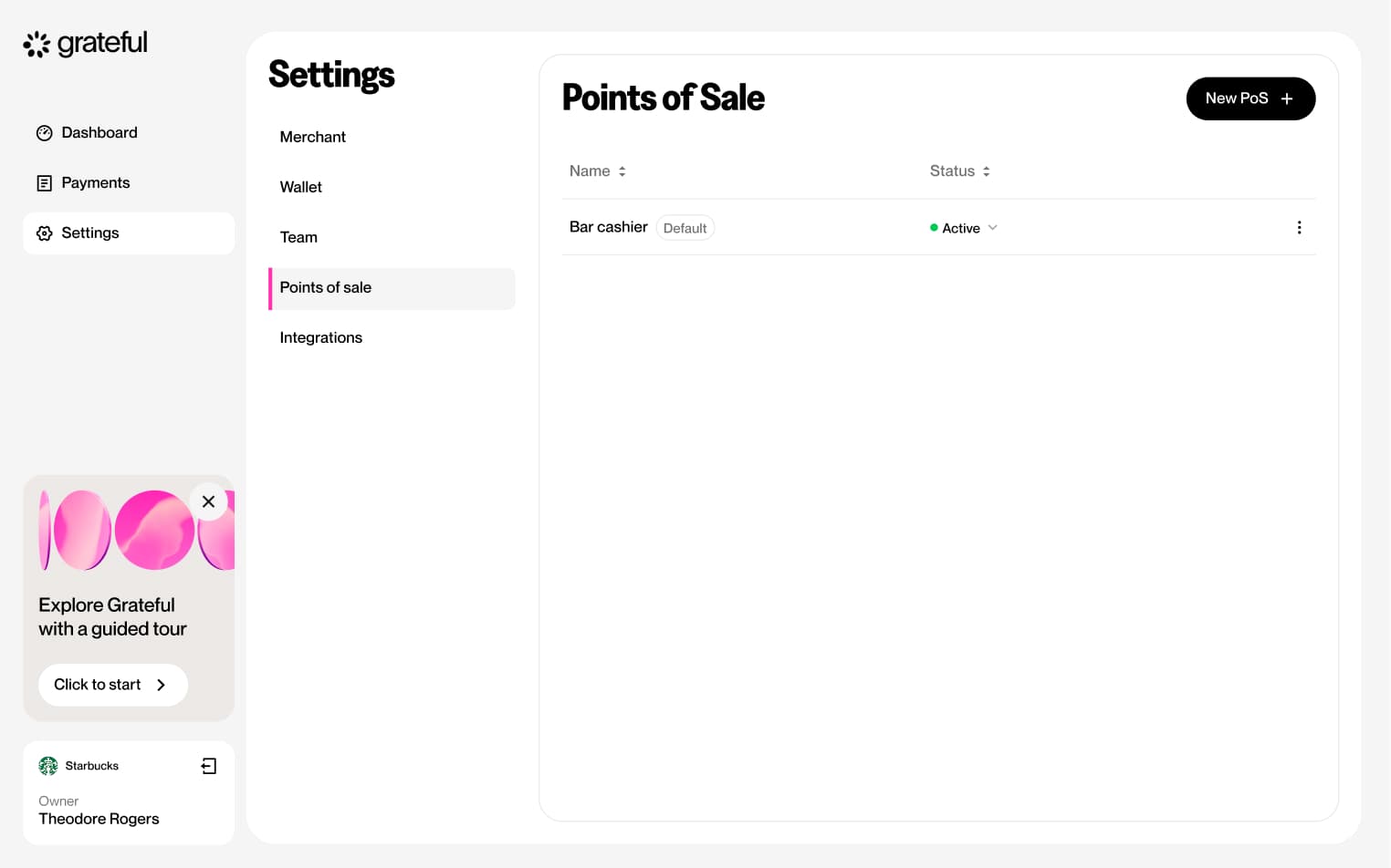
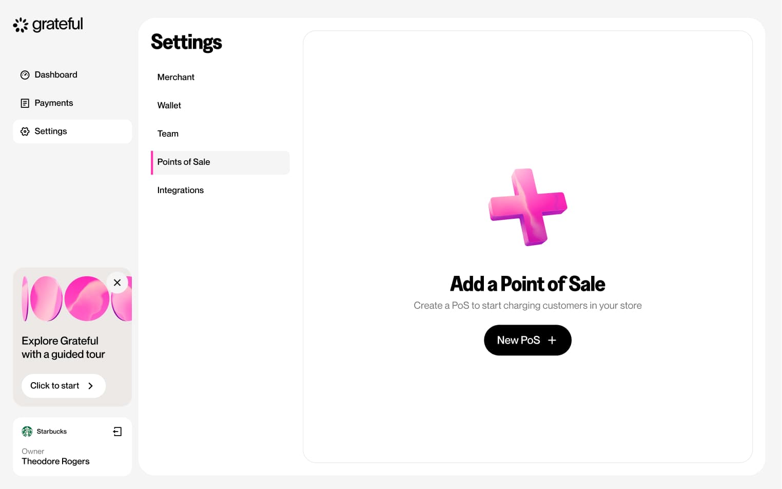
PoS empty state
1 screenThis screen shows how the PoS list looks in Settings when no points-of-sale have been created yet.
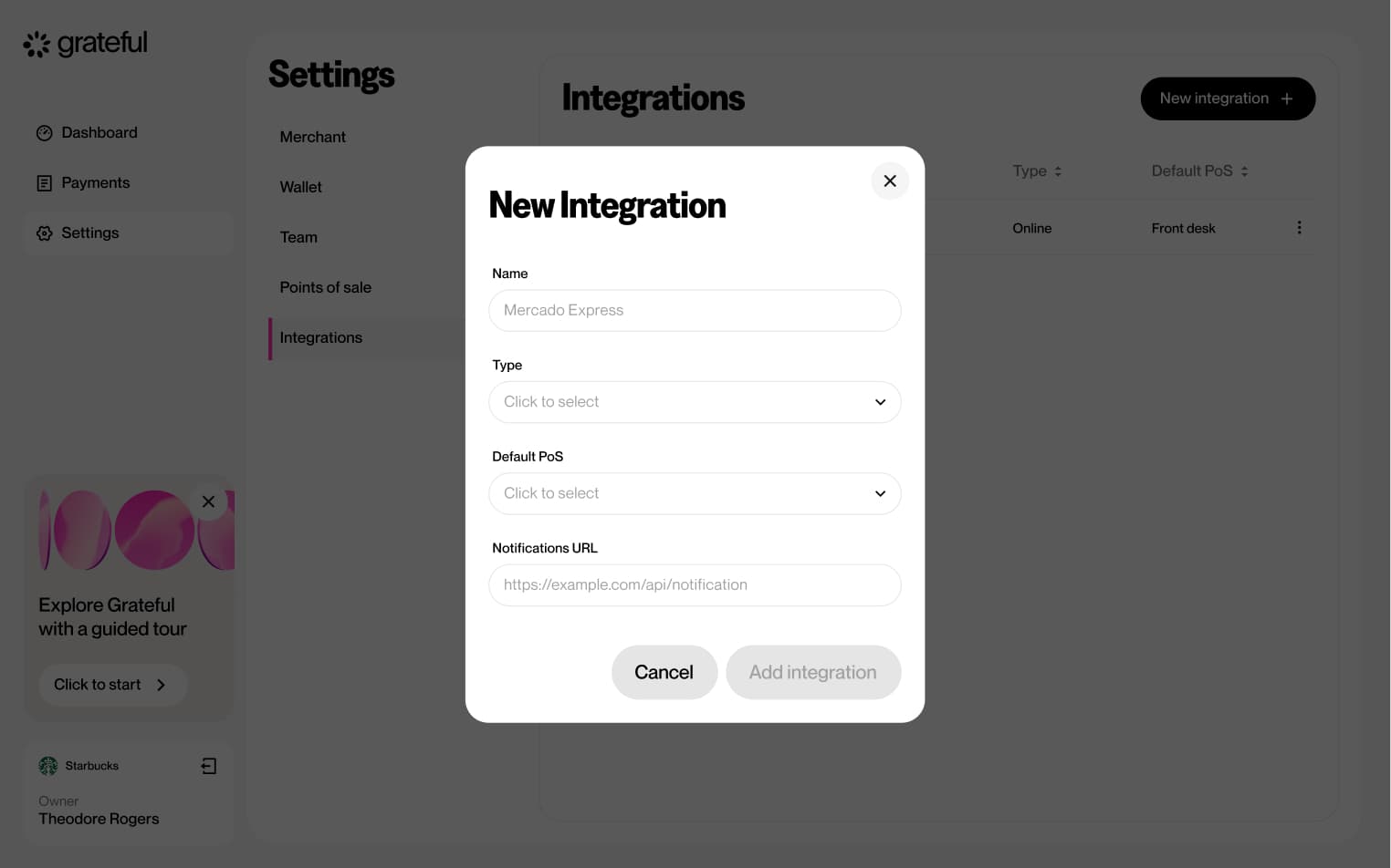
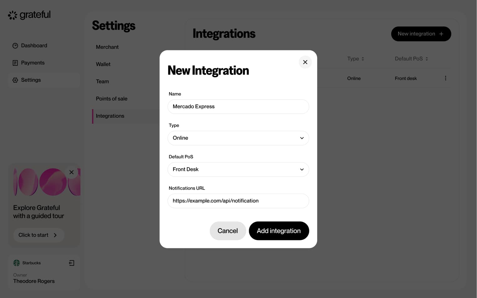
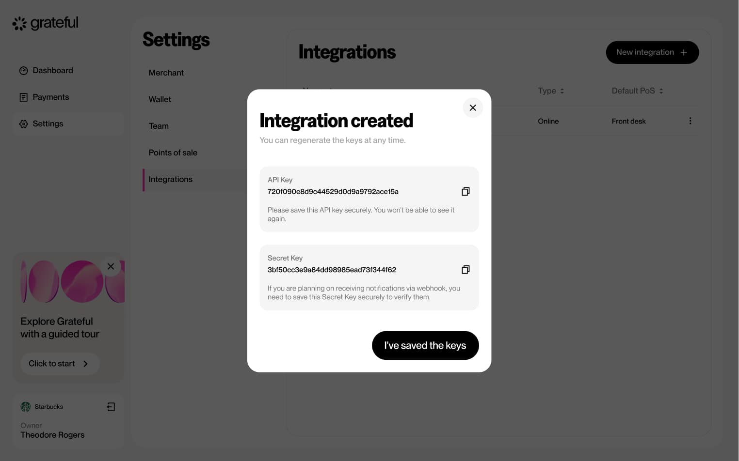
Create integration
6 screensThe Create Integration flow allows merchants to set up a new integration directly from Settings. Users navigate to the Integrations section, create a new entry, and configure it by providing a name, type, default PoS, and notifications URL before confirming.


Edit integration
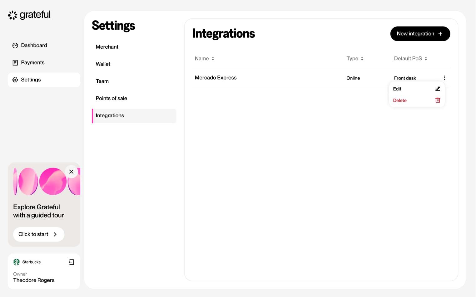
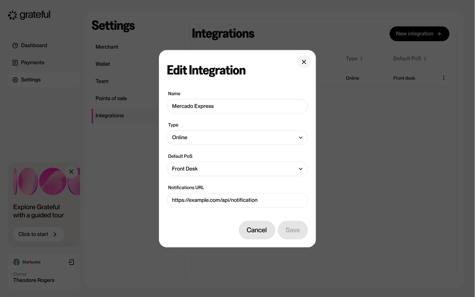
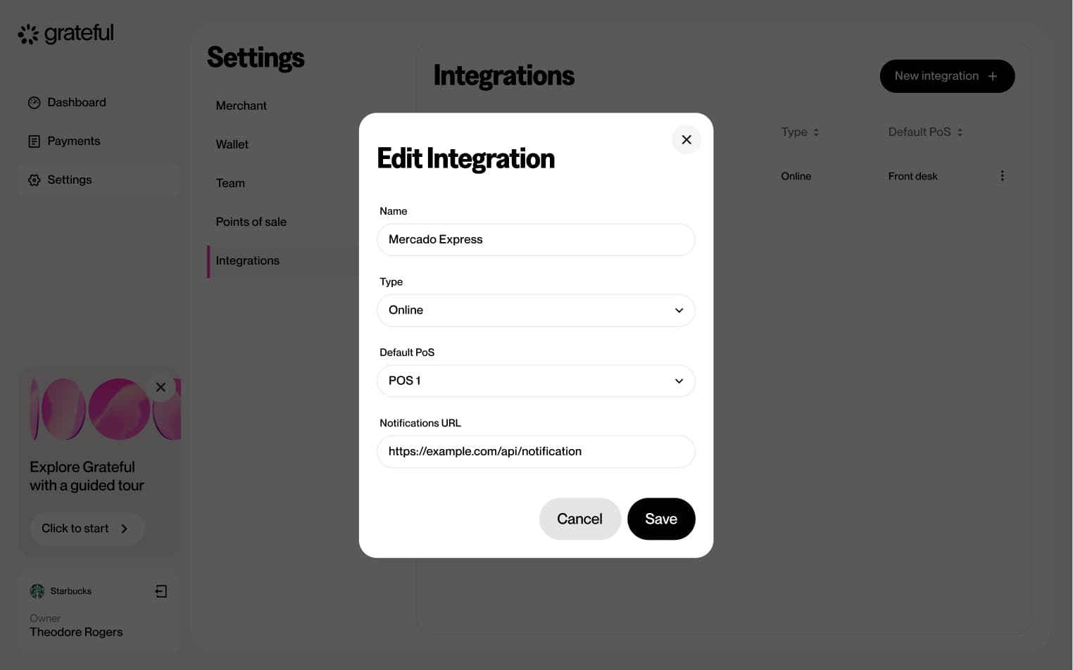
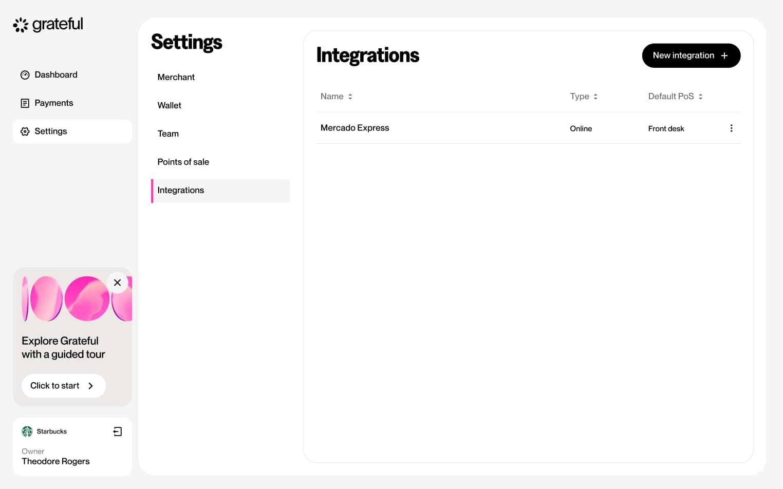
6 screensThe Edit Integration flow allows merchants to update the details of an existing integration directly from the Settings screen.


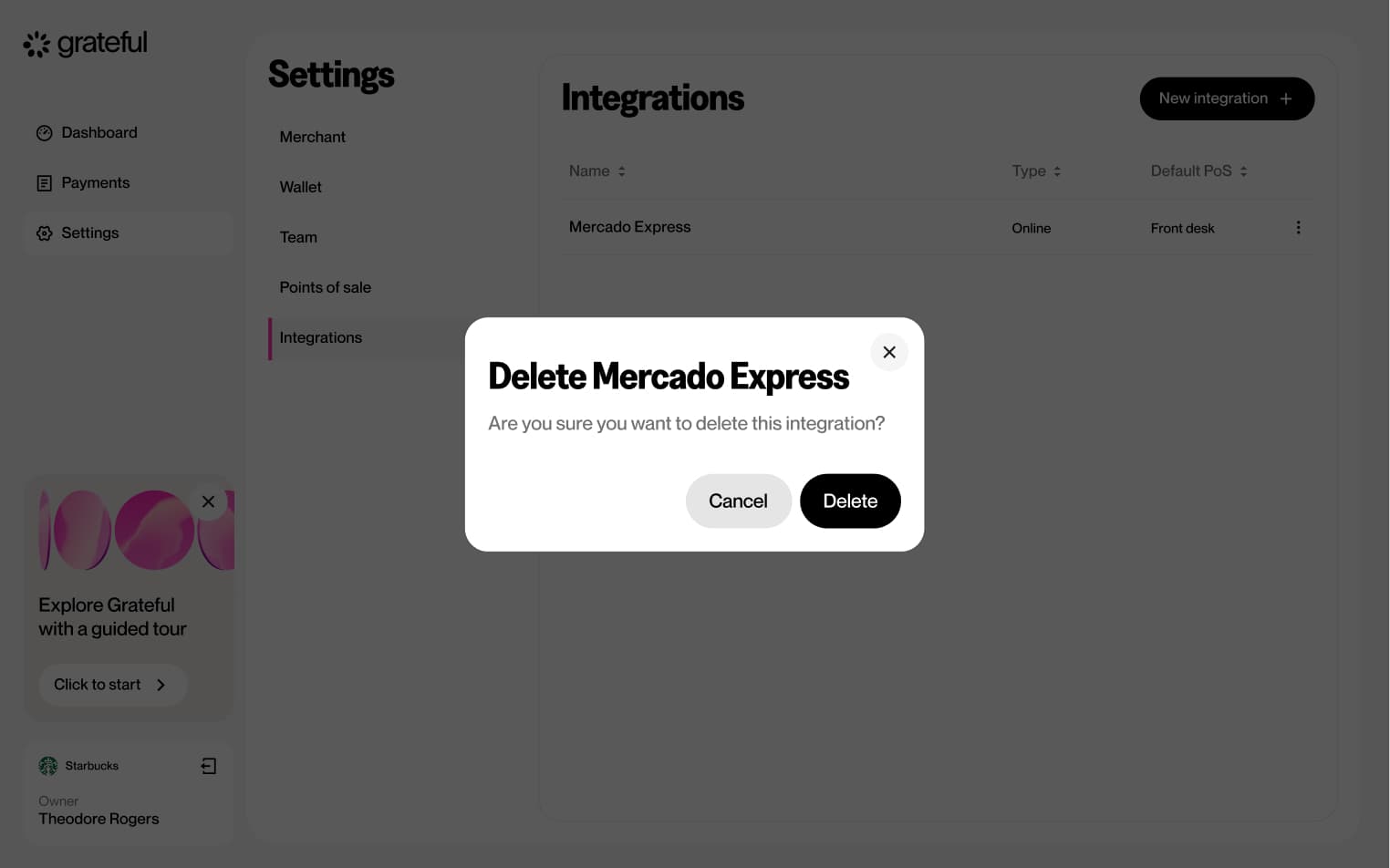
Delete integration
5 screensThe Delete Integration flow allows merchants to remove an existing integration directly from the Settings screen.


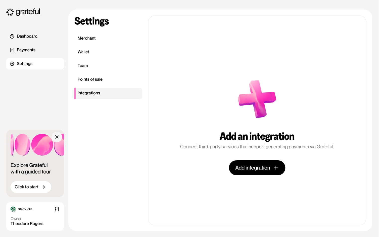
Integrations empty state
1 screenShows how the Integrations list looks in Settings when no integrations have been created yet.